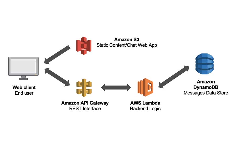
test

The Complete Guide to Mobile App Development Costs

If you believe that developing a commercial app requires only technical skills, you’re in for a surprise. As soon as you step into the market, you’ll quickly realize that the cost of mobile app development poses a significant hurdle, and anticipating it is no easy task. In this article, we delve into the key obstacles that come your way and explore effective strategies to navigate them with foresight.


Unique Software Development

Factors on Which Mobile App Development Costs Depend

Mobile Application has become a crucial aspect of businesses and entrepreneurs. However, one of the most common concerns is Mobile app development costs. The cost of developing a mobile app can vary significantly based on several factors. Understanding these factors is essential for businesses to plan their app development budget effectively and make informed decisions.

So first, let’s dive into four crucial factors that require most of your attention!

Factors effecting App development costs


1.   App Complexity

The technological complexity of the app has a significant impact on the development cost. The platform selection—iOS, Android, or cross-platform development- also impacts the cost. In addition, developing an app would cost more the more features and functionalities it has.


Type of Complexity Features Associated Estimated Cost
Simple Basic UI $5,000-$50,000
Medium Custom UI $50,000-$120,000
Complex Bespoke UI $100,000-$300,000

2.    Number of app Features

The number of features is closely related to app complexity; hence it affects the overall mobile app development costs. In order to optimize costs without compromising quality, it is crucial to focus on the core features that align with the app’s primary purpose and value proposition. By prioritizing these essential functionalities in the initial version of the app, businesses can provide a solid foundation for user engagement and satisfaction. This approach, often implemented through the development of a minimum viable product (MVP), allows businesses to release a functional version of the app with core features while saving both time and money.


Features Application Estimated Cost
User Login Login logout options with passwords $5,00-$1,000
Profile Completion Profile information records $900-$1000
Messaging Text messages with images and document sharing. Some additional features may also be present. $3,000-$5,000
Push Notifications Push notifications and reminders for users $1,000 – $1,200
Admin Panel/ User Management. Delete/create/ edit options and rights exclusive to admins $3,500-$4,000

3.   App Platform

The platform on which an app is built impacts its price as well. Because iOS is an operating system with a closed platform having strong regulations, Android works as an open platform with laxer regulations. There are many iOS and Android apps available on Google Play Store or Apple’s app store. But iOS apps are typically more expensive to develop than Android apps. Because iOS is more popular than Android or Windows and has a greater market share, Windows apps are often less expensive than iOS and Android; meanwhile, Android app development cost is lesser than iOS.

4.   App Category & Design

The costs of mobile app development vary across different categories due to the distinct requirements they entail. E-commerce/M-commerce apps are characterized by their complexity and need for real-time performance, robust security, and the capability to handle large user volumes simultaneously. Examples like Amazon and Wayfair demonstrate the extensive development efforts required for successful e-commerce apps. Similarly, social networking apps, which involve third-party integrations, hardware access (such as cameras), and the ability to scale to millions of users, tend to have higher development costs. These factors highlight the importance of considering the specific category when estimating mobile app development costs.


Type of Complexity Estimated Cost
eCommerce app $50,000 – $150,000
Social media app $50,000 – $300,000
Learning app $60,000 – $225,000
Dating app $50,000 – $350,000
Gaming app $60,000 – $250,000


The Average Cost of App Development

The estimated cost of developing an app can fall within the range of $25,000 to $150,000, and for highly customized complex apps, it can even surpass $300,000. The reason we use the term “estimated” is because the actual cost of custom mobile app development depends on various factors, and above, we have discussed four of them.

·         Cost of Developing an App Based On its Type

It is very evident that the type of mobile application has a great impact on its cost. Different types of apps require varying levels of complexity, features, and functionalities, which directly impact the overall development cost. For example, Basic informational apps with static content have lower development costs, while database-driven apps, social networking apps, on-demand apps, and gaming apps require more complex development, resulting in higher costs due to their specific functionalities and requirements.

·         Cost of Mobile App Development Based On the Region

In terms of technical requirements, it does not affect much but different regions have different average hourly rates for app development services, which directly influence the overall cost. North America and Western Europe offer higher rates for top-quality services, while Eastern Europe provides competitive rates with skilled developers. Asia, including countries like India, China, and Vietnam, offers lower hourly rates for cost-effective solutions. Hence many people opt for a freelance app developer’s cost, but careful evaluation is necessary. Offshore and remote development options enable businesses to achieve cost savings without compromising on quality, regardless of the specific region.

So it’s crucial to assess the trade-offs between cost and other factors such as communication, language barriers, cultural differences, and time zone considerations.

4 Tips to Reduce Mobile App Development Cost

Now that we know what the factors are and how they can affect the overall mobile app development costs, let’s see how we can get higher ROI and greater savings!

1.      External Project Collaboration

Hiring is always more expensive than outsourcing. A developer in your company may need a long-term contract, a higher salary every month, and other benefits as well. But Freelance app developers cost much less. Upwork reports that the range of minimum mobile app development costs ranges from $150,000 to $450,000. Outsourcing the project can limit the cost to a range of $10,000 to $80,000. The final pricing is influenced by factors such as the app’s features, chosen platform, and the country to which the project is outsourced. This approach offers advantages like time efficiency, comprehensive service delivery, and access to a wide talent pool.

2.      Multi-Platform Development

Creating native versions of iOS, Android, and Windows apps can be a costly endeavor. To control project expenses and minimize labor, opting for cross-platform app development is a viable solution. The key advantage of cross-platform development lies in the highly agile code, where the core logic of the code is developed once and can be utilized across multiple platforms.

3.      Iterative Testing

Iterative testing reduces mobile app development costs by detecting bugs early, gathering feedback throughout the process, and improving quality assurance. By addressing issues promptly and ensuring a streamlined app functionality, developers can minimize costly revisions and post-launch bug fixes.

4.      Agile Project Administration

Agile practices emphasize regular feedback from stakeholders and end-users throughout the development process. This iterative approach allows for early identification of potential issues, requirements changes, and necessary adjustments. By addressing these factors early on, costly rework and revisions are minimized. In contrast with rigid project plans, agile methodologies embrace change and promote flexibility in development. This allows teams to respond quickly to evolving requirements and market demands so unnecessary expenses related to extensive planning and rework can be minimized.

Wrap Up

Always remember that working smart surpasses working hard alone. No matter how much effort you invest, without applying these insightful tips and tricks, you may miss out on valuable opportunities to save costs, streamline timelines, and achieve a better return on investment (ROI).

FAQs

1.      What is the cost of building an app?

Though it is not possible to predict a fixed cost to design an app, we can still provide you with some estimated costs of mobile app development:

    • Apps with basic functionality: $5,000 to $40,000.
    • Medium complexity app: $40,000 to $100,000.
    • Complex app (integration with external systems): can exceed $100,000

2.      How much does it cost to hire an app developer?

It depends on the region and expertise required but typically $20 to $60 per hour.

A Comprehensive Guide to A Successful Mobile Application Design

In this technological world, people are engaging with their mobile phones at an ever-increasing rate. The average time a mobile user spends daily on his phone is around 4 hours and 30 minutes. But wait, what are they using it for? You guessed it right, for mobile apps. Therefore, users demand more from their mobile app experience, such as enjoyable interactions, greater user-friendliness, and faster loading times. But with lots of apps, how can you stand out from the competition? The answer is just a high-quality mobile application design.

The proverb “the first impression is the last impression” must be familiar to you. The same holds true for your mobile application. The story does not just finish with the development; there are a lot of things attached. A captivating application design or responsive design app is crucial to keep people hooked on your mobile application in today’s fast-paced world, where decisions are made in an instant! If you want your app to succeed, you must consider app design an essential part of your product strategy.

There are many factors to consider when designing mobile apps. We have compiled many helpful, practical recommendations in this article that you can use to design compelling mobile applications.


Custom Mobile Application Development

What is Mobile Application Design, and Why It Matters?

Mobile application design is the process of creating engaging and dynamic apps. An app design refers to the overall feel of the app. Application design covers every visual component of a mobile app that influence how the app works. Now that you know the meaning of a mobile app, it’s necessary to know its importance. If you think from a user perspective, you might notice that the first thing that catches a user’s attention is an innovative UI/UX design.

Any mobile app design agency focuses on attracting and retaining users with the intent to convert them into loyal customers. The app designers work on many aspects of the design, from UX testing to responsiveness and information architecture. A user interface design encourages users to interact with your app. But what precisely is a user interface design?

  • A user interface design is about building the visual elements and appearance of the software.
  • It focuses heavily on the look and style.
  • It includes colorful themes, fonts, buttons, icons, and every interactive component.

Step-By-Step Guide to Creating a Compelling Mobile Application Design


5 Mobile App Design


We have covered some of the basics of application design in the parts before this one. Now, we’ll go into greater detail about the process of app design. Remember, app designers always collaborate with marketing, development, and other departments. They create a great place for newcomers in the industry.

The next sections will take this reality into account.

1.      Planning and Research

The planning step includes deciding on the strategy for the overall design and development process, including whether to choose native, hybrid, or cross-platform development. It also entails defining all the functional requirements of the mobile app and exploring the business objectives. If the project involves continuous change, it is important to plan accordingly by developing a roadmap to achieve project milestones.

After establishing primary business objectives and finalizing the plan, conducting research becomes necessary. User research serves as the best tool to connect with potential users and discover the most suitable tools for their needs.

  • Audience Analysis: The important part of research is to analyze who is your target audience and what does it want? The people who either downloaded a specific app or perhaps expressed a strong interest in doing so are your target audience. Understanding how people interact with operating systems and what they want is essential for producing designs that appeal to end users.
  • Competition Analysis: User experience designers can better understand industry standards and identify growth opportunities by using competition analysis. At this point, user input design teams can also find competitive UX/UI features by drawing on the achievements and experiences of other companies.

2.      Wireframing and Prototyping

Wireframing is the part where the designers have to work with the developers to create the best layout. App development businesses create wireframes that outline each screen in the app. App designers use these to map out the program’s architecture, conversion areas, and UI components. At subsequent stages of wireframing and prototyping, layouts and basic features are created.

3.      Developing Custom Mobile App

Throughout the development process, developers code and program the app’s features and functionalities. The front and back sides of the app are developed by the custom app development company utilizing coding languages like Swift, React Native, or Java. Additionally, a lot of mobile apps include third-party resources like databases, APIs, and analytics programs that are integrated by mobile app developers.

4.      Choosing the Best Testing Standards

Testing mobile app design is a crucial part of the process as it ensures that the app is meeting the requirements. A design that meets the requirements and ensures high performance and high quality of the design. The main goal of the design testing is to eliminate the errors that are affecting the user experience. Following are the design testing methods that are helpful in the identification of the issues.

  • Usability Testing
  • Functional Testing
  • Performance Testing
  • Interruption Testing

5.      Deploying Mobile App

At this stage, the app is published to the platforms like Google Play Store or Apple’s app store. The developers deploy the app, and the businesses keep a check on the submission procedure. They also ensure the app is not violating any rules and regulations of the store.

Conclusion

The mobile application design is a critical stage in developing a compelling mobile app that caters to the needs of its target audience. App development businesses can make successful mobile apps by having a thorough understanding of the app design process. Each step of the process mentioned above is crucial to create an aesthetically appealing app that is practical and user-friendly.


10 Most Effective UX Testing Methods for Optimal Results

User experience (UX) plays a crucial role in determining the success of a website or application. UX testing is the process of evaluating a product or service by observing real users interacting with it. UX testing aims to identify usability issues, uncover user needs and preferences, and ultimately improve the overall experience. This comprehensive guide will discuss the ten most effective UX testing methods that can help businesses optimize their digital products.


Request UX testing

1. Surveys

Surveys are one of the simplest and most popular usability testing methods employed during a project’s early stages. They involve collecting user feedback through a series of questions, which can help identify existing pain points, user motivations, and preferences.

How and When to Use

Surveys are particularly useful when redesigning or redeveloping an existing website or application. By conducting online or email surveys, you can gather valuable insights from users while they interact with your product. This information can inform design decisions and ensure your updated product meets user expectations.

Considerations

  • Ensure that survey questions are clear, concise, and relevant to your research objectives.
  • Use both open-ended and closed-ended questions to gather a mix of quantitative and qualitative data.
  • Keep the survey length reasonable to avoid respondent fatigue and encourage completion

Survey Process

. Card Sorting

Card sorting is a UX testing method that involves users organizing content items or features into categories. This technique helps to evaluate the information architecture and navigation structure of a website or application, ensuring that users can quickly and easily find the information they need.

How and When to Use

Card sorting can be employed during the planning and strategy stage of a project. Participants are provided with a set of cards, each representing a piece of content or feature, and asked to group them according to their understanding. The resulting groupings can then be used to inform the design of your product’s information architecture and navigation.

Types of Card Sorting

Card Sorting Guide

Considerations

  • Test with a diverse group of users to account for varying mental models and perspectives.
  • Analyze the results to identify common patterns and outliers, which can inform the final information architecture.

3. Tree Testing

Tree testing, also known as reverse card sorting, is a UX testing method that evaluates the effectiveness of a product’s information architecture. It involves providing users with a hierarchical structure of your product’s content and asking them to locate specific items within the structure.

How and When to Use

Tree testing is typically conducted after card sorting or during the design and build stage of a project. By analyzing user performance in locating items, you can identify potential navigation issues and make improvements to your product’s information architecture.

Considerations

  • Ensure that the hierarchical structure used in the test accurately represents your product’s content.
  • Test with a diverse group of users to account for varying levels of familiarity with the content and domain.

4. First Click Testing

First, click testing is a UX testing method that examines user behavior during the initial interaction with a website or application. Users are asked to find specific information or complete a task, and their first click is recorded and analyzed.

How and When to Use

First-click testing is best suited for interactive wireframes, home pages, or landing page concepts. By analyzing users’ initial clicks, you can identify potential issues with the layout, content hierarchy, or call-to-action elements and make necessary adjustments.

Considerations

  • Ensure that test tasks are clear and representative of real-world usage scenarios.
  • Analyze the results to identify patterns in user behavior and areas for improvement.

5. Five-Second Test

The five-second test is a UX testing method that focuses on users’ first impressions of a design. Participants are shown a design, such as a webpage or an app screen, for just five seconds and then asked a single question about their impression.

How and When to Use

Five-second testing is ideal for evaluating design concepts and assessing how quickly a design can convey its intended message. This method can be used during the design stage of a project to ensure that your product effectively communicates its purpose and appeals to its target audience.

Considerations

  • Craft the test question carefully to ensure it aligns with your research objectives and provides meaningful insights.
  • Test with a diverse group of users to account for varying perspectives and preferences.

6. Heat Maps

Heat maps are a powerful UX testing tool that visually represents user interactions on a website or application. By tracking mouse movements, clicks, and other interactions, heat maps can provide valuable insights into user behavior and identify potential usability issues.

How and When to Use

Heat maps can be employed during the design and build stage of a project, as well as for ongoing analysis of user behavior. They can help identify areas of high user engagement, as well as areas where users may be experiencing confusion or frustration.

Considerations

  • Use heat maps in conjunction with other UX testing methods to gain a comprehensive understanding of user behavior.
  • Analyze heat map data to identify trends and inform design improvements.

7. Keystroke Level Analysis

The keystroke-level analysis is a UX testing method that measures the efficiency of a user interface by counting the number of clicks, keystrokes, and other actions required to complete a task.

How and When to Use

This method is best suited for in-house testing by development teams, as it provides an objective benchmark for evaluating the efficiency of a user interface. By identifying tasks that take too long or require too many actions, you can streamline your product’s interface and improve overall usability.

Considerations

  • Use real-world user scenarios to ensure that the tasks being tested are representative of actual user experiences.
  • Compare keystroke-level analysis results with other UX testing methods to gain a comprehensive understanding of your product’s usability.

8. A/B Testing

A/B testing, also known as split testing, is a UX testing method that compares two versions of a website or application to determine which performs better. Users are randomly assigned to one of the two versions, and their interactions are tracked and analyzed to identify the most effective design.

A/B Testing

How and When to Use

A/B testing is often used for optimizing landing pages and marketing campaigns, but it can also be employed during the design and build stage of a project to test different design elements or features. By identifying the most effective version, you can ensure that your product meets user needs and preferences.

Considerations

  • Limit the number of changes between the two versions to one significant element to ensure that the test results are reliable and actionable.
  • Test with a large enough sample size to ensure statistically significant results.

9. Guerrilla Testing

Guerrilla testing is a quick and cost-effective UX testing method that involves recruiting participants at random from public places, such as coffee shops or malls, to complete usability tests in exchange for a small incentive.

How and When to Use

Guerrilla testing can be used during any project stage, but it is particularly useful for testing new features or updates before they are released to a wider audience. Gathering immediate user feedback lets you quickly identify and address any usability issues before they impact more users.

Considerations

  • Ensure that test tasks are clear, concise, and representative of real-world usage scenarios.
  • Be prepared to adapt and iterate on your product based on the feedback received from guerrilla testing.

10. Lab Testing

Lab testing is an in-depth UX testing method that involves observing users as they complete tasks in a controlled environment, often with a moderator present to guide and ask questions.

How and When to Use

Lab testing is ideal for evaluating the overall user experience of a fully-built website or application, either before or after its launch. By observing users as they interact with your product, you can gain valuable insights into their needs, preferences, and pain points, which can inform future improvements.

Considerations

  • Ensure that test tasks are representative of real-world user scenarios and cover all aspects of your product’s user experience.
  • Analyze the results of lab testing in conjunction with other UX testing methods to gain a comprehensive understanding of your product’s usability.

Conclusion

UX testing is essential to ensure that your website or application meets user needs and provides a seamless, enjoyable experience. By employing a combination of the ten effective UX testing methods discussed in this guide, you can optimize your digital products and achieve optimal results. You can benefit from these methods by availing top-quality UI/UX design & testing services. Remember to select the appropriate UX testing methods based on your project’s stage and goals, and always be prepared to adapt and iterate based on user feedback.

Graph Data Structure Demystified

We use Google search, google maps, and social networks regularly nowadays. One of the things they all have in common is the fact they use a remarkable data structure – graphs under the hood to organize and manipulate data. You may have seen this data structure in college but don’t remember much about it. Or maybe it is a scary topic you avoid all the time. Either way, now is an excellent time to get familiar with it. In this blog, we will cover most of the concepts, and you should be comfortable to move on to work with algorithms related to graphs.

Outline

  1. Definition
  2. Terminology
  3. Representations
  4. Graph algorithms

Definition

A graph is a non-linear data structure that organizes data in an interconnected network. It is very similar to trees. Actually, a tree is a connected graph with no cycles. We will talk about the cycles in a little.

Ignore the red stroke around the Trees box. It was supposed to be around the Graphs box. ?

Random graph

There are two primary components of any graph: Nodes and Edges.

Nodes are typically called Vertices (singular: vertex), and they can represent any data: integers, strings, people, locations, buildings, etc.

Edges are the lines that connect the nodes. They can represent roads, routes, cables, friendships, etc.

Graph Terminology

There is a lot of vocabulary to remember related to graphs. We will list the most common ones.

Undirected and Directed graphs

A graph can be directed or undirected. As you might have already guessed, directed graphs have edges that point to specific directions. Undirected graphs simply connect the nodes to each other, and there is no notion of direction or whatsoever.

Weighted and Unweighted graphs

Let’s say we are using a navigation application and trying to get the best route between point A and point B. Once we enter the details of the two points, the app does some calculations and shows us the fastest way to reach our goal. Typically, there are many ways to get from point A to point B. So to choose the best way, the app would need to differentiate the options by specific values. The obvious solution, in this case, is to calculate the distance each option entails and pick the one with the shortest distance. So assigning some value to the connection between two points is called adding weight to it. Weighted graphs have some values (distance, cost, time, etc.) attached to their edges.

Cyclic and Acyclic graphs

Earlier, we have mentioned that a tree is actually a graph without cycles. So what is a cycle in a graph? We say a graph is cyclic when it has a continuous sequence of vertices that connects back to itself. Vertices or edges cannot be repeated. Acyclic graphs do not have cycles. Trees happen to be acyclic and directed graphs with a restriction that a child node can have only one parent node.

Representing graphs in memory

One of the main things that make graphs less intuitive and confusing is probably the way they are stored in computer memory. With the nodes being all over the place and flexible amounts of edges connecting them together, it can be challenging to find an obvious way to implement them. However, there are some widely accepted representations we can consider. Let’s store the following undirected graph in three different ways.

Edge List

This representation stores a graph as a list of edges.

const graph = [['A', 'B'], ['A', 'E'], ['C', 'B'], ['C', 'E'], ['C', 'D']];

Edges are mentioned only once on the list. There is no need to state A and B, and also B and A. Additionally, the order of edges in the list does not matter.

Similar to the list of edges, we could also store the nodes as a list. But that is not what the Edge List representation is.

Adjacency List

This method relies on the indexes when storing the connections to a particular node. In JavaScript, we would create an array of arrays, where each index indicates a node in the graph, and value at each index represents the adjacent (neighbor) nodes.

const graph = [
	['B', 'E'],
	['A', 'C'],
	['B', 'D', 'E'],
	['C'],
	['A', 'C']
]

Again, the order of the nodes does not really matter, as long as we organize them without duplicates and with correct adjacent vertices.

Moreover, the graph could also be represented as an object. In that case, keys would represent the nodes and values would be the list of neighbor nodes:

const graph = {
	'A': ['B', 'E'],
	'B': ['A', 'C'],
	'C': ['B', 'D', 'E'],
	'D': ['C'],
	'E': ['A', 'C']
}

This option is usually helpful when the vertices do not properly map to array indexes.

Adjecency matrix

In this representation, we create an array of arrays in which each index indicates a node, and value at that node shows the list of nodes this particular node has connections with. A connection is denoted as 1, and a lack of connection is denoted as 0.

const graph = [
	[0, 1, 0, 0, 1],
	[1, 0, 1, 0, 1],
	[0, 1, 0, 1, 1],
	[0, 0, 1, 0, 0],
	[1, 0, 1, 0, 0]
]

In this case, the order of the nodes in the list matters.

Graph Algorithms

BFS and DFS

There are two main graph algorithms that we absolutely need to know when it comes to graphs:

  • Breadth-First Search
  • Depth First Search

Many graph-related problems can be solved with these two traversal methods.

Breadth-First Traversal
BFS algorithm traverses a graph by visiting the neighbor nodes instead of going down to the child nodes. And it uses a queue data structure to keep track of the visited vertices.

The structure given above looks like a tree, but it does not have to be a tree data structure for us to use the breadth-first search algorithm. Actually, a tree is a type of graph.

There are three main steps that these algorithms follows:

  1. Visit the adjacent unvisited node. Mark it as a visited node by pushing it in a queue.
  2. If no neighbor vertex is found, pop the first node from the queue and use it as the new starting point for a search.
  3. Repeat the steps above until there is nothing left in the queue

Depth-First Traversal
This algorithm visits the child vertices before traversing the sibling nodes. It tries to go as deep as possible before starting a new search on the graph. The significant difference of this algorithm from the previous breadth-first is the fact that it uses stack data structure instead of a queue.

DFS follows these steps to traverse through a graph:

  1. Visit the unvisited neighbor node. Push it in a stack. Keep doing it until there is no adjacent node is found.
  2. If no adjoining node is found, pop the first node from the stack and use it as the next starting point
  3. Repeat the steps above until the stack is clear

Cheers!

Umbraco 8: Authentication & Authorization

User Handling, & Security

In the last installment, we learned about the different kinds of controllers that Umbraco provides us. Now we will delve into User and Member management, and how to code authentication & authorization into your Umbraco website.

Security

Umbraco has two distinct user types. User security for the back office and member security for the front end. Both are quite easy to work with and are built upon Forms Authentication. One of the great things about Umbraco is its versatility. For either users or members, you can use a different provider than Forms Authentication or you can even roll your own. User Authentication works right out of the box without you having to do any real work, but member authentication & authorization will require a bit of custom coding on your part.

Securing the Backoffice

I’m not going to talk a lot about back office security because that is the main topic of my next article, but I will give a basic overview. Umbraco back office authentication & authorization is built upon ASP.Net Identity, which most of us should be pretty familiar with at this point. Being built on Identity means that it can support any OAuth provider that you throw its way. There is one important thing to note. Umbraco released a github project called UmbracoIdentityExtensions, and I’ve tried working with it in v8 & it is rather buggy to say the least at this point. I’m pretty sure that they will release something else down the road.

Securing the Frontend

Frontend security in Umbraco is straightforward and can be handled absolutely any way that you please. Umbraco really does a lot of the heavy-lifting for you!  I’m going to keep it as simple as possible in this tutorial.

We will need to do the following first:

  • Create a login page.
  • Create a registration page.
  • Create an authentication error page for when the user fails to authenticate correctly or doesn’t have sufficient privileges.
  • Create a couple of secured pages that are only accessible to certain types of users.

I believe in making code as modular as possible, so the login page will just be of the “Simple Page” document type & we will create a login macro.

So, let’s get started:

  • Login to the Umbraco Backoffice
  • Now we need to create our member groups. click on Members, right click on Member Groups, and click on Create, now simply type Admin and click Save.
  • Follow the same steps from above and create a Member Group called Standard.
  • Right click on Home and create the following pages and put whatever content in there that you like for the moment:
    1. Administration
    2. My Account
    3. Login
    4. AuthError
  • Now Click on Administration, Click on Actions, Click on Public Access
    1. For Select the groups who have access to the page Administration, click on Add and select the newly created Admin group.
    2. For Login Page select the Login page that you created above.
    3. For Error Page select the AuthError page that you created above.
    4. Click Save
  • Now Click on the My Account, Click on Actions, Click on Public Access
    1. For Select the groups who have access to the page Administration, click on Add and select the newly created Admin group, then add Standard.
    2. For Login Page select the Login page that you created above.
    3. For Error Page select the AuthError page that you created above.
    4. Click Save.
  • Have a look at our site now…

  • It looks like our Macro and Document Type aren’t smart enough to magically figure out when a page that we’ve created should not be displayed. The programmer of this site should be shot! Oh wait… never mind. Everyone makes mistakes. Let’s kill two birds with one stone, by updating that macro right now to intelligently display a login or logout button. and we’ll quickly discuss how to hide pages that you don’t want in the navigation menu. So, if you click on the Administration or My Account page, you’ll see that it redirects you to our presently completely useless Login page. Let’s go ahead and remedy that.
  • First let’s go back to the backoffice, go to settings, click on Document Types, select Simple Page, and click Add property with the following properties:
    Name: Hide From Navigation Menu
  • Click Add editor, then select Checkbox, accept the default values and click Submit.
  • Click Save.
  • Click Content, Click Auth Error, click “Hide From Navigation Menu,” and click Save and publish.
  • Do the same thing for Login
  • First, let’s deal with that pesky weird items in the navigation menu issue. To fix, that… all we need to do is reference our newly created property in our ~/Views/MacroPartials/Navigation.cshtml partial, like so:

@inherits Umbraco.Web.Macros.PartialViewMacroPage
@using Umbraco.Web
@{ var selection = Model.Content.Root().Children.Where(x => x.IsVisible() && (bool)x.GetProperty("hideFromNavigationMenu").Value() == false).ToArray(); }
<div class="collapse navbar-collapse" id="navbarsExampleDefault">
<ul class="navbar-nav mr-auto">
<li class="nav-item" @(Model.Content.Root().IsAncestorOrSelf(Model.Content) ? "active" : null)>
<a class="nav-link" href="@Model.Content.Root().Url">@Model.Content.Root().Name</a>
</li>
@if (selection.Length > 0)
{
foreach (var item in selection)
{
<li class="nav-item @(item.IsAncestorOrSelf(Model.Content) ? "active" : null)">
<a class="nav-link" href="@item.Url">@item.Name</a>
</li>
}
}
</ul>
</div>

I know that a magician never reveals his secrets, but the real magic happens here:
@{ var selection = Model.Content.Root().Children.Where(x => x.IsVisible() && (bool)x.GetProperty("hideFromNavigationMenu").Value() == false).ToArray(); }

  • Now that is finished, we will go ahead and create that custom login header for the navigation menu. For the moment, we will only worry about when the user is not logged in. Start by creating a partial view in the ~/Views/Partials directory called _LoginHeader.
  • This will be a pretty simple partial where you simply display a different link if a user is logged in or not & it will look like this:

@inherits Umbraco.Web.Mvc.UmbracoViewPage<Umbraco.Web.Models.PartialViewMacroModel>
<div class="my-2 my-lg-0">
@if (Umbraco.MemberIsLoggedOn())
{
<text>
<ul class="nav navbar-nav">
<li class="nav-item navbar-text">
Welcome, @Umbraco.Member(Umbraco.MembershipHelper.GetCurrentMemberId()).Name
</li>
<li class="nav-item">
<a class="nav-link" href="/Umbraco/Surface/Authentication/Logout">Logout</a>
</li>
</ul>
</text>
}
else
{
<text>
<ul class="nav navbar-nav">
<li class="nav-item">
<a class="nav-link" href="/login">Login</a>
</li>
<li class="nav-item">
<a class="nav-link" href="/register">Register</a>
</li>
</ul>
</text>
}
</div>

  • Now we simply need to add the partial to our navigation menu macro partial (~/Views/MacroPartials/Navigation.cshtml). You do this by adding the following line just before the closing div of your navbar:
    @Html.Partial(@”~/Views/Partials/_LoginHeader.cshtml”)
  • Finally, to create the login page. For this, we are going to create a new model, authentication controller and a macro. Let’s start with the model. Go ahead and create a class called LoginViewModel.cs in the ~/Models directory. The code you write should look a little something like this, but feel free to play around with it:

using System.ComponentModel;
using System.ComponentModel.DataAnnotations;
namespace USD.Umbraco.Article3.UI.Models
{
public class LoginViewModel
{
public LoginViewModel(string username, string password, string returnUrl)
{
Username = username;
Password = password;
ReturnUrl = returnUrl;
}
public LoginViewModel()
{
}
[Required]
[DisplayName("Email Address")]
[DataType(DataType.EmailAddress)]
public string Username { get; set; }
[Required]
[DisplayName("Password")]
[DataType(DataType.Password)]
public string Password { get; set; }
[DataType(DataType.Url)]
public string ReturnUrl { get; set; }
}
}

  • Now we just need to add login and logout methods to AuthenticationController.cs and create the login view. We’re not going to worry about creating a logout page, I’m just going to show you how to call an action without Umbraco getting in the way and trying to display a page (quite simple really, but the documentation doesn’t make this apparent).

Here is what your controller code should look like:

using System;
using System.Web.Mvc;
using System.Web.Security;
using Umbraco.Web.Mvc;
using USD.Umbraco.Article3.UI.Models;
namespace USD.Umbraco.Article3.UI.Controllers
{
public class AuthenticationController : SurfaceController
{
[HttpPost]
[ValidateAntiForgeryToken]
public ActionResult Login(LoginViewModel model)
{
if (ModelState.IsValid)
{
if (Membership.ValidateUser(model.Username, model.Password))
{
FormsAuthentication.SetAuthCookie(model.Username, false); // set to true for "remember me."
Redirect(model.ReturnUrl.IndexOf(@"login", StringComparison.InvariantCulture) > 0 ? "/" : model.ReturnUrl);
}
else
{
this. ModelState.AddModelError(String.Empty, @"Invalid Username or password.");
}
}
return CurrentUmbracoPage();
}
[HttpGet]
public void Logout()
{
FormsAuthentication.SignOut();
Response.Redirect(@"/", true);
}
}
}

Now for the view. For modularity & simplicity sake, let’s create a normal MVC partial called _Login.cshtml in the ~/Views/Partials directory and code it like so:

@inherits Umbraco.Web.Mvc.UmbracoViewPage<USD.Umbraco.Article3.UI.Models.LoginViewModel>
<div class="container">
@using (Html.BeginUmbracoForm(
@"Login",
@"Authentication",
System.Web.Mvc.FormMethod.Post,
new { id = "loginForm" }))
{
@Html.AntiForgeryToken()
<input type="hidden" name="ReturnUrl" value="@this.Request.RawUrl" />
<div class="row">
<div class="col-md-3">
<div class="form-group">
@Html.LabelFor(m => m.Username)
</div>
</div>
<div class="col-md-3">
<div class="form-group">
@Html.TextBoxFor(m => m.Username, new { placeholder = "Username", @class="form-control" })
@Html.ValidationMessageFor(m => m.Username)
</div>
</div>
</div>
<div class="row">
<div class="col-md-3">
<div class="form-group">
@Html.LabelFor(m => m.Password)
</div>
</div>
<div class="col-md-3">
<div class="form-group">
@Html.PasswordFor(m => m.Password, new { placeholder = "Password", @class = "form-control" })
@Html.ValidationMessageFor(m => m.Username)
</div>
</div>
</div>
<div class="row">
<div class="col-md-12">
<button name="login" id="login" type="submit" class="btn btn-primary">Login</button>
</div>
</div>
}
</div>

  • Once again, in order to keep this modular, we’re going to create a macro for this, so login to the back office and head to the settings tab, right click on Partial View Macro Files, and click New Partial View Macro. Let’s call this one Login and use the following code:

@inherits Umbraco.Web.Macros.PartialViewMacroPage
@Html.Partial(@"~/Views/Partials/_Login.cshtml", new USD.Umbraco.Article3.UI.Models.LoginViewModel(string.Empty, string.Empty, this.Url.ToString()))

Macros do not allow you to pass in models, only Umbraco parameters.

  • At this point, you should be able to login. Don’t forget to create a member in the back office. Page access is automatically handled by Umbraco, which follows the rules we set up before.

  • If you’ve logged in, logout and try logging in again without any username or password. You’ll notice that it totally bypasses our validation rules specified in the model. This is because we haven’t installed unobtrusive ajax and we need to make a couple of changes to the web.config file.
  • First, let’s install the necessary javascript files. Type the following two commands into Package Manager Console:
    • Install-Package jQuery.Validation
    • Install-Package Microsoft.jQuery.Unobtrusive.Validation
  • Now, we’ll need to update ~/Views/Master.cshtml. Add the following code after the base jquery script:
    <script src="~/Scripts/jquery.validate.js"></script>

<script src="~/Scripts/jquery.validate.unobtrusive.js"></script>

  • You would think that it would work now… wrong. ?You need to add the following lines to your web.config file:
    1. <add key="ClientValidationEnabled" value="true"/>
    2. <add key="UnobtrusiveJavaScriptEnabled" value="true"/>

This is something that confused me initially. These two lines were already included in earlier versions of Umbraco. They were set to false, but they were included.

  • Voila! Just like that any validation settings that you specify in your models will be enforced in the UI.
  • Now, we just need to do the member registration page and we can call this lesson a wrap. First, we’re going to once again create a new macro. So, once again, go to the back office, go to settings, right click on partial view macro files and create a new one called RegisterForm leave it blank for the moment, & click save (because I prefer working in Visual Studio – don’t forget in a few moments to show all files and include it in the project).
  • Now go up to Macros, click RegisterForm and just click “Use in rich text editor and the grid” and click save.
  • Now we want to put this somewhere, so you’ll want to go to the Content tab, right click on Home & Create a new “Simple Page” called Register.
  • Click “Hide from Navigation Menu” and then simply go up and include our new macro and hit save.
  • For the login, we took a more traditional Forms Authentication approach. For this page, however… I’m going to do something a little more “Umbraco-centric” and we won’t even have to add a controller, because really… all of this functionality is already baked into Umbraco, so there is no need to even create a controller. I chose to hand code the login page to show just how easy it is to customize Umbraco to suit your needs. So, open ~/Views/MacroPartials/RegisterForm.cshtml and paste the following code:

@inherits Umbraco.Web.Macros.PartialViewMacroPage
@using System.Web.Mvc.Html
@using Umbraco.Web
@using Umbraco.Web.Controllers
@{
var registerModel = Members.CreateRegistrationModel();
registerModel.LoginOnSuccess = true;
registerModel.UsernameIsEmail = true;
registerModel.RedirectUrl = "/";
var success = TempData["FormSuccess"] != null;
}
@if (success) //BUG This is a bug that I have reported to Umbraco and will fix it for them.
{
<p>>Thank you for registering!</p>
}
else
{
using (Html.BeginUmbracoForm<UmbRegisterController>
("HandleRegisterMember"))
{
<div class="container">
<fieldset>
@Html.ValidationSummary("registerModel", true)
<div class="row">
<div class="col-md-3">
<div class="form-group">
@Html.LabelFor(m => registerModel.Name)
</div>
</div>
<div class="col-md-3">
<div class="form-group">
@Html.TextBoxFor(m => registerModel.Name, new { @class = "form-control" })
@Html.ValidationMessageFor(m => registerModel.Name)
</div>
</div>
</div>
<div class="row">
<div class="col-md-3">
<div class="form-group">
@Html.LabelFor(m => registerModel.Email)
</div>
</div>
<div class="col-md-3">
<div class="form-group">
@Html.TextBoxFor(m => registerModel.Email, new { @class = "form-control" })
@Html.ValidationMessageFor(m => registerModel.Email)
</div>
</div>
</div>
<div class="row">
<div class="col-md-3">
<div class="form-group">
@Html.LabelFor(m => registerModel.Password)
</div>
</div>
<div class="col-md-3">
<div class="form-group">
@Html.PasswordFor(m => registerModel.Password)
@Html.ValidationMessageFor(m => registerModel.Password)
</div>
</div>
</div>
@if (registerModel.MemberProperties != null)
{
@*
It will only displays properties marked as "Member can edit" on the "Info" tab of the Member Type.
*@
for (var i = 0; i < registerModel.MemberProperties.Count; i++)
{
@Html.LabelFor(m => registerModel.MemberProperties[i].Value, registerModel.MemberProperties[i].Name)
@*
By default this will render a textbox but if you want to change the editor template for this property you can
easily change it. For example, if you wanted to render a custom editor for this field called "MyEditor" you would
create a file at ~/Views/Shared/EditorTemplates/MyEditor.cshtml", then you will change the next line of code to
render your specific editor template like:
@Html.EditorFor(m => profileModel.MemberProperties[i].Value, "MyEditor")
*@
@Html.EditorFor(m => registerModel.MemberProperties[i].Value)
@Html.HiddenFor(m => registerModel.MemberProperties[i].Alias)
<br />
}
}
@Html.HiddenFor(m => registerModel.MemberTypeAlias)
@Html.HiddenFor(m => registerModel.RedirectUrl)
@Html.HiddenFor(m => registerModel.UsernameIsEmail)
<div class="row">
<div class="col-md-12">
<button type="submit" class="btn btn-primary">Register</button>
</div>
</div>
</fieldset>
</div>
}
}

It’s just that simple! Note: Don’t try to use the success variable. In past versions of Umbraco, they were setting TempData[“FormSuccess”] behind the scenes. It seems they aren’t doing that anymore. I need to see what they say about this “bug.” I left it in there because if they confirm it is a bug, I’ll fix it and it will work in a future version of Umbraco.

Summation

In this article, we covered just how easy it is to configure authentication and authorization in Umbraco 8. It isn’t terribly dissimilar than the way it has worked since version six. We also covered simple and unobtrusive form validation. I didn’t complete the “My Account” page on purpose to give readers the opportunity to try to solve this on their own. In the the source for article 4, I’ll include some code for the “My Account” page. It is important to remember that member authentication in Umbraco is based on Forms Authentication with very few mild differences.

The full source code for this article can be found at

As always, the username & password to the Umbraco back office is:
Username: info@coderpro.net
Password: Q1w2e3r4t5y6!

If you have any questions, please feel free to drop me a line anytime.

Coming Up Next Time

In the next lesson, we will start working on some more advanced topics. We will use IdentityServer4 & ASP.Net Core to write a custom membership provider that allows for single sign on & third-party authentication for both the back-office and members. We will also extend the back office so that you can manage IdentityServer users directly from the back office. Until then: Happy Coding!

Using the Camera in React Native

In the last few articles, we have been working with React Native and have learned how to use some of React Native’s built in component. Most recently, we learned how to navigate between different screens using React Navigation.

One thing we haven’t covered yet, is getting access to the camera and camera roll in a React Native app. Now a days, it seems like every app has access to the phone’s camera. It is used to take photos, to scan QR codes, augmented reality and much more. A lot of these apps can also access the phone’s camera roll to either save photos or allow a user to select a photo from the camera roll. Therefore, in this article, we will be learning how to gain access to the camera and camera roll.

Getting Started

I will be working on a Mac, using Visual Studio Code as my editor and will run the app on the iOS simulator. If you are using Windows or are targeting Android, I will test the app on the Android emulator at the end of the article.

If you are working with Expo, we will be creating a different project after completing the React Native project.

Let’s begin by creating a new React Native project. I will be calling this project, RNCamera. Run the following code in the Terminal.

react-native init RNCamera

Now that we have our project created, let’s go create a src folder to hold our screens and components folders. Here is how our project will be structured.

Once you have the folders created, create a new file called Main.js in the screens folder. Then we need to make changes to the App.js file. Here is the code for App.js and Main.js

App.js

import React, { Component } from 'react';
import Main from './src/screens/Main';
class App extends Component {
render() {
return <Main />
}
}
export default App;

Main.js

import React, { Component } from 'react';
import { StyleSheet, View } from 'react-native';
const styles = StyleSheet.create({
container: {
flex: 1
}
})
class Main extends Component {
render() {
return (
<View style={styles.container} />
)
}
}
export default Main;

The plan here will be to have a one-page application consisting of two parts. The first part is going to be an image component. The second component will be a button that when pressed, will allow the user to either take or choose an image from their phone.

Let’s first start with the image component. Create a new file called PhotoComponent.js, inside of the components folder. Then import this new file in Main.js, it will look like this.

Main.js

import React, { Component } from 'react';
import { StyleSheet, View } from 'react-native';
import PhotoComponent from '../components/PhotoComponent'
const styles = StyleSheet.create({
container: {
flex: 1
}
})
class Main extends Component {
render() {
return (
<View style={styles.container}>
<PhotoComponent />
</View>
)
}
}
export default Main;

Now, in PhotoComponent.js, let’s use React Native’s Image component to display an image of a camera. I downloaded two images and stored them inside of a new folder I created, called resources. The first image is one of a hexagon, which I will use as a background, and the second is that of a camera, which will be on top of the hexagon.

Here is the code for the PhotoComponent.js file.

import React, { Component } from 'react';
import { Dimensions, Image, StyleSheet, View } from 'react-native';
const width = Dimensions.get('window').width;
const largeContainerSize = width / 2;
const largeImageSize = width / 4;
const styles = StyleSheet.create({
container: {
flex: 3,
justifyContent: 'center',
alignItems: 'center',
paddingVertical: 10
},
containerSize: {
width: largeContainerSize,
height: largeContainerSize,
alignItems: 'center',
justifyContent: 'center',
tintColor: 'grey'
},
imageSize: {
width: largeImageSize,
alignItems: 'center',
justifyContent: 'center',
position: 'absolute'
},
})
class PhotoComponent extends Component {
render() {
return (
<View style={styles.container}>
<Image
resizeMode='contain'
style={styles.containerSize}
source={require('../resources/background.png')}
/>
<Image
resizeMode='contain'
style={styles.imageSize}
source={require('../resources/camera.png')}
/>
</View>
)
}
}
export default PhotoComponent;

The first two lines are imports we will be using from React and React Native.

The one import that we haven’t used before is Dimensions. This will allow us to get the dimensions of the device the app is running on, both height and width. We will use Dimensions to size our images dynamically based on the user’s screen size.

The next couple lines are constants that will be used to size the images. The first one gets the width of the screen. The next line, const largeContainerSize, is set to half the width of the screen and it will be used for the background image. The next one, largeImageSize, is set to a quarter of the screen’s width.

Then we have our styling. Our container has a flex value of 3 because I want this component to take up most of the screen. In the containerSize, which is the styling for the background image, we give it a tintColor of grey. This changes the color of the original image. And finally, in imageSize, which is the styling for the camera image, we give it a position of absolute because we want it to lay on top of the background image. The other properties that I didn’t mention, are to used to center the images, give it some padding and give it a specific size.

Then we have the class. Here we are returning a View with two Images. The first image is the background image and the second is the camera image.

Now save the files and run the app using the following command.

react-native run-ios

Depending on the images you chose, you may have something like this.

Great! Time to add a button.

Begin by creating a button component called, ButtonComponent.js in the components folder. Then import it in Main.js and add it in the render function, below the PhotoComponent.

Our button will be using an icon, which we will get from a third party library. We will be using react-native-vector-icons and to do so we must first install it, then link it.

To install react-native-vector-icons, run the following command while inside of your project directory.

npm install --save react-native-vector-icons

Once installed, run the following command to link it.

react-native link react-native-vector-icons

With that out the way, let’s work on ButtonComponent.js file. We will import from React and React Native. Import Icon from react-native-vector-icons. Then comes the styling and the class. The class consist of a TouchableOpacity, Icon and View components. The View will be used to create a round gray background for the button. Here is the code.

ButtonComponent.js

import React, { Component } from 'react';
import { StyleSheet, TouchableOpacity, View } from 'react-native';
import Icon from 'react-native-vector-icons/FontAwesome';
const styles = StyleSheet.create({
buttonContainer: {
flex: 1,
justifyContent: 'center',
alignItems: 'center'
},
buttonBorder: {
borderColor: 'grey',
borderWidth: 1,
justifyContent: 'center',
alignItems: 'center',
borderRadius: 35,
width: 70,
height: 70,
backgroundColor: 'grey'
},
})
class ButtonComponent extends Component {
render() {
return (
<TouchableOpacity style={styles.buttonContainer}>
<View style={styles.buttonBorder}>
<Icon
name='plus'
size={35}
color='white'/>
</View>
</TouchableOpacity>
)
}
}
export default ButtonComponent;

Save the files and reload the app. If you come upon any errors, close the Metro Bundler and run the project again.

Button looks good. We used the plus icon from FontAwesome and if you want to use different icon, go to http://fontawesome.com/icons?d=gallery to check out their options.

Time to gain access to the camera through React Native. We will be installing react-native-image-picker, which is, “A React Native module that allows you to use native UI to select a photo/video from the device library or directly from the camera.” You can learn more about it at http://github.com/react-native-community/react-native-image-picker.

Begin by installing react-native-image-picker. Use the following command in the Terminal.

npm install --save react-native-image-picker

Once installed, link it by using the following command.

react-native link react-native-image-picker

Now that it is linked, we need to go into the Android and iOS native code to ask the user for permission to take photos or to use an image from their camera roll.

Let’s begin with iOS. Inside of the iOS folder, open the RNCamera folder and open the info.plist file. In this file add the following between the <dict> tags.

<key>NSPhotoLibraryUsageDescription</key>
<string>$(PRODUCT_NAME) would like access to your photo gallery</string>
<key>NSCameraUsageDescription</key>
<string>$(PRODUCT_NAME) would like to use your camera</string>
<key>NSPhotoLibraryAddUsageDescription</key>
<string>$(PRODUCT_NAME) would like to save photos to your photo gallery</string>

This code will ask iOS users for permission. Time to do the same for Android users. Head to the Android folder and the AndroidManifest.xml file will be under app/src/main. In it add the following code, which can be added below the code asking for user permission to access the internet at the top of the file.

<uses-permission android:name="android.permission.CAMERA" />
<uses-permission android:name="android.permission.WRITE_EXTERNAL_STORAGE"/>

To learn more about the setup, please visit http://github.com/react-native-community/react-native-image-picker

With react-native-image-picker installed and the permission code added, we can now add it to our Main.js file.

We will begin by importing react-native-image-picker, using constructor and creating a state, creating a function for the image picker and passing the onPress prop to ButtonComponent. Here is the code.

Main.js

import ImagePicker from "react-native-image-picker";
const styles = StyleSheet.create({
container: {
flex: 1
}
})
class Main extends Component {
constructor(props) {
super(props)
this.state = {
uploadSource: null
}
}
selectPhotoTapped() {
const options = {
quality: 1.0,
maxWidth: 200,
maxHeight: 200,
storageOptions: {
skipBackup: true
}
};
ImagePicker.showImagePicker(options, response => {
console.log("Response = ", response);
if (response.didCancel) {
console.log("User cancelled photo picker");
} else if (response.error) {
console.log("ImagePicker Error: ", response.error);
} else {
let source = { uri: response.uri };
this.setState({
uploadSource: source
});
}
});
}
render() {
return (
<View style={styles.container}>
<PhotoComponent />
<ButtonComponent onPress={this.selectPhotoTapped.bind(this)}/>
</View>
)
}
}

The selectPhotoTapped() function, starts with a constant, option, which sets the max width and max height of the image. Next, we have ImagePicker.showImagePicker, which opens the image picker and returns console logs if the user cancels it or there is an error. If they choose or take a picture, then the state is updated to have upLoadSource equal to the source of the image. Then this function is passed as a prop to ButtonComponent, so that the TouchableOpacity button has access to the function.

Now go to ButtonComponent.js and pass the onPress prop to the TouchableOpacity component. Also, since this component does not use state or lifecycle functions, we can make a stateless function.

ButtonComponent.js

import React, { Component } from 'react';
import { StyleSheet, TouchableOpacity, View } from 'react-native';
import Icon from 'react-native-vector-icons/FontAwesome';
const styles = StyleSheet.create({
buttonContainer: {
flex: 1,
justifyContent: 'center',
alignItems: 'center'
},
buttonBorder: {
borderColor: 'grey',
borderWidth: 1,
justifyContent: 'center',
alignItems: 'center',
borderRadius: 35,
width: 70,
height: 70,
backgroundColor: 'grey'
},
})
const ButtonComponent = ({ onPress }) => (
<TouchableOpacity onPress={onPress} style={styles.buttonContainer}>
<View style={styles.buttonBorder}>
<Icon
name='plus'
size={35}
color='white'/>
</View>
</TouchableOpacity>
)
export default ButtonComponent;

Save the files and reload the app. If you run into any issues, try closing the Metro Bundler and run the react-native run-ios command again.

Great! The option to take a photo or choose one from the library appears. But if we pick an image from the library will it work? Let’s try it. Press the Choose from Library button and this will happen.

That’s a good sign. It shows us that the permission code we used worked. Let’s allow it and continue. Here is the next screen.

I’m going to pick the first photo in the Camera Roll folder.

Wait, nothing happened. This is because we are not passing upLoadSource to the PhotoComponent. Before we continue, let’s make sure that upLoadSource has something set to it. To check that upLoadSoucre has a value set to it, we will use console log. Add this line of code in the selectPhotoTapped function, right after setting the state.

Main.js

} else {
let source = { uri: response.uri };
this.setState({
uploadSource: source
);
console.log(this.state.uploadSource)
}

Save the file. Then in the simulator, press both the Command and D buttons to option up the React Native Development options. If you are using the Android emulator on a Mac, press Command and M. If you are using the Android emulator on a Windows computer, press Control and M. Then select Debug JS Remotely, and this will open up a tab in Google Chrome with the URL http://localhost:8081/debugger-ui. If you do not have Google Chrome, please download it or head over to, http://facebook.github.io/react-native/docs/debugging, for other options.

Once the Google Chrome tab opens up, select View from the top menu and then select Developer/Developer Tools. With the debugger now running, reload the app and select an image from the camera roll and see what is displayed in the console.

Awesome! We see that our upLoadSource state has the url of the image. We also see the other console log I added which was meant to show more information about the image is displaying too. The other console logs are meant to show only if there are errors.

Now we should pass upLoadSource to our PhotoComponent. You can stop debugging remotely for now by pressing Command and D, Command and M, or Control and M, then selecting Stop Remote JS Debugging.

Pass the state of uploadSource to the PhotoComponent.

Main.js

<View style={styles.container}>
<PhotoComponent uri={this.state.uploadSource} />
<ButtonComponent onPress={this.selectPhotoTapped.bind(this)}/>
</View>

Then in PhotoComponent, we will check to whether we have a source for an image. To do this we will use the conditional operator “?”.

PhotoComponent.js

renderDefault() {
return (
<View style={styles.container}>
<Image
resizeMode='contain'
style={styles.containerSize}
source={require('../resources/background.png')}
/>
<Image
resizeMode='contain'
style={styles.imageSize}
source={require('../resources/camera.png')}
/>
</View>
)
}
renderImage() {
return (
<View style={styles.container}>
<Image
resizeMode='contain'
style={styles.imageSize}
source={this.props.uri}/>
</View>
)
}
render() {
const displayImage = this.props.uri ? this.renderImage() : this.renderDefault()
return (
<View style={styles.container}>
{displayImage}
</View>
)
}

Inside of the render() function we create a variable named displayImage and it is equal to a conditional operator. If this.props.uri is not null and has a value, then the renderImage() function is called, else the renderDefault() function is called. This variable, displayImage, replaces the code we had between the View tags in the render() function, which was the background image and the camera image. The background image and camera image, are placed in the renderDefault() function. The renderImage() function is where our chosen image will render.

Save the files and reload the app then add a photo from the phone’s camera roll.

Ok, not perfect but the image I chose did display. Let’s make a new set of styles to make this image a bit bigger.

PhotoComponent.js

chosenImage: {
width: width / 1.25,
height: width / 1.25,
alignItems: 'center',
justifyContent: 'center',
position: 'absolute'
}
renderImage() {
return (
<View style={styles.container}>
<Image
resizeMode='contain'
style={styles.chosenImage}
source={this.props.uri}/>
</View>
)
}

The styling is very similar to the camera image, but we are dividing by 1.25 instead of 4, which will make our chosen image much bigger.

Save the files, reload the app and try it again.

That’s much better! The image looks great and we can replace it by pressing on the plus button and choosing another image.

I think it a good time to test this code on Android. Begin by opening the Android emulator, then run the following command.

react-native run-android

It seems like the Android emulator does not have any photos in the camera roll, but you are able to take a photo. This is the result of taking a photo.

Great! It works for Android too. And if you try to select an image from the camera roll, you will see that the image we took is saved there.

Before we get into Expo, here is the code for RNCamera project we created.

Main.js

import React, { Component } from 'react';
import { StyleSheet, View } from 'react-native';
import PhotoComponent from '../components/PhotoComponent';
import ButtonComponent from '../components/ButtonComponent';
import ImagePicker from "react-native-image-picker";
const styles = StyleSheet.create({
container: {
flex: 1
}
})
class Main extends Component {
constructor(props) {
super(props)
this.state = {
uploadSource: null
}
}
selectPhotoTapped() {
const options = {
quality: 1.0,
maxWidth: 200,
maxHeight: 200,
storageOptions: {
skipBackup: true
}
};
ImagePicker.showImagePicker(options, response => {
console.log("Response = ", response);
if (response.didCancel) {
console.log("User cancelled photo picker");
} else if (response.error) {
console.log("ImagePicker Error: ", response.error);
} else {
let source = { uri: response.uri };
this.setState({
uploadSource: source
});
console.log(this.state.uploadSource)
}
});
}
render() {
return (
<View style={styles.container}>
<PhotoComponent uri={this.state.uploadSource} />
<ButtonComponent onPress={this.selectPhotoTapped.bind(this)}/>
</View>
)
}
}
export default Main;

ButtonComponent.js

import React from 'react';
import { StyleSheet, TouchableOpacity, View } from 'react-native';
import Icon from 'react-native-vector-icons/FontAwesome';
const styles = StyleSheet.create({
buttonContainer: {
flex: 1,
justifyContent: 'center',
alignItems: 'center'
},
buttonBorder: {
borderColor: 'grey',
borderWidth: 1,
justifyContent: 'center',
alignItems: 'center',
borderRadius: 35,
width: 70,
height: 70,
backgroundColor: 'grey'
},
})
const ButtonComponent = ({ onPress }) => (
<TouchableOpacity onPress={onPress} style={styles.buttonContainer}>
<View style={styles.buttonBorder}>
<Icon
name='plus'
size={35}
color='white'/>
</View>
</TouchableOpacity>
)
export default ButtonComponent;

PhotoComponent.js

import React, { Component } from 'react';
import { Dimensions, Image, StyleSheet, View } from 'react-native';
const width = Dimensions.get('window').width;
const largeContainerSize = width / 2;
const largeImageSize = width / 4;
const styles = StyleSheet.create({
container: {
flex: 3,
justifyContent: 'center',
alignItems: 'center',
paddingVertical: 10
},
containerSize: {
width: largeContainerSize,
height: largeContainerSize,
alignItems: 'center',
justifyContent: 'center',
tintColor: 'grey'
},
imageSize: {
width: largeImageSize,
height: largeImageSize,
alignItems: 'center',
justifyContent: 'center',
position: 'absolute'
},
chosenImage: {
width: width / 1.25,
height: width / 1.25,
alignItems: 'center',
justifyContent: 'center',
position: 'absolute'
}
})
class PhotoComponent extends Component {
renderDefault() {
return (
<View style={styles.container}>
<Image
resizeMode='contain'
style={styles.containerSize}
source={require('../resources/background.png')}
/>
<Image
resizeMode='contain'
style={styles.imageSize}
source={require('../resources/camera.png')}
/>
</View>
)
}
renderImage() {
return (
<View style={styles.container}>
<Image
resizeMode='contain'
style={styles.chosenImage}
source={this.props.uri}/>
</View>
)
}
render() {
const displayImage = this.props.uri ? this.renderImage() : this.renderDefault()
return (
<View style={styles.container}>
{displayImage}
</View>
)
}
}
export default PhotoComponent;

App.js

import React, { Component } from 'react';
import Main from './src/screens/Main'
class App extends Component {
render() {
return <Main />
}
}
export default App;

Using the Camera in Expo

Instead of using creating an Expo project and using the code we already wrote, we will start from scratch. This is because Expo has an API for picking an image or taking one with the phone that we will be using. To read more about it, here is the link, http://docs.expo.io/versions/latest/sdk/imagepicker/.

We will create a new project using Expo and take most of the code we have written. The only thing that will change is the code for selecting the image.

Begin by closing everything that relates to the RNCamera project. We then use the Terminal to create a new Expo project, called ExpoCamera, using the following command.

expo init ExpoCamera

When prompted to choose a template, pick blank template. Then enter the name of the project and use Yarn if you have it.

Once the project is created, copy over the App.js and src folder from RNCamera to ExpoCamera project. Before running, we will need to remove a few things. Here are how the files will look like in your ExpoCamera project.

App.js

import React, { Component } from 'react';
import Main from './src/screens/Main'
class App extends Component {
render() {
return <Main />
}
}
export default App;

Main.js

import React, { Component } from 'react';
import { StyleSheet, View } from 'react-native';
import PhotoComponent from '../components/PhotoComponent';
import ButtonComponent from '../components/ButtonComponent';
const styles = StyleSheet.create({
container: {
flex: 1
}
})
class Main extends Component {
render() {
return (
<View style={styles.container}>
<PhotoComponent />
<ButtonComponent />
</View>
)
}
}
export default Main;

PhotoComponent.js

import React, { Component } from 'react';
import { Dimensions, Image, StyleSheet, View } from 'react-native';
const width = Dimensions.get('window').width;
const largeContainerSize = width / 2;
const largeImageSize = width / 4;
const styles = StyleSheet.create({
container: {
flex: 3,
justifyContent: 'center',
alignItems: 'center',
paddingVertical: 10
},
containerSize: {
width: largeContainerSize,
height: largeContainerSize,
alignItems: 'center',
justifyContent: 'center',
tintColor: 'grey'
},
imageSize: {
width: largeImageSize,
height: largeImageSize,
alignItems: 'center',
justifyContent: 'center',
position: 'absolute'
},
chosenImage: {
width: width / 1.25,
height: width / 1.25,
alignItems: 'center',
justifyContent: 'center',
position: 'absolute'
}
})
class PhotoComponent extends Component {
renderDefault() {
return (
<View style={styles.container}>
<Image
resizeMode='contain'
style={styles.containerSize}
source={require('../resources/background.png')}
/>
<Image
resizeMode='contain'
style={styles.imageSize}
source={require('../resources/camera.png')}
/>
</View>
)
}
renderImage() {
return (
<View style={styles.container}>
<Image
resizeMode='contain'
style={styles.chosenImage}
source={this.props.uri}/>
</View>
)
}
render() {
const displayImage = this.props.uri ? this.renderImage() : this.renderDefault()
return (
<View style={styles.container}>
{displayImage}
</View>
)
}
}
export default PhotoComponent;

ButtonComponent.js

import React from 'react';
import { StyleSheet, TouchableOpacity, View } from 'react-native';
import Icon from 'react-native-vector-icons/FontAwesome';
const styles = StyleSheet.create({
buttonContainer: {
flex: 1,
justifyContent: 'center',
alignItems: 'center'
},
buttonBorder: {
borderColor: 'grey',
borderWidth: 1,
justifyContent: 'center',
alignItems: 'center',
borderRadius: 35,
width: 70,
height: 70,
backgroundColor: 'grey'
},
})
const ButtonComponent = ({ onPress }) => (
<TouchableOpacity onPress={onPress} style={styles.buttonContainer}>
<View style={styles.buttonBorder}>
<Icon
name='plus'
size={35}
color='white'/>
</View>
</TouchableOpacity>
)
export default ButtonComponent;

Most of what was removed was related to react-native-image-picker. Now with that out the way, save the files and run the app.

App looks great. Time to implement Expo’s ImagePicker API.

First thing we must do is install some Expo components. You will need to install Permissions, Constants, and ImagePicker by using the following command.

expo install expo-image-picker expo-permissions expo-constants

Then in Main.js, we will add the constructor with our state, upLoadSource. Then we will use a componentDidMount() function which will call another function called getPermissionAsync. This will be done to ask the user for their permission to gain access to the camera roll.

Then we will create a function called _pickImage, which will launch the camera roll and set upLoadSource to the source of the image we pick.

Last thing to do is to go to PhotoComponent and make a change to the Image component responsible for the photo we pick.

Main.js

import React, { Component } from 'react';
import { StyleSheet, View } from 'react-native';
import * as ImagePicker from 'expo-image-picker';
import Constants from 'expo-constants';
import * as Permissions from 'expo-permissions';
import PhotoComponent from '../components/PhotoComponent';
import ButtonComponent from '../components/ButtonComponent';
const styles = StyleSheet.create({
container: {
flex: 1
}
})
class Main extends Component {
constructor(props) {
super(props)
this.state = {
uploadSource: null
}
}
componentDidMount() {
this.getPermissionAsync();
}
getPermissionAsync = async () => {
if (Constants.platform.ios) {
const { status } = await Permissions.askAsync(Permissions.CAMERA_ROLL);
if (status !== 'granted') {
alert('Sorry, we need camera roll permissions to make this work!');
}
}
}
_pickImage = async () => {
let result = await ImagePicker.launchImageLibraryAsync({
mediaTypes: ImagePicker.MediaTypeOptions.All,
allowsEditing: true,
aspect: [4, 3],
});
console.log(result);
if (!result.cancelled) {
this.setState({ uploadSource: result.uri });
}
};
render() {
return (
<View style={styles.container}>
<PhotoComponent uri={this.state.uploadSource} />
<ButtonComponent onPress={this._pickImage}/>
</View>
)
}
}
export default Main;

PhotoComponent.js

renderImage() {
return (
<View style={styles.container}>
<Image
resizeMode='contain'
style={styles.chosenImage}
source={{uri: this.props.uri}}/>
</View>
)
}

Now save the files and reload the app.

As you may have noticed, we can only select an image from the camera roll. This is because in _pickImage function, we are using launchImageLibraryAsync. This launches the camera roll and if we wanted to have an option to take a photo, we would need to add another permission request and another button to handle this.

Let’s create another button that will let us take a picture. In Main.js, copy ButtonComponent and paste it right below. We will be making changes to the onPress and will also pass it a prop for icon.

We got two buttons but that doesn’t look good. Wrap these buttons in a View component with flexDirection of row and paddingBottom of 40.

Main.js

render() {
return (
<View style={styles.container}>
<PhotoComponent uri={this.state.uploadSource} />
<View style={{ flexDirection: 'row', paddingBottom: 40 }}>
<ButtonComponent onPress={this._pickImage}/>
</View>
</View>
)
}

Much better. Time to make changes to the icons of these buttons. We will make the left button the camera button and will use a camera icon. For the right button, we will make it the gallery button and use an image icon.

Main.js

render() {
return (
<View style={styles.container}>
<PhotoComponent uri={this.state.uploadSource} />
<View style={{ flexDirection: 'row', paddingBottom: 40 }}>
<ButtonComponent onPress={this._pickImage} icon='camera'/>
<ButtonComponent onPress={this._pickImage} icon='image'/>
</View>
</View>
)
}

ButtonComponent.js

const ButtonComponent = ({ onPress, icon }) => (
<TouchableOpacity onPress={onPress} style={styles.buttonContainer}>
<View style={styles.buttonBorder}>
<Icon
name={icon}
size={35}
color='white'/>
</View>
</TouchableOpacity>
)

Great! The buttons look much better and the user can distinguish between the two. Time to work on onPress. For the second button we can leave it, but we need to create a new function for the other one. We also need to include another permission request.

Main.js

getPermissionAsync = async () => {
if (Constants.platform.ios) {
const { status } = await Permissions.askAsync(Permissions.CAMERA_ROLL, Permissions.CAMERA);
if (status !== 'granted') {
alert('Sorry, we need camera roll permissions to make this work!');
}
}
}

We add the request for camera right after the request for camera roll.

We will use _pickImage as a guide to create the _takePhoto function. We will replace launchImageLibraryAsync with launchCameraAsync.

Main.js

_takePhoto = async () => {
let result = await ImagePicker.launchCameraAsync({
mediaTypes: ImagePicker.MediaTypeOptions.All,
allowsEditing: true,
aspect: [4, 3],
});
console.log(result);
if (!result.cancelled) {
this.setState({ uploadSource: result.uri });
}
};

Last thing to do before running the app is to change the onPress of the first button. Then save the files and give it a try.

Perfect! It is working. We can use the left button to take photos, which can’t be done in the iOS simulator, or the right button to pick a photo from the camera roll.

Here is the code for the Expo project we just worked on.

Main.js

import React, { Component } from 'react';
import { StyleSheet, View } from 'react-native';
import * as ImagePicker from 'expo-image-picker';
import Constants from 'expo-constants';
import * as Permissions from 'expo-permissions';
import PhotoComponent from '../components/PhotoComponent';
import ButtonComponent from '../components/ButtonComponent';
const styles = StyleSheet.create({
container: {
flex: 1
}
})
class Main extends Component {
constructor(props) {
super(props)
this.state = {
uploadSource: null
}
}
componentDidMount() {
this.getPermissionAsync();
}
getPermissionAsync = async () => {
if (Constants.platform.ios) {
const { status } = await Permissions.askAsync(Permissions.CAMERA_ROLL, Permissions.CAMERA);
if (status !== 'granted') {
alert('Sorry, we need camera roll permissions to make this work!');
}
}
}
_pickImage = async () => {
let result = await ImagePicker.launchImageLibraryAsync({
mediaTypes: ImagePicker.MediaTypeOptions.All,
allowsEditing: true,
aspect: [4, 3],
});
console.log(result);
if (!result.cancelled) {
this.setState({ uploadSource: result.uri });
}
};
_takePhoto = async () => {
let result = await ImagePicker.launchCameraAsync({
mediaTypes: ImagePicker.MediaTypeOptions.All,
allowsEditing: true,
aspect: [4, 3],
});
console.log(result);
if (!result.cancelled) {
this.setState({ uploadSource: result.uri });
}
};
render() {
return (
<View style={styles.container}>
<PhotoComponent uri={this.state.uploadSource} />
<View style={{ flexDirection: 'row', paddingBottom: 40 }}>
<ButtonComponent onPress={this._takePhoto} icon='camera'/>
<ButtonComponent onPress={this._pickImage} icon='image'/>
</View>
</View>
)
}
}
export default Main;

ButtonComponent.js

import React from 'react';
import { StyleSheet, TouchableOpacity, View } from 'react-native';
import Icon from 'react-native-vector-icons/FontAwesome';
const styles = StyleSheet.create({
buttonContainer: {
flex: 1,
justifyContent: 'center',
alignItems: 'center'
},
buttonBorder: {
borderColor: 'grey',
borderWidth: 1,
justifyContent: 'center',
alignItems: 'center',
borderRadius: 35,
width: 70,
height: 70,
backgroundColor: 'grey'
},
})
const ButtonComponent = ({ onPress, icon }) => (
<TouchableOpacity onPress={onPress} style={styles.buttonContainer}>
<View style={styles.buttonBorder}>
<Icon
name={icon}
size={35}
color='white'/>
</View>
</TouchableOpacity>
)
export default ButtonComponent;

PhotoComponent.js

import React, { Component } from 'react';
import { Dimensions, Image, StyleSheet, View } from 'react-native';
const width = Dimensions.get('window').width;
const largeContainerSize = width / 2;
const largeImageSize = width / 4;
const styles = StyleSheet.create({
container: {
flex: 3,
justifyContent: 'center',
alignItems: 'center',
paddingVertical: 10
},
containerSize: {
width: largeContainerSize,
height: largeContainerSize,
alignItems: 'center',
justifyContent: 'center',
tintColor: 'grey'
},
imageSize: {
width: largeImageSize,
height: largeImageSize,
alignItems: 'center',
justifyContent: 'center',
position: 'absolute'
},
chosenImage: {
width: width / 1.25,
height: width / 1.25,
alignItems: 'center',
justifyContent: 'center',
position: 'absolute'
}
})
class PhotoComponent extends Component {
renderDefault() {
return (
<View style={styles.container}>
<Image
resizeMode='contain'
style={styles.containerSize}
source={require('../resources/background.png')}
/>
<Image
resizeMode='contain'
style={styles.imageSize}
source={require('../resources/camera.png')}
/>
</View>
)
}
renderImage() {
return (
<View style={styles.container}>
<Image
resizeMode='contain'
style={styles.chosenImage}
source={{uri: this.props.uri}}/>
</View>
)
}
render() {
const displayImage = this.props.uri ? this.renderImage() : this.renderDefault()
return (
<View style={styles.container}>
{displayImage}
</View>
)
}
}
export default PhotoComponent;

App.js

import React, { Component } from 'react';
import Main from './src/screens/Main'
class App extends Component {
render() {
return <Main />
}
}
export default App;

Awesome work! We create two projects, a RNCamera and ExpoCamera. These two projects use the phone’s camera to take pictures or the phone’s camera roll to display a photo on the screen. We learned how to get the user’s permission to gain access to the camera and camera roll, how to use icons with react-native-vector-icons, how to layer two images on top of each other, and how to display the photo we took or chose.

So where can you go from here? Play with the code. Change the size of the images. Or try using a video or taking a video. With what we have learned in this article you are on your way to creating an app with an awesome camera feature.

Why Blockchain Is Too Big To Ignore Or Build A Blockchain With JavaScript – Part 2

Prerequisites: Basic knowledge of JavaScript

Outline

  1. Intro
  2. Block class
  3. USDevBlockchain
  4. Mining
  5. Transactions and rewards
  6. Transaction signature

Intro

In the first part of the blog, we have introduced the notion of blockchain and covered the basic concepts. You could dig a lot deeper if you want, but that is the minimum knowledge we need to move on to the next step of the blockchain system of our own. In this part, we will make a blockchain system called USDevCoin. With the help of our system, users will be able to exchange USDev coins and every transaction will be securely stored as blocks in the chain. Now, by no means the system will be secure enough actually to perform the role of a blockchain, but it will be enough to demonstrate the infrastructure. There is a lot to do, so let’s dive right in!

Environment setup

Before getting started, we need to ensure that we have the latest version of Node installed on our machine. Once you confirm it, go ahead and create the main JavaScript file.

We will call the file chain.js and write the first class Block.

Block class

// chain.js
class Block {
	constructor(index, payload, timestamp, previousHash = ""){
		this.index = index;
		this.payload = payload;
		this.timestamp = timestamp;
		this.previousHash = previousHash;
		this.hash = "";
	}
}

The are four arguments given in the constructor of the class Block. They have the following purposes:

index – it will be the index of the block in the chain

payload – data that the block holds. It could be anything. In our case, we will store the number of coins being transferred in this parameter

timestamp – date and time of the record when it was created

previousHash – since we are going to be chaining the blocks, this argument will refer to the hash of the previous block

If you have noticed, we initially set the hash value of the class to an empty string. Now we need a way to calculate the hash value of the block. Hash value entails taking a range of arguments for a digital record, and creating a unique signature. The important thing about this hash is that it always should return the exact same value when we provide identical parameters.
In JavaScript however, the hashing function is not included by default. So we have to use a third-party library called crypto-js.

So we need to run npm install --save crypto-js in our project folder and import the hashing function from the node module. We will specifically use the SHA256 algorithm for hashing.

// chain.js
const  SHA256 = require("crypto-js/sha256");

class Block {
	constructor(index, payload, timestamp, previousHash = ""){
		this.index = index;
		this.payload = payload;
		this.timestamp = timestamp;
		this.previousHash = previousHash;
		this.hash = this.getHashValue;
	}
	getHashValue() {
		return SHA256(
		  this.index + 
		  this.previousHash + 
		  this.timestamp + 
		  JSON.stringify(this.payload)
		).toString();
	}
}

SHA256 algorithm processes the values and returns the hash value as a string. We also need to update the constructor with the new function, so that the hash automatically gets calculated upon creation of a block.

USDevBlockchain class

The next step is to add the USDevBlockchain class.

class USDevBlockchain {
  constructor(){
    // Chain is an array of blocks
    this.chain = [this.getFirstBlock()];
  }

  // We have to create the first block manually
  getFirstBlock() {
    return new Block(0, "First Block (Genesis Block)", new Date(), "0");
  }

  // Returns the latest block in the array
  getLastBlock(){
    return this.chain[this.chain.length - 1];
  }

  // Adds new block
  addNewBlock(newBlock){
    newBlock.previousHash = this.getLastBlock().hash;
    newBlock.hash = newBlock.getHashValue();
    this.chain.push(newBlock);
  }

  // It checks if the blocks are chained properly and valid
  validateChain(){
    for(let i = 1; i < this.chain.length; i++){
      let prevBlock = this.chain[i-1];
      let currBlock = this.chain[i]

      // Check if each block's hash value was not modified
      if(currBlock.hash !== currBlock.getHashValue()){
        return false;
      }
      
      // Check if the blocks are chained correctly
      if(currBlock.previousHash !== prevBlock.hash){
        return false;
      }
    }
    return true;
  }
}

Let’s go through all of the features of this class.

  • constructor defines the chain as an array
  • getFirstBlock creates the initial block in the chain. This first block is usually called the Genesisblock. We need to create it at the beginning manually
  • getLastBlock returns the latest block in the chain. We need to know this to connect the new block to the chain
  • addNewBlock is self-explanatory. It adds a new block to the chain
  • validaChain checks if the chain is valid

We can test our classes to make sure that we are not missing anything

const USDevCoin = new USDevBlockchain();
USDevCoin.addNewBlock(new  Block(1, {amount:  2}, new  Date()));
USDevCoin.addNewBlock(new  Block(2, {amount:  5}, new  Date()));
console.log(JSON.stringify(USDevCoin))

We can test the validation function as well.

const  USDevCoin  =  new  USDevBlockchain();
USDevCoin.addNewBlock(new  Block(1, {amount:  2}, new  Date()));
USDevCoin.addNewBlock(new  Block(2, {amount:  5}, new  Date()));

console.log(USDevCoin.validateChain()); // Prints "true"

USDevCoin.chain[1].payload  = {amount:  290}; // Someone tampers with the chain

console.log(USDevCoin.validateChain()); // Prints "false"

Mining

The current state of the application is not only incomplete but also fragile. Because it allows us to add new blocks to the chain very quickly, spammers can take advantage of this weakness and try to add a huge number of blocks at the same time and eventually break the system. Or the whole chain could be overwritten with a powerful machine. To prevent all of these from happening, we need to implement a method to enforce the system to wait for a certain amount of time before adding a new block to the chain.

For example, Bitcoin requires the hashes to have a specific number of zeros at the beginning. That number is also called the difficulty. It is hard for the machines to find the hash value with the exact amount of zeros at the beginning. So it will take time and tremendous computational power to come up with that value. Since the whole system is distributed, there are a bunch of networks competing against each other to find the correct value. The good thing about mining is that even though it takes a long time to process, it is swift and easy to verify if the work was completed correctly. The entire step is called proof-of-work. Now let us implement it in our code.

In order to add the proof of work step to the system, we need to add a new function to the Block class. This function basically has a while loop which does not stop until it matches the requirement we specify in the arguments.

class Block {
	constructor(index, payload, timestamp, previousHash = ""){
		this.index = index;
		this.payload = payload;
		this.timestamp = timestamp;
		this.previousHash = previousHash;
		this.hash = this.getHashValue;
		this.nonce = 0;
	}
	// .........
	mineNewBlock(difficulty){
		 while(this.hash.substr(0, difficulty) !== Array(difficulty + 1).join("0")){
		   this.nonce++;
		   this.hash = this.getHashValue();
		 }
	}
}

mineNewBlock function takes difficulty as a parameter. The difficulty is another term used in the blockchain world. In simple terms, it defines the level of difficulty to mine new blocks. Bitcoin for example is designed to take about 10 minutes to mine a new block. That timeframe could be increased or decreased by manipulating the difficulty parameter.

The while loop waits until the hash generated has the specified number of zeros at the beginning given in the difficulty property.

Then we have to modify the addNewBlock function to include the newly created function in the Block class. While calling the mineNewBlock function, we send the difficulty defined in the constructor.

class USDevBlockchain {
  constructor(){
    // Chain is an array of blocks
    this.chain = [this.getFirstBlock()];
    this.difficulty = 3;
  }
  // .....
  // Adds new block
  addNewBlock(newBlock){
    newBlock.previousHash = this.getLastBlock().hash;
    newBlock.mineNewBlock(this.difficulty);
    this.chain.push(newBlock);
  }
  // ....
}

Transactions and Rewards

As the name of our blockchain USDevCoin indicates, we are going to use our system for making a cryptocurrency. The most critical part of the cryptocurrencies is the ledger of transactions. Coins get transferred from one user to another, and that action gets recorded as a single transaction. However, one transaction alone cannot be stored as a whole block in the chain. Because of the proof-of-work security layer we have in place.

Again, going back to Bitcoin. We earlier mentioned that it takes about 10 minutes to mine a single block. But in 10 minutes we cannot process only one transaction. That would be an incredibly useless system. So there are thousands of transactions happening within that timeframe. While the network waits for about 10 minutes, those transactions get added to a queue and stay as pending transactions. Once a new block gets mined, all of the pending transactions will be included in that new block and the block is added to the chain.

It means that we have to modify our Block class to include an array of transactions, instead of just a random data object.

// chain.js
const SHA256 = require("crypto-js/sha256");

class Transaction {
  constructor(fromAddress, toAddress, amount){
    this.fromAddress = fromAddress;
    this.toAddress = toAddress;
    this.amount = amount;
  }
}

class Block {
  constructor(transactions, timestamp, previousHash = ""){
    this.previousHash = previousHash;
    this.timestamp = timestamp;
    this.transactions = transactions; // Data -> Transactions
    this.hash = this.getHashValue();
    this.nonce = 0;
  }

  getHashValue() {
    return SHA256(
      this.previousHash + 
      this.timestamp + 
      JSON.stringify(this.transactions) +
      this.nonce
    ).toString();
  }
  //...
}

Then in our USDevBlockchain class we need to make some drastic modifications. Let’s write the code first and then we will go through each addition on by one.

class USDevBlockchain {
  constructor(){
    // Chain is an array of blocks
    this.chain = [this.getFirstBlock()];
    this.difficulty = 3;
    this.pendingTransactions = [];
    this.rewardForMiners = 20;
  }
  //....
  mineBlockForPendingTransactions(minerAddress){
    let newBlock = new Block(this.pendingTransactions, new Date(), this.getLastBlock().hash);
    newBlock.mineNewBlock(this.difficulty);
    this.chain.push(newBlock);

    // When a new block is mined, reward the miner
    // But the reward will be available with the next block
    this.pendingTransactions = [
      new Transaction(null, minerAddress, this.rewardForMiners)
    ];
  }

  addTransactionToList(transaction){
    this.pendingTransactions.push(transaction);
  }

  getWalletBalance(address){
    let bal = 0;
    for(let block of this.chain){
      for(let t of block.transactions){
        if(t.fromAddress === address){
          bal -+ t.amount;
        }
        if(t.toAddress === address){
          bal += t.amount;
        }
      }
    }
    return bal;
  }
  // .....
}
  1. We added the pendingTransactions property, which will store an array of transactions that are still waiting to be included in a new block
  2. rewardForMiners property defines the number of coins that will be given as a reward for mining the blocks. Since mining requires a lot of computations and machine power, the miners must be compensated for their work.
  3. addTransactionToList function takes a transaction record and adds it to the list of pending transactions
  4. mineBlockForPendingTransactions function grabs the list of pending transactions and adds them into the newly mined block when it is completed. Also, once the block is mined, the reward coin for the miner will be stored as a pending transaction. Which means is not available right away. It will be given to the miner on the next completion of mining a new block.
  5. getWalletBalance returns the current balance of an address

Transaction signature

Currently, there is a massive problem with our cryptocurrency system: anyone can use any coin in the network. In other words, people can spend the coins that are not even theirs.

To fix this issue, we need to sign each transaction with a private key. By signing I mean adding a signature property to each transaction. So that when we do the calculations to get the wallet balance, we know whom that transaction belongs to. We can get the private key by utilizing the elliptic module.

Let’s get the public and private keys first. In the main project folder run npm i --save elliptic, create a new file called key.js and add the following code.

const EC = require("elliptic").ec;
const ec = new EC("secp256k1");

const keyPair = ec.genKeyPair();
const publicKey = keyPair.getPublic("hex");
const privateKey = keyPair.getPrivate("hex");

console.log("Public: " + publicKey); // Wallet address
console.log("Private: " + privateKey); // Used to sign

secp256k1 algorithm is actually used in Bitcoin to generate keys. Once we run node key.js we will see two keys on the console: one private and one public.

Public: 0419034253dc7f431983904da1adba98fb766a1669f7b8c55d03fb4d2381a1340b88d52c4f26936cab7ee6473285b2d891ad0552ceb1431fd7fab36ca4bfbf4769
Private: c6e9fb1a2b8954e3af2f92ba4ddfb7f8328f6288f4c53f93e7c6aca0a29148b9

Private key should never be shared with others because it is used to sign transactions. Public key serves as a wallet address, so it can be shared with the public.

Next we need to add a few modifications to the chain.js file.

First we need to change the Transaction class to reflect the signing process.

class Transaction {
  constructor(fromAddress, toAddress, amount){
    this.fromAddress = fromAddress;
    this.toAddress = toAddress;
    this.amount = amount;
  }

  getHashValue(){
    return SHA256(
      this.fromAddress + 
      this.toAddress + 
      this.amount
    ).toString();
  }

  signTransaction(key){
    if(key.getPublic("hex") !== this.fromAddress){
      throw new Error("Invalid signature");
    }
    this.signature = key.sign(this.getHashValue(), "base64").toDER("hex");
  }

  isTransactionValid(){
    if(this.fromAddress === null) return true;
    if(!this.signature ||  this.signature.length === 0){
      throw new Error("No signature was found.");
    }

    const publicKey = ec.keyFromPublic(this.fromAddress, "hex");
    return publicKey.verify(this.getHashValue(), this.signature);
  }
}

signTransaction and isTransactionValid functions add a signature to each transaction, and verify the existing ones with the help of elliptic node module.

And in the Block class, we can add a new function to validate all the transactions that block holds.

class Block {
  // ......
  hasValidTransactions(){
    for(const t of this.transactions){
      if(!t.isTransactionValid){
        return false;
      }
    }
    return true;
  }
}

Now, let’s create an index file to test all of the code.

Make sure to export the classes from the chain.js file.

const EC = require("elliptic").ec;
const ec = new EC("secp256k1");
const { USDevBlockchain, Transaction } = require("./chain");

const key = ec.keyFromPrivate("c6e9fb1a2b8954e3af2f92ba4ddfb7f8328f6288f4c53f93e7c6aca0a29148b9");
const walletAddress = key.getPublic("hex");

const USDevCoin = new USDevBlockchain();
const t1 = new Transaction(walletAddress, "someone else's wallet address", 2);
t1.signTransaction(key);
USDevCoin.addTransactionToList(t1);

USDevCoin.mineBlockForPendingTransactions(walletAddress);

const t2 = new Transaction(walletAddress, "someone else's wallet address", 2);
t2.signTransaction(key);
USDevCoin.addTransactionToList(t2);

USDevCoin.mineBlockForPendingTransactions(walletAddress);

console.log("My balance: " + USDevCoin.getWalletBalance(walletAddress));

//Prints: My balance: 96

Link to GitHub

In the next and last part of this blog, we will create a neat user interface that will implement the blockchain system we have built.

Cheers!

Feature Detection is Real, and it just Found Flesh – Eating Butterflies

What’s All the Fuss About Features?

Features are interesting aspects or attributes of a thing. When we read a feature story, it’s what the news room feels will be the most interesting, compelling story that draws in viewers. Similarly, when we look at a picture, or a Youtube thumbnail, various aspects of that photo or video tend to draw us in. Over the years (thousands of years), humans have gotten pretty good at picking up visual cues. Our ancestors had to stay away from danger, protect their caves from enemies, detect good and bad intentions from the quiver of a lip, and read all sorts of body language form gestures and dances.

Nowadays, it’s not much different, except that we’re teaching computers to pick up on some of the same cues. In computer vision, features are attributes within an image or video that we’d like to isolate as important. A feature could be the mouth, nose, ears, legs, or feet of a face, the corners of a portrait, the roof of a house, or the cap of a bottle.

It is an interesting area, and a grayscale pixel that makes up just a tiny portion of an entire photograph won’t tell us much. Instead, a collection of these pixels within a given area of interest is what we’re after. If an image can be processed, then certainly we can isolate areas of that photo for further inspection, and match it with like or exact objects – and that is what we’re going to explore.

Types of Detection

We all should know the power that OpenCV brings to the table, and it does not fall short with its methods of feature detection. There is Harris corner detection, Shi-Tomasi corner detection, Scale-Invariant Feature transform (SIFT), and Speeded-Up Robust Features (SURF), to name a few. Harris and Shi-Tomasi both have different ways of detecting corners, and using one over the other comes down mostly to personal preference. Use them and find as many boxes and portraits in images and videos as you like, but we’re looking for the big power brokers. We’re gonna use SIFT in this example, and SURF works great too, but not today my friends.

Both SURF and SIFT work by detecting points of interest, and then forming a descriptor of said points. If you’d like the technical explanation of SIFT, take a look at the source. The explanation goes into depth about how this type of feature detection and matching has enough robustness to handle changing light conditions, orientations, angles, etc. Pretty, pretty…pret-tyyy good stuff.

Basics

The basic workflow we’ll be using is to take an image, automatically detect features which would make this object unique from similar objects, attempt to describe those features, and then compare those unique features (if any are found) with another image or video that contains the original image/video, perhaps in a group to make it more challenging. Imagine, if we keyed a particular make and model of a car, setup a camera, and waited to see if and when that car showed up in front of our house again. You could setup a network of cameras to look for a missing person, or key an image of a lost bike for cameras around a college campus. Just make sure you do so within the laws of your jurisdiction, of course.

The bulk of the work for matching keyed features is handled by a version of the unsupervised clustering classifier, the k-Nearest Neighbor (kNN) algorithm. In our example, we train a kNN model to detect descriptors from our original training image, and then use a query set to see if we find matches.

Code Exploration and Download Resources

Here’s our original image to start with. That butterfly is known as the Purple Emperor, and it is beautiful, oh yes. And it also feeds on rotting flesh. Be an admirer when you’re combing the British countryside, but not too close. Full code and resources can be downloaded here.

Use Python 3 if you can, an installation of OpenCV (3+ if possible), and the usual Numpy and Matplotlib. It may be necessary to install along with OpenCV, opencv-contrib. In my case using Python 3+, I had installed OpenCV though Homebrew on a Mac/Linux install, and had to find an alternative way to invoke the SIFT command:

import cv2
import matplotlib.pyplot as plt
import numpy as np
n_kp = 100 #limit the number of possible matches
# Initiate SIFT detector
#sift = cv2.SIFT() #in Python 2.7 or earlier?
sift = cv2.xfeatures2d.SIFT_create(n_kp)

If you still have trouble getting your interpreter to recognize SIFT, try using the Python command line or terminal, and invoking this function:

>>help(cv2.xfeatures2d)

Then exit and run these lines to see if everything checks out:

>>import cv2
>>>image = cv2.imread("any_test_image.jpg")
>>>sift = cv2.xfeatures2d.SIFT_create()
>>>(kps, descs) = sift.detectAndCompute(gray, None)
>>>print("# kps: {}, descriptors: {}".format(len(kps), des
cs.shape))

If you get a response, and not an error message, you’re all set. I’ve set the number of possible feature matches to 100 with the variable n_kp , if only to make our final rendition more visually pleasing. Try it without this parameter – it’s ugly, but gives you a sense of all the features that match; some are more accurate than others.

MIN_MATCHES = 10
img1 = cv2.imread('butterfly_orig.png',0) # queryImage
img2 = cv2.imread('butterflies_all.png',0) # trainImage
# find the keypoints and descriptors with SIFT
keyp1, desc1 = sift.detectAndCompute(img1,None)
keyp2, desc2 = sift.detectAndCompute(img2,None)
FLANN_INDEX_KDTREE = 0
src_params = dict(checks = 50)
idx_params = dict(algorithm = FLANN_INDEX_KDTREE, trees =
5)

With our training and test images set, we send SIFT off of detect features. We set MIN_MATCHES to 10, meaning that we’ll need at least 10 of the 100 max possible matches to be detected for us to accept them as identifiable features. Making use of the Fast Library for Approximate Nearest Neighbors (FLANN) classifier, we now want to actually search for recognizable patterns between our original training set and our target image. First, we’ve set up index idx_params , and search src_params , and we’ll run the method FlannBasedMatcher to perform a quick search to determine matches.

flann = cv2.FlannBasedMatcher(idx_params, src_params)
matches = flann.knnMatch(desc1,desc2,k=2)
# only good matches using Lowe's ratio test
good_matches = []
for m,n in matches:
if m.distance < 0.7*n.distance:
#good_matches = filter(lambda x: x[0].distance<0.7
*x[1].distance,m)
good_matches.append(m)

We’ve also saved to matches , a run of descriptors from both images to see if they match. From flann.knnMatch will come up with a list of commonalities between the two sets of descriptors. Keep in mind that the more matches that are found between the training and query (target image) set, the more likely that our training pattern has been found in our target image. Of course, not all features will accurately line up. We used k=2 for our k parameter, and that means the algorithm is searching for the two closest descriptors for each match.

Invariably, one of these two matches will be further away from the correct match, so to filter out the worst matches, and filter in the best ones, we’ve setup a list and a loop to catch the good_matches . By using the Lowe’s ratio test, a good match comes along when ratio of distances between the first and second match is less than a certain number – in this case 0.7.

We’ve now found our best-matching keypoints, if there are any, and now we have to iterate over them, and do fun stuff like draw circles and lines between key points so we won’t be confused at what we’re looking at.

if len(good_matches)>MIN_MATCHES:
src_pts = np.float32([ keyp1[m.queryIdx].pt for m in g
ood_matches ]).reshape(-1,1,2)
train_pts = np.float32([ keyp2[m.trainIdx].pt for m in
good_matches ]).reshape(-1,1,2)
M, mask = cv2.findHomography(src_pts, train_pts, cv2.R
ANSAC,5.0)
matchesMask = mask.ravel().tolist()
h,w = img1.shape
pts = np.float32([ [0,0],[0,h-1],[w-1,h-1],[w-1,0] ]).
reshape(-1,1,2)
dst = cv2.perspectiveTransform(pts,M)
img2 = cv2.polylines(img2,[np.int32(dst)],True,255,3,
cv2.LINE_AA)
else:
print("Not enough matches have been found - {}/{}".for
mat(len(good_matches),MIN_MATCHES))
matchesMask = None
draw_params = dict(matchColor = (0,0,255), singlePointColo
r = None,matchesMask = matchesMask,flags = 2)
img3 = cv2.drawMatches(img1,keyp1,img2,keyp2,good_matches,
None,**draw_params)
plt.imshow(img3, 'gray'),plt.show()

We store src_pts and train_pts , where each match, m , is a store of the index of keypoint lists. m.queryIdx refers to the index of query key points, and m.trainIdx refers to the index of the training key points in the keyp2 list. So, our lists and matching key points are saved, but what’s this cv2.findHomography ? This method makes our matching more robust, by finding the homography transformation matrix between the feature points. Thus, if our target image is distorted or has a different perspective transformation from the camera or otherwise, we can bring the desired feature points into the right plane as our training image.

RANSAC stands for Random Sample Consensus, and it involves some heavy lifting whereby the training image is used to determine where those same, matching features might be in the new image that may have been twisted, tilted, warped, or otherwise transformed. The best matches after any transforms are known as inliers, and those that didn’t make the cut are called outliers. Again, if you take a moment to think about that, the power of feature detection after significant transforms is pretty interesting…maybe a bit too interesting.

We then draw lines to match the original image key points with the query transforms, and the output might look something like this:

I’m calling this the butterfly effect.

Takeaways

It’s not as if you needed another example, but OpenCV’s computer vision is a powerful tool. We grabbed an image, classified its unique features, then partially obstructed that image in a busier query image, only to find that our feature detection was so strong that it had no problem whatsoever finding and matching the features and descriptors from our target image. The applications of this technology are being implemented today, and if you explore it now, you’ll be well on your way to creating something for tomorrow.

Facebook Might be Spying on Us, but it Makes for Pretty Graphs

Graphs, Graph theory, Euler, and Dijkstra

As tasks become more defined, the structures of data used to define them increase in complexity. Even the smallest of projects can be broken down into groups of smaller tasks, that represent even smaller sub-tasks. Graphs are a data structure that helps us deal with large amounts of complex interactions, in a static, logical way. They are widely used in all kinds of optimization problems, including network traffic and routing, maps, game theory, and decision making. Whether we know it or not, most of us have had experiences with graphs when we interact with social media. It turns out that graphs are the perfect data structure to describe, analyze, and keep track of many objects, along with their relationships to one another. However, despite the ubiquity of graphs, they can be quite intimidating to understand. In the interest of curiosity and science, today is the day we’re going to tackle graphs, and wrestle with that uneasy feeling we get when we don’t have the slightest clue how something in front of us works.

In order to explore graphs, we’re gonna take a look at what makes a graph, cover some of the math behind it, build a simplified graph, and begin to explore a more complex social graph from Facebook data. Nodes, or vertices of a graph are like the corners of a shape, while the edges are like the sides. Edges connect with corners in all directions, giving graphs the ability to take on any shape. Any graph can be depicted with G = (V, E) , where E is the set of edges, and V is the set of vertices. Larger graphs just have more nodes, and more edges means more connectivity.

Computers find it more convenient to depict graphs as an adjacency matrix, otherwise known as a connection matrix. An adjacency matrix is made up of a square matrix that consists of only 0’s and 1’s (binary). In this binary matrix, a 1 represents a spot in the graph were an edge goes from vertex to vertex. If there is no edge running between, say vertex i and vertex j, there will be a 0 in the matrix. A good bit of graph theory can be attributed to 18th century Swiss mathematician Leonhard Euler. Euler is known as one of the most influential and prolific mathematicians of all time, with contributions in the fields of physics, number theory, and graph theory. His work on the famous Seven Bridges of Königsberg problem, where one had to decide if they could cross each bridge only once in a round-trip back to the starting point, resulted in a number of revelations concerning graph theory. Among those revelations was the discovery of the formula V-E+F=2 , having to do with the number of vertices, edges, and faces of a convex polyhedron.

Weighted, Directed, and Undirected Graphs

Weighted graphs are those that have a value associated with an edge. The weight of each edge corresponds to some cost relationship between its nodes. This cost could be distance, power, or any other relationship that relates an edge to a node. The only difference between this and an unweighted graph, is that a weighted adjacency list includes an extra field for the cost of each edge in the graph.

A directed graph is a set of objects where all the edges have a direction associated with them. You could think of most social networks as directed graphs, because direction matters when you consider the terms followers and following. Kim Kardashian certainly doesn’t follow all of her followers, rather, her 140-plus million edges are directed towards her node in a way that makes her quite influential. We’ll take a look to explore this kind of network influence a bit later when we build a graph.

Dijkstra

Edsger Dijkstra was a Dutch systems scientist, who published Dijkstra’s Shortest Path First Algorithm (SPF) in 1956. The algorithm finds the shortest paths from the source (origin) node to all other nodes. Simplified, the algorithm works under these rules:

  • For each new node that is visited, choose the node with the smallest known distance/cost to visit first.
  • Once at the newest node, check each of its neighboring nodes.
  • For each neighboring node, calculate the cost of the neighboring nodes by summing the cost of all the edges, from the starting vertex, which lead to this node.
  • If the cost to this node is less than a known (labeled) distance, this is the new shortest distance to this vertex.
  • This loop continues to run through all nodes until our algorithm is done running.

Basically, this is a find and sort algorithm, where we are searching for nearby nodes, labeling them as found and measured, or found and not measured.

A Map of Manhattan

A while back, I visited some family in Manhattan. Most days I was there, I ended my trip on the Lexington Avenue line at the 125th St. station. As I walked (through the cold) from my source to wait for my train, I traversed a series of forgetful left and right turns, covering a jagged path, where the total distance was the absolute distance between turns, or Manhattan distance. Once I was underground in the subway, the train took mostly a straight line path, and that’s Euclidean distance; also known as the distance a bird flies. One weekend we decided to visit some tourist-y spots, and as we were deciding which places to visit on the map, and in which order, it looked something like this:

With this graph, the edges between points represent distances. If we wanted to minimize the cost from Chelsea Market © to the New York Stock Exchance (S), we could find the shortest path to S. In reality, we would want to visit all locations, but in this example we’re simply going for the absolute shortest route possible. Of course, that’s another good question: which route order signifies the shortest distance if all five destinations are desired? I may or may not leave that for you to explore on your own.

Code Exploration

All you need to have installed to explore graphs in this example is Python (preferably 3+), Matplotlib, and NetworkX. Instructions on how to properly install and get started with NetworkX can be found from their documentation. Later, we’ll download some social network data as a groundwork for analyzing much more complex graph networks. If you’d like to follow along in an interactive coding environment without having to install everything locally, the full code can be found in this IPython/Jupyter environment.

Soon, you might be surprised at how simple it is to create graph representations of many real-world objects. To start, let’s initialize a graph object, and add nodes and weighted edges to it:

import networkx as nx
import matplotlib.pyplot as plt
G = nx.Graph()
G.add_node('S')
G.add_node('F')
G.add_node('W')
G.add_node('P')
G.add_node('C')
G.add_edge('S', 'F', weight=2)
G.add_edge('F', 'W', weight=1.2)
G.add_edge('F', 'P', weight=1.5)
G.add_edge('P', 'C', weight=0.8)
G.add_edge('P', 'W', weight=1.1)
G.add_edge('W', 'C', weight=0.4)

Now, we draw the graph and label the edges:

pos = nx.spring_layout(G, scale=3)
nx.draw(G, pos,with_labels=True, font_weight='bold')
edge_labels = nx.get_edge_attributes(G,'r')
nx.draw_networkx_edge_labels(G, pos, labels = edge_labels)
plt.show()
print(nx.shortest_path(G,'C','S',weight='weight'))
print(nx.nx.shortest_path_length(G,'C','S',weight='weight'
))
all = (nx.nx.floyd_warshall(G))
print(all)

Spoiler: So I’ve already given you an idea of determining the distances from any point from the source, by using the floyd_warshall method. The returned object is a dictionary with nodes as keys, and distances as edges from the source node. You should notice that this would only solve part of our issue if we want to actually trace the path that a traveler might take if they wanted to traverse the whole route. Instead, it gives us the distance of each point from the source, not the distance between each point. Let’s keep going.

Take a look at nx.nx.spring_layout(G) . We’ve seen this before when we were setting up and drawing our graph, but we saved it in a variable, so it bears explanation. As you can see, the returned object is a dictionary of positions keyed by node. Aha! This would be the key to finding the relative positions of the nodes on a Cartesian coordinate plane. As we look back, we can see that we did in fact save these positions to the variable pos before we drew the graph. If you comment out the position step, or neglect the pos parameter in the drawing step, you’d find that the node positions would be random instead of fixed points. Effectively, just a group of connected points floating around in space, but not here; we have fixed nodes.

With the shortest_path method, we have the Dijkstra-derived algorithm tell us the final order of the shortest-first search winner, from node C to node S. You could change these parameters to come up with an alternate route if you were so inclined. If that’s not enough, we print out the length of this path, which all adds up when you do the arithmetic.

And now we play around a bit with some other functions to get more familiar with graph networks. In terms of the degree of ‘connectedness’ that each node has, you’ll use degree . That’s just going to tell us how many edges are coming out of a node. As for clustering, it is defined as:

The local clustering of each node in G is the fraction of triangles that actually exist over all possible triangles in its neighborhood. (source)

Essentially, how many nodes occupy the immediate space relative to other clusters. When you’re exploring power and influence in a network, you might look at centrality. Eigenvector_centrality gives an indication of not only how connected a node is, but how important those incoming connections are. P and W seem to be the most powerful nodes in our little network. Yet another network measure is betweenness_centrality , that tries to gauge those nodes that help form connections from distant nodes. In our example, it comes as no surprise that node F holds the throne in betweenness, effectively bridging the gap between Greenwich Village, and downtown Lower Manhattan.

Now it makes more sense why location bears so much importance in real estate, business, and other arenas. If you lack visibility within a network (city), it might be hard to turn an isolated node into a node that has high betweenness or centrality. On the other hand, you can see why office parks, malls, and strip malls can do wonders for businesses; think about those kiosks you see in airports, or vendor booths at special events.

Facebook Data

Facebook means many things to many people, but one thing that cannot be argued is the vast amount of data that can be found there. If you’re looking for it, you can most certainly find it, and Stanford has cleaned up some social data for us to use. You will need to download the zip file labeled facebook_combined. When you run the code in the notebook, and properly upload your downloaded file (it gets erased on each instance) it should look something like this:

Wow – Take a deep dive into that with some of the methods we just learned!

Exploring React Native – Part 3

Previously, in “Exploring React Native (Continued Part 2)”, we continued to work on our simple app. The code for the app was long and was all located in one file after the article, “Exploring React Native (Continued Part 1)”. Being that React Native uses native components as building blocks, we decided to break down each part of the app into custom components. There was a custom component for our images, texts, and buttons. Then we used React Native’s View component to create cards for each subject and learned the different ways to style components.

In this article, we will continue to work on our project implementing the TextInput component provided by React Native. Then we will use some JavaScript functions to convert the counter into the correct data type.

Let’s get started!

Built In Components

I will be working on a Mac using Visual Studio Code as my editor, run the app on the iOS simulator and will be working with the “FirstRNProject” project. If you are using Windows or are targeting Android, I will test the app on the Android emulator at the end of the article. This code will also work if you are using Expo and will also be tested later on.

If you are starting with a new React Native or Expo project or didn’t follow the previous article, here is the project structure:

Here is the code:

App.js

import React, { Component } from 'react';
import Main from './src/screens/Main'
class App extends Component {
render() {
return <Main />
}
}
export default App;

Main.js

import React, { Component } from 'react';
import { ScrollView, StyleSheet, View } from 'react-native';
import OurImage from '../components/OurImage';
import Question from '../components/Question';
import Counter from '../components/Counter';
import OurButton from '../components/OurButton';
const styles = StyleSheet.create({
container: {
flex: 1,
backgroundColor: '#bff0d4',
paddingTop: 20
},
cardStyle: {
borderColor: '#535B60',
borderWidth: 2,
margin: 20,
borderRadius: 10,
},
buttonRow: {
flexDirection: 'row',
alignSelf: 'center'
}
});
class Main extends Component {
state = {
raccoons: 0,
pigeons: 0
};
//Raccoon Functions
addRaccoons = () => {
this.setState({
raccoons: this.state.raccoons + 1
})
}
removeRaccoons = () => {
if(this.state.raccoons !== 0){
this.setState({
raccoons: this.state.raccoons - 1
})
}
}
//Pigeon Functions
addPigeons = () => {
this.setState({
pigeons: this.state.pigeons + 1
})
}
removePigeons = () => {
if(this.state.pigeons !== 0){
this.setState({
pigeons: this.state.pigeons - 1
})
}
}
render() {
return (
<ScrollView style={styles.container}>
{/* Raccoon */}
<View style={styles.cardStyle}>
<OurImage imageSource={require('../img/raccoon.png')} />
<Question question='How many raccoons did you see last night?' />
<Counter count={this.state.raccoons} />
{/* Raccoon Button */}
<View style={styles.buttonRow}>
<OurButton buttonColor='#9FC4AD'
onPressed={this.addRaccoons}
text='PLUS'
/>
<OurButton buttonColor='#BAAAC4'
onPressed={this.removeRaccoons}
text='MINUS'
/>
</View>
</View>
{/* Pigeon */}
<View style={[styles.cardStyle, {marginBottom: 60}]}>
<OurImage imageSource={{ uri: 'http://cdn.pixabay.com/photo/2012/04/02/12/43/pigeon-24391_1280.png' }} />
<Question question='How many pigeons did you see today?' />
<Counter count={this.state.pigeons} />
{/* Pigeon Buttons */}
<View style={styles.buttonRow}>
<OurButton buttonColor='#9FC4AD'
onPressed={this.addPigeons}
text='PLUS'
/>
<OurButton buttonColor='#BAAAC4'
onPressed={this.removePigeons}
text='MINUS'
/>
</View>
</View>
</ScrollView>
)
}
}
export default Main;

OurImage.js

import React from 'react';
import { Image, StyleSheet } from 'react-native';
const styles = StyleSheet.create({
image: {
height: 200,
width: 200,
alignSelf: 'center'
}
})
const OurImage = ({ imageSource }) => (
<Image style={styles.image} resizeMode='contain' source={imageSource} />
);
export default OurImage;

Question.js

import React from 'react';
import { StyleSheet, Text } from 'react-native';
const styles = StyleSheet.create({
question: {
fontSize: 30,
fontWeight: 'bold',
textAlign: 'center',
color: '#535B60',
padding: 10
},
})
const Question = ({ question }) => (
<Text style={styles.question}>{question}</Text>
);
export default Question;

Count.js

import React from 'react';
import { StyleSheet, Text } from 'react-native';
const styles = StyleSheet.create({
number: {
fontSize: 60,
fontWeight: 'bold',
textAlign: 'center',
color: '#535B60',
padding: 10
},
})
const Counter = ({ count }) => (
<Text style={styles.number} >{count}</Text>
);
export default Counter;

OurButton.js

import React from 'react';
import { StyleSheet, Text, TouchableOpacity } from 'react-native';
const styles = StyleSheet.create({
buttonStyling: {
width: 150,
borderRadius: 10,
margin: 5,
alignSelf: 'center'
},
buttonText: {
fontSize: 30,
fontWeight: 'bold',
textAlign: 'center',
color: '#535B60'
},
})
const OurButton = ({ buttonColor, onPressed, text }) => (
<TouchableOpacity onPress={onPressed} style={[styles.buttonStyling, {backgroundColor:buttonColor}]} >
<Text style={styles.buttonText}>{text}</Text>
</TouchableOpacity>
);
export default OurButton;

Here is how the app looked:

The app looks great, the code is clean and we have custom components. What we will be doing is giving the user the option to change the counter with the keyboard. This will be done with React Native’s TextInput component. According to React Native’s documentation, “A foundational component for inputting text into the app via a keyboard. Props provide configurability for several features, such as auto-correction, auto-capitalization, placeholder text, and different keyboard types, such as a numeric keypad.”

Open the “Counter.js” file and import TextInput from React Native. Then delete the Text component and replace that with the TextInput component like this:

import React from 'react';
import { StyleSheet, Text, TextInput } from 'react-native';
const styles = StyleSheet.create({
number: {
fontSize: 60,
fontWeight: 'bold',
textAlign: 'center',
color: '#535B60',
padding: 10
},
})
const Counter = ({ count }) => (
<TextInput />
);
export default Counter;

Save the file and reload.

Hey what happened to the zero? Well, TextInput requires a that a value prop be passed. Give the component a prop of “value” that is equal to the count.

<TextInput value={count} />

Nothing appears. If you look at the bottom of the screen, you will see that there is a warning. The warning says that the value of TextInput must be a string. In order for the TextInput component to work, we will need to use some JavaScript. The plan is to change the data from a number to a string. Then when the buttons are pressed we will convert the string to number then back to string. Hopefully this works.

Start by changing the data in state from a number to a string. Go to “Main.js” and simply put the quotes around the zero, like this:

state = {
raccoons: '0',
pigeons: '0'
};

Save and reload the file to see that the zeroes appear again.

We have lost our styling. Let’s add styling to the TextInput component in “Counter.js” by passing the style prop.

const styles = StyleSheet.create({
number: {
fontSize: 60,
fontWeight: 'bold',
textAlign: 'center',
color: '#535B60',
padding: 10
},
})
const Counter = ({ count }) => (
<TextInput
style={styles.number}
value={count}
/>
);

If we save the file and reload the app, the zeroes will appear with the styling we had before.

But if you try using the “PLUS” button, it will concatenate a one to the end of the text every time you press it. And if you use the “MINUS” button, the text will disappear and a warning will pop up.

For the raccoon section I used the “PLUS” button and for the pigeon section I used the “MINUS” button. These were my results:

Go to “Main.js” and we will start with the “addRaccoons” function. Create a variable named “num”, before “this.setState”. This variable will be equal to “parseInt({this.state.raccoons}) + 1”.  JavaScript comes with some built in functions, similarly to how React Native comes with built in components. We are using the function “parseInt()” to convert “{this.state.raccoons}” from a string to a number, then add one. After, we will set “num” equal to “num.toString()”. Here we are using another JavaScript function “toString()”. This function converts a number to a string. Now that “num” is a string again, we can now use “this.setState” to have “raccoons” set to “num”.

//Raccoon Functions
addRaccoons = () => {
let num = parseInt(this.state.raccoons) + 1;
num = num.toString();
this.setState({
raccoons: num
})
}

Save the file and reload the app:

Cool! The button is working and we can implement this to the “addPigeons” function, just remember to use “{this.state.pigeons}”. Now the “PLUS” buttons for the raccoon and pigeon section will work but the “MINUS” will still cause the app to give a warning.

//Pigeon Functions
addPigeons = () => {
let num = parseInt(this.state.pigeons) + 1;
num = num.toString();
this.setState({
pigeons: num
})
}

Go to “removeRaccoons” and start by creating a variable named “num”. This variable will be equal to “parseInt(this.state.raccoons)”. Then replace “{this.state.raccoons}” with “num” in the if condition. If “num” is not equal to zero, set “num” to “num – 1” and then convert it to a string. Last thing to do is set “{this.state.raccoons}” to “num”.

Here is the code:

removeRaccoons = () => {
let num = parseInt(this.state.raccoons);
if(num !== 0){
num = num - 1;
num = num.toString();
this.setState({
raccoons: num
})
}
}

The counter for the raccoon is working again. Let’s go and add this logic to the “removePigeons” function. Again, remember to use “this.state.pigeons” or the button will not work correctly.

Here are the four functions for the raccoon and pigeon buttons:

//Raccoon Functions
addRaccoons = () => {
let num = parseInt(this.state.raccoons) + 1;
num = num.toString();
this.setState({
raccoons: num
})
}
removeRaccoons = () => {
let num = parseInt(this.state.raccoons);
if(num !== 0){
num = num - 1;
num = num.toString();
this.setState({
raccoons: num
})
}
}
//Pigeon Functions
addPigeons = () => {
let num = parseInt(this.state.pigeons) + 1;
num = num.toString();
this.setState({
pigeons: num
})
}
removePigeons = () => {
let num = parseInt(this.state.pigeons);
if(num !== 0){
num = num - 1;
num = num.toString();
this.setState({
pigeons: num
})
}
}

Next what we want to do is choose the keyboard type of TextInput component. By default, the keyboard consist of the alphabet but we don’t need letters.

Go back to “Counter.js” and pass the TextInput component the following prop, “keyboard=’numeric’”.

<TextInput
style={styles.number}
value={count}
keyboardType='numeric'
/>

To test that the correct keyboard appears, save and reload the app. Then press on zero and the keyboard will appear. If the keyboard does not appear in the iOS simulator, click on “Hardware” menu and head to “Keyboard”. Then select “Toggle Software Keyboard”. Or on your computer’s keyboard, press “Command” and “K”.

It looks fine when editing the raccoon’s counter but we can’t see the text field when editing the pigeon’s counter. We need the text fields to move up when the keyboard pops up. Luckily, React Native has a component named KeyboardAvoidingView which we can use. This component, according to the React Native documentation, “is a component to solve the common problem of views that need to move out of the way of the virtual keyboard. It can automatically adjust either its position or bottom padding based on the position of the keyboard.”

First, import KeyboardAvoidingView from React Native. Then inside the render function, wrap the entire JSX code with KeyboardAvoidingView. Give this component a style prop equal to “flex: 1” and a behavior prop equal to “padding”.

import { KeyboardAvoidingView, ScrollView, StyleSheet, View } from 'react-native';
<KeyboardAvoidingView style={{ flex: 1 }} behavior="padding">
<ScrollView style={styles.container}>
{/* Raccoon */}
<View style={styles.cardStyle}>
<OurImage imageSource={require('../img/raccoon.png')} />
<Question question='How many raccoons did you see last night?' />
<Counter count={this.state.raccoons} />
{/* Raccoon Button */}
<View style={styles.buttonRow}>
<OurButton buttonColor='#9FC4AD'
onPressed={this.addRaccoons}
text='PLUS'
/>
<OurButton buttonColor='#BAAAC4'
onPressed={this.removeRaccoons}
text='MINUS'
/>
</View>
</View>
{/* Pigeon */}
<View style={[styles.cardStyle, {marginBottom: 60}]}>
<OurImage imageSource={{ uri: 'http://cdn.pixabay.com/photo/2012/04/02/12/43/pigeon-24391_1280.png' }} />
<Question question='How many pigeons did you see today?' />
<Counter count={this.state.pigeons} />
{/* Pigeon Buttons */}
<View style={styles.buttonRow}>
<OurButton buttonColor='#9FC4AD'
onPressed={this.addPigeons}
text='PLUS'
/>
<OurButton buttonColor='#BAAAC4'
onPressed={this.removePigeons}
text='MINUS'
/>
</View>
</View>
</ScrollView>
</KeyboardAvoidingView>

Save the file and reload the app. Try selecting the text input for the pigeon and notice that it moves up above the keyboard.

Much better! Now, we need to work on the handling the user input. If you are to press a number, you will see that the zero remains. TextInput has a prop called onChangeText, which we need to implement.

Go to “Counter.js” and add the prop onChangeText, we will set this equal to “handleText”. “handleText” will be a prop that is passed to “Counter.js” from “Main.js”

Counter.js

const Counter = ({ count, handleText }) => (
<TextInput
style={styles.number}
value={count}
keyboardType='numeric'
onChangeText={handleText}
/>
);

Then in “Main.js”, head to the Counter component and give it the prop “handleText”. We will have this prop equal an arrow function which takes the users input and sets the state equal to it.

Main.js

<Counter
count={this.state.raccoons}
handleText={(text) => this.setState({ raccoons: text})}
/>

Now when we use the keyboard to enter a number, the text will change.

Cool! We can change the text by pressing on the keyboard. Yes, the zero is front of the numbers doesn’t look nice but it is working. We can even use our buttons to increase or decrease the value. We won’t worry about the zero for now, instead let’s implement the “handleText” for the pigeon section.

<Counter
count={this.state.pigeons}
handleText={(text) => this.setState({ pigeons: text})}
/>

Save the file and reload to test the pigeon section.

Great! It works here too. At this point we know the app works on the iOS simulator, let’s go ahead and test it on Android first then in Expo.

Here is how it looks on Android:

Woah! That was unexpected. If we go back to the React Native document on behavior prop for KeyboardAvoidingView, it states that, “Note: Android and iOS both interact with this prop differently. Android may behave better when given no behavior prop at all, whereas iOS is the opposite.” Therefore, it is the behavior prop that is passed to KeyboardAvoidingView that is causing the spacing between the keyboard and the text input.

What we can do is check on which phone the app is running. We first import Platform and create a variable called “paddingBehavior”. This variable will check to see if the app is running on iOS and if it is then “paddingBehavior = ‘padding’”, else it is equal to ‘’. Using this variable, have “behavior={paddingBehavior}”.

import { KeyboardAvoidingView, Platform, ScrollView, StyleSheet, View } from 'react-native';
const paddingBehavior = Platform.OS === 'ios' ? 'padding' : '';
<KeyboardAvoidingView style={{ flex: 1 }} behavior={paddingBehavior}>

Save the file and reload the app.

Works much better! Time to test on Expo. After copying the code into the Expo project and running the app, here is what I got:

Nice! The app is working great in Expo as well. Here are the two files worked on throughout this article.

Main.js

1. import React, { Component } from 'react';
2. import { KeyboardAvoidingView, Platform, ScrollView, StyleSheet, View } from 'react-native';
import OurImage from '../components/OurImage';
import Question from '../components/Question';
import Counter from '../components/Counter';
import OurButton from '../components/OurButton';
const paddingBehavior = Platform.OS === 'ios' ? 'padding' : '';
const styles = StyleSheet.create({
container: {
flex: 1,
backgroundColor: '#bff0d4',
paddingTop: 20
},
cardStyle: {
borderColor: '#535B60',
borderWidth: 2,
margin: 20,
borderRadius: 10,
},
buttonRow: {
flexDirection: 'row',
alignSelf: 'center'
}
});
class Main extends Component {
state = {
raccoons: '0',
pigeons: '0'
};
//Raccoon Functions
addRaccoons = () => {
let num = parseInt(this.state.raccoons) + 1;
num = num.toString();
this.setState({
raccoons: num
})
}
removeRaccoons = () => {
let num = parseInt(this.state.raccoons);
if(num !== 0){
num = num - 1;
num = num.toString();
this.setState({
raccoons: num
})
}
}
//Pigeon Functions
addPigeons = () => {
let num = parseInt(this.state.pigeons) + 1;
num = num.toString();
this.setState({
pigeons: num
})
}
removePigeons = () => {
let num = parseInt(this.state.pigeons);
if(num !== 0){
num = num - 1;
num = num.toString();
this.setState({
pigeons: num
})
}
}
render() {
return (
<KeyboardAvoidingView style={{ flex: 1 }} behavior={paddingBehavior}>
<ScrollView style={styles.container}>
{/* Raccoon */}
<View style={styles.cardStyle}>
<OurImage imageSource={require('../img/raccoon.png')} />
<Question question='How many raccoons did you see last night?' />
<Counter
count={this.state.raccoons}
handleText={(text) => this.setState({ raccoons: text})}
/>
{/* Raccoon Button */}
<View style={styles.buttonRow}>
<OurButton buttonColor='#9FC4AD'
onPressed={this.addRaccoons}
text='PLUS'
/>
<OurButton buttonColor='#BAAAC4'
onPressed={this.removeRaccoons}
text='MINUS'
/>
</View>
</View>
{/* Pigeon */}
<View style={[styles.cardStyle, {marginBottom: 60}]}>
<OurImage imageSource={{ uri: 'http://cdn.pixabay.com/photo/2012/04/02/12/43/pigeon-24391_1280.png' }} />
<Question question='How many pigeons did you see today?' />
<Counter
count={this.state.pigeons}
handleText={(text) => this.setState({ pigeons: text})}
/>
{/* Pigeon Buttons */}
<View style={styles.buttonRow}>
<OurButton buttonColor='#9FC4AD'
onPressed={this.addPigeons}
text='PLUS'
/>
<OurButton buttonColor='#BAAAC4'
onPressed={this.removePigeons}
text='MINUS'
/>
</View>
</View>
</ScrollView>
</KeyboardAvoidingView>
)
}
}
export default Main;

Counter.js

import React from 'react';
import { StyleSheet, Text, TextInput } from 'react-native';
const styles = StyleSheet.create({
number: {
fontSize: 60,
fontWeight: 'bold',
textAlign: 'center',
color: '#535B60',
padding: 10
},
})
const Counter = ({ count, handleText }) => (
<TextInput
style={styles.number}
value={count}
keyboardType='numeric'
onChangeText={handleText}
/>
);
export default Counter;

These two files were the only files we worked on in this article, if you need the others, please check the beginning of the article.

Great job! We added the TextInput component to allow a user to use the keyboard to edit the counter data. We also used some JavaScript functions to convert the counter from a string to a number and back to a string because TextInput only worked with strings. The buttons still work and can be used to controlled the counter. We also added KeyboardAvoidingView to allow us to always see the text input field when the keyboard pops up. This caused an issue on Android because different props have different affects on specific platforms. To resolve this issue, we created a variable that checked the platform on which the app is running on.

Until next time, please try to go over the code and make changes to better understand the topics that were covered here.