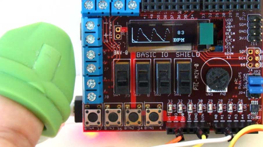
test

Exploring React Native – Part 3

Previously, in “Exploring React Native (Continued Part 2)”, we continued to work on our simple app. The code for the app was long and was all located in one file after the article, “Exploring React Native (Continued Part 1)”. Being that React Native uses native components as building blocks, we decided to break down each part of the app into custom components. There was a custom component for our images, texts, and buttons. Then we used React Native’s View component to create cards for each subject and learned the different ways to style components.

In this article, we will continue to work on our project implementing the TextInput component provided by React Native. Then we will use some JavaScript functions to convert the counter into the correct data type.

Let’s get started!

Built In Components

I will be working on a Mac using Visual Studio Code as my editor, run the app on the iOS simulator and will be working with the “FirstRNProject” project. If you are using Windows or are targeting Android, I will test the app on the Android emulator at the end of the article. This code will also work if you are using Expo and will also be tested later on.

If you are starting with a new React Native or Expo project or didn’t follow the previous article, here is the project structure:

Here is the code:

App.js

import React, { Component } from 'react';
import Main from './src/screens/Main'
class App extends Component {
render() {
return <Main />
}
}
export default App;

Main.js

import React, { Component } from 'react';
import { ScrollView, StyleSheet, View } from 'react-native';
import OurImage from '../components/OurImage';
import Question from '../components/Question';
import Counter from '../components/Counter';
import OurButton from '../components/OurButton';
const styles = StyleSheet.create({
container: {
flex: 1,
backgroundColor: '#bff0d4',
paddingTop: 20
},
cardStyle: {
borderColor: '#535B60',
borderWidth: 2,
margin: 20,
borderRadius: 10,
},
buttonRow: {
flexDirection: 'row',
alignSelf: 'center'
}
});
class Main extends Component {
state = {
raccoons: 0,
pigeons: 0
};
//Raccoon Functions
addRaccoons = () => {
this.setState({
raccoons: this.state.raccoons + 1
})
}
removeRaccoons = () => {
if(this.state.raccoons !== 0){
this.setState({
raccoons: this.state.raccoons - 1
})
}
}
//Pigeon Functions
addPigeons = () => {
this.setState({
pigeons: this.state.pigeons + 1
})
}
removePigeons = () => {
if(this.state.pigeons !== 0){
this.setState({
pigeons: this.state.pigeons - 1
})
}
}
render() {
return (
<ScrollView style={styles.container}>
{/* Raccoon */}
<View style={styles.cardStyle}>
<OurImage imageSource={require('../img/raccoon.png')} />
<Question question='How many raccoons did you see last night?' />
<Counter count={this.state.raccoons} />
{/* Raccoon Button */}
<View style={styles.buttonRow}>
<OurButton buttonColor='#9FC4AD'
onPressed={this.addRaccoons}
text='PLUS'
/>
<OurButton buttonColor='#BAAAC4'
onPressed={this.removeRaccoons}
text='MINUS'
/>
</View>
</View>
{/* Pigeon */}
<View style={[styles.cardStyle, {marginBottom: 60}]}>
<OurImage imageSource={{ uri: 'http://cdn.pixabay.com/photo/2012/04/02/12/43/pigeon-24391_1280.png' }} />
<Question question='How many pigeons did you see today?' />
<Counter count={this.state.pigeons} />
{/* Pigeon Buttons */}
<View style={styles.buttonRow}>
<OurButton buttonColor='#9FC4AD'
onPressed={this.addPigeons}
text='PLUS'
/>
<OurButton buttonColor='#BAAAC4'
onPressed={this.removePigeons}
text='MINUS'
/>
</View>
</View>
</ScrollView>
)
}
}
export default Main;

OurImage.js

import React from 'react';
import { Image, StyleSheet } from 'react-native';
const styles = StyleSheet.create({
image: {
height: 200,
width: 200,
alignSelf: 'center'
}
})
const OurImage = ({ imageSource }) => (
<Image style={styles.image} resizeMode='contain' source={imageSource} />
);
export default OurImage;

Question.js

import React from 'react';
import { StyleSheet, Text } from 'react-native';
const styles = StyleSheet.create({
question: {
fontSize: 30,
fontWeight: 'bold',
textAlign: 'center',
color: '#535B60',
padding: 10
},
})
const Question = ({ question }) => (
<Text style={styles.question}>{question}</Text>
);
export default Question;

Count.js

import React from 'react';
import { StyleSheet, Text } from 'react-native';
const styles = StyleSheet.create({
number: {
fontSize: 60,
fontWeight: 'bold',
textAlign: 'center',
color: '#535B60',
padding: 10
},
})
const Counter = ({ count }) => (
<Text style={styles.number} >{count}</Text>
);
export default Counter;

OurButton.js

import React from 'react';
import { StyleSheet, Text, TouchableOpacity } from 'react-native';
const styles = StyleSheet.create({
buttonStyling: {
width: 150,
borderRadius: 10,
margin: 5,
alignSelf: 'center'
},
buttonText: {
fontSize: 30,
fontWeight: 'bold',
textAlign: 'center',
color: '#535B60'
},
})
const OurButton = ({ buttonColor, onPressed, text }) => (
<TouchableOpacity onPress={onPressed} style={[styles.buttonStyling, {backgroundColor:buttonColor}]} >
<Text style={styles.buttonText}>{text}</Text>
</TouchableOpacity>
);
export default OurButton;

Here is how the app looked:

The app looks great, the code is clean and we have custom components. What we will be doing is giving the user the option to change the counter with the keyboard. This will be done with React Native’s TextInput component. According to React Native’s documentation, “A foundational component for inputting text into the app via a keyboard. Props provide configurability for several features, such as auto-correction, auto-capitalization, placeholder text, and different keyboard types, such as a numeric keypad.”

Open the “Counter.js” file and import TextInput from React Native. Then delete the Text component and replace that with the TextInput component like this:

import React from 'react';
import { StyleSheet, Text, TextInput } from 'react-native';
const styles = StyleSheet.create({
number: {
fontSize: 60,
fontWeight: 'bold',
textAlign: 'center',
color: '#535B60',
padding: 10
},
})
const Counter = ({ count }) => (
<TextInput />
);
export default Counter;

Save the file and reload.

Hey what happened to the zero? Well, TextInput requires a that a value prop be passed. Give the component a prop of “value” that is equal to the count.

<TextInput value={count} />

Nothing appears. If you look at the bottom of the screen, you will see that there is a warning. The warning says that the value of TextInput must be a string. In order for the TextInput component to work, we will need to use some JavaScript. The plan is to change the data from a number to a string. Then when the buttons are pressed we will convert the string to number then back to string. Hopefully this works.

Start by changing the data in state from a number to a string. Go to “Main.js” and simply put the quotes around the zero, like this:

state = {
raccoons: '0',
pigeons: '0'
};

Save and reload the file to see that the zeroes appear again.

We have lost our styling. Let’s add styling to the TextInput component in “Counter.js” by passing the style prop.

const styles = StyleSheet.create({
number: {
fontSize: 60,
fontWeight: 'bold',
textAlign: 'center',
color: '#535B60',
padding: 10
},
})
const Counter = ({ count }) => (
<TextInput
style={styles.number}
value={count}
/>
);

If we save the file and reload the app, the zeroes will appear with the styling we had before.

But if you try using the “PLUS” button, it will concatenate a one to the end of the text every time you press it. And if you use the “MINUS” button, the text will disappear and a warning will pop up.

For the raccoon section I used the “PLUS” button and for the pigeon section I used the “MINUS” button. These were my results:

Go to “Main.js” and we will start with the “addRaccoons” function. Create a variable named “num”, before “this.setState”. This variable will be equal to “parseInt({this.state.raccoons}) + 1”.  JavaScript comes with some built in functions, similarly to how React Native comes with built in components. We are using the function “parseInt()” to convert “{this.state.raccoons}” from a string to a number, then add one. After, we will set “num” equal to “num.toString()”. Here we are using another JavaScript function “toString()”. This function converts a number to a string. Now that “num” is a string again, we can now use “this.setState” to have “raccoons” set to “num”.

//Raccoon Functions
addRaccoons = () => {
let num = parseInt(this.state.raccoons) + 1;
num = num.toString();
this.setState({
raccoons: num
})
}

Save the file and reload the app:

Cool! The button is working and we can implement this to the “addPigeons” function, just remember to use “{this.state.pigeons}”. Now the “PLUS” buttons for the raccoon and pigeon section will work but the “MINUS” will still cause the app to give a warning.

//Pigeon Functions
addPigeons = () => {
let num = parseInt(this.state.pigeons) + 1;
num = num.toString();
this.setState({
pigeons: num
})
}

Go to “removeRaccoons” and start by creating a variable named “num”. This variable will be equal to “parseInt(this.state.raccoons)”. Then replace “{this.state.raccoons}” with “num” in the if condition. If “num” is not equal to zero, set “num” to “num – 1” and then convert it to a string. Last thing to do is set “{this.state.raccoons}” to “num”.

Here is the code:

removeRaccoons = () => {
let num = parseInt(this.state.raccoons);
if(num !== 0){
num = num - 1;
num = num.toString();
this.setState({
raccoons: num
})
}
}

The counter for the raccoon is working again. Let’s go and add this logic to the “removePigeons” function. Again, remember to use “this.state.pigeons” or the button will not work correctly.

Here are the four functions for the raccoon and pigeon buttons:

//Raccoon Functions
addRaccoons = () => {
let num = parseInt(this.state.raccoons) + 1;
num = num.toString();
this.setState({
raccoons: num
})
}
removeRaccoons = () => {
let num = parseInt(this.state.raccoons);
if(num !== 0){
num = num - 1;
num = num.toString();
this.setState({
raccoons: num
})
}
}
//Pigeon Functions
addPigeons = () => {
let num = parseInt(this.state.pigeons) + 1;
num = num.toString();
this.setState({
pigeons: num
})
}
removePigeons = () => {
let num = parseInt(this.state.pigeons);
if(num !== 0){
num = num - 1;
num = num.toString();
this.setState({
pigeons: num
})
}
}

Next what we want to do is choose the keyboard type of TextInput component. By default, the keyboard consist of the alphabet but we don’t need letters.

Go back to “Counter.js” and pass the TextInput component the following prop, “keyboard=’numeric’”.

<TextInput
style={styles.number}
value={count}
keyboardType='numeric'
/>

To test that the correct keyboard appears, save and reload the app. Then press on zero and the keyboard will appear. If the keyboard does not appear in the iOS simulator, click on “Hardware” menu and head to “Keyboard”. Then select “Toggle Software Keyboard”. Or on your computer’s keyboard, press “Command” and “K”.

It looks fine when editing the raccoon’s counter but we can’t see the text field when editing the pigeon’s counter. We need the text fields to move up when the keyboard pops up. Luckily, React Native has a component named KeyboardAvoidingView which we can use. This component, according to the React Native documentation, “is a component to solve the common problem of views that need to move out of the way of the virtual keyboard. It can automatically adjust either its position or bottom padding based on the position of the keyboard.”

First, import KeyboardAvoidingView from React Native. Then inside the render function, wrap the entire JSX code with KeyboardAvoidingView. Give this component a style prop equal to “flex: 1” and a behavior prop equal to “padding”.

import { KeyboardAvoidingView, ScrollView, StyleSheet, View } from 'react-native';
<KeyboardAvoidingView style={{ flex: 1 }} behavior="padding">
<ScrollView style={styles.container}>
{/* Raccoon */}
<View style={styles.cardStyle}>
<OurImage imageSource={require('../img/raccoon.png')} />
<Question question='How many raccoons did you see last night?' />
<Counter count={this.state.raccoons} />
{/* Raccoon Button */}
<View style={styles.buttonRow}>
<OurButton buttonColor='#9FC4AD'
onPressed={this.addRaccoons}
text='PLUS'
/>
<OurButton buttonColor='#BAAAC4'
onPressed={this.removeRaccoons}
text='MINUS'
/>
</View>
</View>
{/* Pigeon */}
<View style={[styles.cardStyle, {marginBottom: 60}]}>
<OurImage imageSource={{ uri: 'http://cdn.pixabay.com/photo/2012/04/02/12/43/pigeon-24391_1280.png' }} />
<Question question='How many pigeons did you see today?' />
<Counter count={this.state.pigeons} />
{/* Pigeon Buttons */}
<View style={styles.buttonRow}>
<OurButton buttonColor='#9FC4AD'
onPressed={this.addPigeons}
text='PLUS'
/>
<OurButton buttonColor='#BAAAC4'
onPressed={this.removePigeons}
text='MINUS'
/>
</View>
</View>
</ScrollView>
</KeyboardAvoidingView>

Save the file and reload the app. Try selecting the text input for the pigeon and notice that it moves up above the keyboard.

Much better! Now, we need to work on the handling the user input. If you are to press a number, you will see that the zero remains. TextInput has a prop called onChangeText, which we need to implement.

Go to “Counter.js” and add the prop onChangeText, we will set this equal to “handleText”. “handleText” will be a prop that is passed to “Counter.js” from “Main.js”

Counter.js

const Counter = ({ count, handleText }) => (
<TextInput
style={styles.number}
value={count}
keyboardType='numeric'
onChangeText={handleText}
/>
);

Then in “Main.js”, head to the Counter component and give it the prop “handleText”. We will have this prop equal an arrow function which takes the users input and sets the state equal to it.

Main.js

<Counter
count={this.state.raccoons}
handleText={(text) => this.setState({ raccoons: text})}
/>

Now when we use the keyboard to enter a number, the text will change.

Cool! We can change the text by pressing on the keyboard. Yes, the zero is front of the numbers doesn’t look nice but it is working. We can even use our buttons to increase or decrease the value. We won’t worry about the zero for now, instead let’s implement the “handleText” for the pigeon section.

<Counter
count={this.state.pigeons}
handleText={(text) => this.setState({ pigeons: text})}
/>

Save the file and reload to test the pigeon section.

Great! It works here too. At this point we know the app works on the iOS simulator, let’s go ahead and test it on Android first then in Expo.

Here is how it looks on Android:

Woah! That was unexpected. If we go back to the React Native document on behavior prop for KeyboardAvoidingView, it states that, “Note: Android and iOS both interact with this prop differently. Android may behave better when given no behavior prop at all, whereas iOS is the opposite.” Therefore, it is the behavior prop that is passed to KeyboardAvoidingView that is causing the spacing between the keyboard and the text input.

What we can do is check on which phone the app is running. We first import Platform and create a variable called “paddingBehavior”. This variable will check to see if the app is running on iOS and if it is then “paddingBehavior = ‘padding’”, else it is equal to ‘’. Using this variable, have “behavior={paddingBehavior}”.

import { KeyboardAvoidingView, Platform, ScrollView, StyleSheet, View } from 'react-native';
const paddingBehavior = Platform.OS === 'ios' ? 'padding' : '';
<KeyboardAvoidingView style={{ flex: 1 }} behavior={paddingBehavior}>

Save the file and reload the app.

Works much better! Time to test on Expo. After copying the code into the Expo project and running the app, here is what I got:

Nice! The app is working great in Expo as well. Here are the two files worked on throughout this article.

Main.js

1. import React, { Component } from 'react';
2. import { KeyboardAvoidingView, Platform, ScrollView, StyleSheet, View } from 'react-native';
import OurImage from '../components/OurImage';
import Question from '../components/Question';
import Counter from '../components/Counter';
import OurButton from '../components/OurButton';
const paddingBehavior = Platform.OS === 'ios' ? 'padding' : '';
const styles = StyleSheet.create({
container: {
flex: 1,
backgroundColor: '#bff0d4',
paddingTop: 20
},
cardStyle: {
borderColor: '#535B60',
borderWidth: 2,
margin: 20,
borderRadius: 10,
},
buttonRow: {
flexDirection: 'row',
alignSelf: 'center'
}
});
class Main extends Component {
state = {
raccoons: '0',
pigeons: '0'
};
//Raccoon Functions
addRaccoons = () => {
let num = parseInt(this.state.raccoons) + 1;
num = num.toString();
this.setState({
raccoons: num
})
}
removeRaccoons = () => {
let num = parseInt(this.state.raccoons);
if(num !== 0){
num = num - 1;
num = num.toString();
this.setState({
raccoons: num
})
}
}
//Pigeon Functions
addPigeons = () => {
let num = parseInt(this.state.pigeons) + 1;
num = num.toString();
this.setState({
pigeons: num
})
}
removePigeons = () => {
let num = parseInt(this.state.pigeons);
if(num !== 0){
num = num - 1;
num = num.toString();
this.setState({
pigeons: num
})
}
}
render() {
return (
<KeyboardAvoidingView style={{ flex: 1 }} behavior={paddingBehavior}>
<ScrollView style={styles.container}>
{/* Raccoon */}
<View style={styles.cardStyle}>
<OurImage imageSource={require('../img/raccoon.png')} />
<Question question='How many raccoons did you see last night?' />
<Counter
count={this.state.raccoons}
handleText={(text) => this.setState({ raccoons: text})}
/>
{/* Raccoon Button */}
<View style={styles.buttonRow}>
<OurButton buttonColor='#9FC4AD'
onPressed={this.addRaccoons}
text='PLUS'
/>
<OurButton buttonColor='#BAAAC4'
onPressed={this.removeRaccoons}
text='MINUS'
/>
</View>
</View>
{/* Pigeon */}
<View style={[styles.cardStyle, {marginBottom: 60}]}>
<OurImage imageSource={{ uri: 'http://cdn.pixabay.com/photo/2012/04/02/12/43/pigeon-24391_1280.png' }} />
<Question question='How many pigeons did you see today?' />
<Counter
count={this.state.pigeons}
handleText={(text) => this.setState({ pigeons: text})}
/>
{/* Pigeon Buttons */}
<View style={styles.buttonRow}>
<OurButton buttonColor='#9FC4AD'
onPressed={this.addPigeons}
text='PLUS'
/>
<OurButton buttonColor='#BAAAC4'
onPressed={this.removePigeons}
text='MINUS'
/>
</View>
</View>
</ScrollView>
</KeyboardAvoidingView>
)
}
}
export default Main;

Counter.js

import React from 'react';
import { StyleSheet, Text, TextInput } from 'react-native';
const styles = StyleSheet.create({
number: {
fontSize: 60,
fontWeight: 'bold',
textAlign: 'center',
color: '#535B60',
padding: 10
},
})
const Counter = ({ count, handleText }) => (
<TextInput
style={styles.number}
value={count}
keyboardType='numeric'
onChangeText={handleText}
/>
);
export default Counter;

These two files were the only files we worked on in this article, if you need the others, please check the beginning of the article.

Great job! We added the TextInput component to allow a user to use the keyboard to edit the counter data. We also used some JavaScript functions to convert the counter from a string to a number and back to a string because TextInput only worked with strings. The buttons still work and can be used to controlled the counter. We also added KeyboardAvoidingView to allow us to always see the text input field when the keyboard pops up. This caused an issue on Android because different props have different affects on specific platforms. To resolve this issue, we created a variable that checked the platform on which the app is running on.

Until next time, please try to go over the code and make changes to better understand the topics that were covered here.

Exploring React Native – Part 2

Previously, in “Exploring React Native (Continued Part 1), we continued to work on our simple app. The app initially consisted of an Image component, Text components, state with data, a couple of TouchableOpacity buttons and styling. The app was to keep track of the number of raccoons the user saw but we wanted to add to it. So, we add a new set of components to track the number of pigeons and added the ScrollView component for scrolling. We used the View component to build cards for each animal and learned different ways to pass styling to components.

In this article, we will learn how to create our own components. Components are the building block of React Native. They come built in but they can also be created. As stated on the React Native documentation, “When you’re building a React Native app, you’ll be making new components a lot. Anything you see on the screen is some sort of component. A component can be pretty simple – the only thing that’s required is a render function which returns some JSX to render.”

At the end of the previous article, all our code was in the “App.js” file. Our code was long and we used the same components for the each animal. We will structure our project by creating folders and files, then grouping them by type.

Let’s get started!

Creating Our Components

I will be working on a Mac using Visual Studio Code as my editor, run the app on the iOS simulator and will be working with the “FirstRNProject” project. If you are using Windows or are targeting Android, I will test the app on the Android emulator at the end of the article. This code will also work if you are using Expo and will also be tested later on.

If you are starting with a new React Native or Expo project or didn’t follow the previous article, here is the code:

App.js

import React, { Component } from 'react';
import { Button, Image, ScrollView, StyleSheet, Text, TouchableOpacity, View } from 'react-native';
const styles = StyleSheet.create({
container: {
flex: 1,
backgroundColor: '#bff0d4',
paddingTop: 20
},
image: {
height: 200,
width: 200,
alignSelf: 'center'
},
question: {
fontSize: 30,
fontWeight: 'bold',
textAlign: 'center',
color: '#535B60',
padding: 10
},
number: {
fontSize: 60,
fontWeight: 'bold',
textAlign: 'center',
color: '#535B60',
padding: 10
},
plusButton: {
backgroundColor: '#9FC4AD',
width: 150,
borderRadius: 10,
margin: 5,
alignSelf: 'center'
},
minusButton: {
backgroundColor: '#BAAAC4',
width: 150,
borderRadius: 10,
margin: 5,
alignSelf: 'center'
},
buttonText: {
fontSize: 30,
fontWeight: 'bold',
textAlign: 'center',
color: '#535B60'
},
cardStyle: {
borderColor: '#535B60',
borderWidth: 2,
margin: 20,
borderRadius: 10,
},
buttonRow: {
flexDirection: 'row',
alignSelf: 'center'
}
});
class App extends Component {
state = {
raccoons: 0,
pigeons: 0
};
//Raccoon Functions
addRaccoons = () => {
this.setState({
raccoons: this.state.raccoons + 1
})
}
removeRaccoons = () => {
if(this.state.raccoons !== 0){
this.setState({
raccoons: this.state.raccoons - 1
})
}
}
//Pigeon Functions
addPigeons = () => {
this.setState({
pigeons: this.state.pigeons + 1
})
}
removePigeons = () => {
if(this.state.pigeons !== 0){
this.setState({
pigeons: this.state.pigeons - 1
})
}
}
render() {
return (
<ScrollView style={styles.container}>
{/* Raccoon */}
<View style={styles.cardStyle}>
<Image style={styles.image} resizeMode='contain' source={require('./img/raccoon.png')} />
<Text style={styles.question} >How many raccoons did you see last night?</Text>
<Text style={styles.number}>{this.state.raccoons}</Text>
{/* Raccoon Button */}
<View style={styles.buttonRow}>
<TouchableOpacity onPress={this.addRaccoons} style={styles.plusButton} >
<Text style={styles.buttonText}>PLUS</Text>
</TouchableOpacity>
<TouchableOpacity onPress={this.removeRaccoons} style={styles.minusButton}>
<Text style={styles.buttonText}>MINUS</Text>
</TouchableOpacity>
</View>
</View>
{/* Pigeon */}
<View style={[styles.cardStyle, {marginBottom: 60}]}>
<Image style={styles.image} resizeMode='contain' source={{ uri: 'http://cdn.pixabay.com/photo/2012/04/02/12/43/pigeon-24391_1280.png' }} />
<Text style={styles.question} >How many pigeons did you see today?</Text>
<Text style={styles.number}>{this.state.pigeons}</Text>
{/* Pigeon Buttons */}
<View style={styles.buttonRow}>
<TouchableOpacity onPress={this.addPigeons} style={styles.plusButton} >
<Text style={styles.buttonText}>PLUS</Text>
</TouchableOpacity>
<TouchableOpacity onPress={this.removePigeons} style={styles.minusButton}>
<Text style={styles.buttonText}>MINUS</Text>
</TouchableOpacity>
</View>
</View>
</ScrollView>
)
}
}
export default App;

Our app looked like this:

As you can see the app looks great but the code is long and somewhat complicated. We are going to create our own components for the image, texts and buttons.

First begin by creating a folder inside the project, called “src”. Inside of the “src” folder, create two more folders, one called “components” and one called “screens”. I have seen others name their “src” folder, “app”, and their “screens” folder, “container”. I prefer “src” and “screens” but you can go with “app” and “container” if you would like.

Here is my project:

Now inside of the “components” folder, let’s create a files for the image, question, counter and buttons. We will named them “OurImage.js”, “Question.js”, “Counter.js” and “Button.js”. Then create a file inside of the “screens” folder called “Main.js”. Also take the “img” folder and move inside of the “src” folder.

Let’s start with the “Main.js” file. Copy everything from “App.js” and paste it into “Main.js”. Then go back to “App.js” and delete the imports from React Native, the styles, state, functions for the buttons and everything that is returned in the render function. What you are left with is:

import React, {Component} from 'react';
class App extends Component {
render() {
return (
);
}
}
export default App;

If you try running the app right now, you will get an error because nothing is being returned in the render function. What we will do is, instead of using a built in component, we will return our main screen, “Main.js”. First import the “Main.js” file located inside the “screens” folder like this:

import Main from ‘./src/screens/Main’;

It is similar to importing built in components from React Native. Now inside the render functions add the following tag:

<Main />

Your “App.js” file should look like this:

import React, {Component} from 'react';
import Main from './src/screens/Main'
class App extends Component {
render() {
return (
<Main />
);
}
}
export default App;

Try running the app again and you will notice there is still an error. The problem is that we need to change the class and export names in the “Main.js” file from “App” to “Main”.

import React, { Component } from 'react';
import { Button, Image, ScrollView, StyleSheet, Text, TouchableOpacity, View } from 'react-native';
const styles = StyleSheet.create({
container: {
flex: 1,
backgroundColor: '#bff0d4',
paddingTop: 20
},
image: {
height: 200,
width: 200,
alignSelf: 'center'
},
question: {
fontSize: 30,
fontWeight: 'bold',
textAlign: 'center',
color: '#535B60',
padding: 10
},
number: {
fontSize: 60,
fontWeight: 'bold',
textAlign: 'center',
color: '#535B60',
padding: 10
},
plusButton: {
backgroundColor: '#9FC4AD',
width: 150,
borderRadius: 10,
margin: 5,
alignSelf: 'center'
},
minusButton: {
backgroundColor: '#BAAAC4',
width: 150,
borderRadius: 10,
margin: 5,
alignSelf: 'center'
},
buttonText: {
fontSize: 30,
fontWeight: 'bold',
textAlign: 'center',
color: '#535B60'
},
cardStyle: {
borderColor: '#535B60',
borderWidth: 2,
margin: 20,
borderRadius: 10,
},
buttonRow: {
flexDirection: 'row',
alignSelf: 'center'
}
});
class Main extends Component {
state = {
raccoons: 0,
pigeons: 0
};
//Raccoon Functions
addRaccoons = () => {
this.setState({
raccoons: this.state.raccoons + 1
})
}
removeRaccoons = () => {
if(this.state.raccoons !== 0){
this.setState({
raccoons: this.state.raccoons - 1
})
}
}
//Pigeon Functions
addPigeons = () => {
this.setState({
pigeons: this.state.pigeons + 1
})
}
removePigeons = () => {
if(this.state.pigeons !== 0){
this.setState({
pigeons: this.state.pigeons - 1
})
}
}
render() {
return (
<ScrollView style={styles.container}>
{/* Raccoon */}
<View style={styles.cardStyle}>
<Image style={styles.image} resizeMode='contain' source={require('./img/raccoon.png')} />
<Text style={styles.question} >How many raccoons did you see last night?</Text>
<Text style={styles.number}>{this.state.raccoons}</Text>
{/* Raccoon Button */}
<View style={styles.buttonRow}>
<TouchableOpacity onPress={this.addRaccoons} style={styles.plusButton} >
<Text style={styles.buttonText}>PLUS</Text>
</TouchableOpacity>
<TouchableOpacity onPress={this.removeRaccoons} style={styles.minusButton}>
<Text style={styles.buttonText}>MINUS</Text>
</TouchableOpacity>
</View>
</View>
{/* Pigeon */}
<View style={[styles.cardStyle, {marginBottom: 60}]}>
<Image style={styles.image} resizeMode='contain' source={{ uri: 'http://cdn.pixabay.com/photo/2012/04/02/12/43/pigeon-24391_1280.png' }} />
<Text style={styles.question} >How many pigeons did you see today?</Text>
<Text style={styles.number}>{this.state.pigeons}</Text>
{/* Pigeon Buttons */}
<View style={styles.buttonRow}>
<TouchableOpacity onPress={this.addPigeons} style={styles.plusButton} >
<Text style={styles.buttonText}>PLUS</Text>
</TouchableOpacity>
<TouchableOpacity onPress={this.removePigeons} style={styles.minusButton}>
<Text style={styles.buttonText}>MINUS</Text>
</TouchableOpacity>
</View>
</View>
</ScrollView>
)
}
}
export default Main;

Reload the app and you still get an error. This is because in the “Main.js”, the Image component can not locate the raccoon image. Change the source location to:

<Image style={styles.image} resizeMode='contain' source={require('../img/raccoon.png')} />

The “..” at the beginning means that the file is located outside of the current folder and the rest of the code states that it is located in the “img” folder and is called “raccoon.png”. If the “img” folder is still outside of “src”, the location will be “../../img/raccoon.png”.

I reloaded the app and was still getting an error regarding the image location, so I closed the Metro Bundler and ran the project again. This time it worked and here is the app again:

Ok, cool. Things are working again. Let’s first work on the image component. Open up the “OurImage.js” file inside of “components” and paste this code in it:

import React from 'react';
import { Image, StyleSheet } from 'react-native';
const styles = StyleSheet.create({
})
const OurImage = () => (
);
export default OurImage;

As you can probably tell, this is a bit different. We import Image and StyleSheet from React Native, create the styles variable and export but we do not create a class. The reason for this is because this will be a stateless component. A stateless component is one that will not use lifecycle hooks, which we have not talked about yet, and has no state.

Copy the image styling from “Main.js” and paste it here. Then copy the Image component from “Main.js” and paste it here as well.

import React from 'react';
import { Image, StyleSheet } from 'react-native';
const styles = StyleSheet.create({
image: {
height: 200,
width: 200,
alignSelf: 'center'
}
})
const OurImage = () => (
<Image style={styles.image} resizeMode='contain' source={require('../img/raccoon.png')} />
);
export default OurImage;

Go into “Main.js”, import OurImage component and replace the Image tags with OurImage.

import { Button, Image, ScrollView, StyleSheet, Text, TouchableOpacity, View } from 'react-native';
import OurImage from '../components/OurImage';
const styles = StyleSheet.create({
image: {
height: 200,
width: 200,
alignSelf: 'center'
},
});
class Main extends Component {
render() {
return (
<ScrollView style={styles.container}>
{/* Raccoon */}
<View style={styles.cardStyle}>
<OurImage style={styles.image} resizeMode='contain' source={require('../img/raccoon.png')} />
{/* Pigeon */}
<View style={[styles.cardStyle, {marginBottom: 60}]}>
<OurImage style={styles.image} resizeMode='contain' source={{ uri: 'http://cdn.pixabay.com/photo/2012/04/02/12/43/pigeon-24391_1280.png' }} />
<Text style={styles.question} >How many pigeons did you see today?</Text>

Reload the app and now we have two raccoon images. Before continuing, let’s clean the code in “Main.js” by removing “image” from styles and the Image component import from React Native. Then inside the OurImage tags remove the style and “resizeMode” props. Rename the source prop to “imageSource”.

I realized that we have not discussed what props are. Props are properties that can be passed from a parent to child component. Certain components like View, do not need props but can take them, such as style. Other components like Image, need props or else they will not work. The built in Image component needs at least a source location for its image and possibly dimensions depending on the type of image.

{/* Raccoon */}
<OurImage imageSource={require('../img/raccoon.png')} />
{/* Pigeon */}
<View style={[styles.cardStyle, {marginBottom: 60}]}>
<OurImage imageSource={{ uri: 'http://cdn.pixabay.com/photo/2012/04/02/12/43/pigeon-24391_1280.png' }} />

In the “OurImage.js” file we will pass “imageSource” to “source”.

const OurImage = ({ imageSource }) => (
<Image style={styles.image} resizeMode='contain' source={imageSource} />
);

Save both files and reload the app. We have the correct images again. Next component we will tackle is the question component. Inside of “Question.js” add the following:

import React from 'react';
import { StyleSheet, Text } from 'react-native';
const styles = StyleSheet.create({
question: {
fontSize: 30,
fontWeight: 'bold',
textAlign: 'center',
color: '#535B60',
padding: 10
},
})
const Question = ({ question }) => (
<Text style={styles.question}>{question}</Text>
);
export default Question ;

This is similar to the OurImage component. First import the necessary components from React Native. Then I went ahead and copied the styling from “Main.js” file. After that, create the const Question, which will get a “question” prop, and add a Text component with the “question” prop. Going back to “Main.js”, import Question component and replace both question texts with a Question component, passing it a prop, “question”.

Here is “Main.js”:

import Question from '../components/Question';
{/* Raccoon */}
<View style={styles.cardStyle}>
<OurImage imageSource={require('../img/raccoon.png')} />
<Question question='How many raccoons did you see last night?' />
<Text style={styles.number}>{this.state.raccoons}</Text>
{/* Raccoon Button */}
<View style={styles.buttonRow}>
<TouchableOpacity onPress={this.addRaccoons} style={styles.plusButton} >
<Text style={styles.buttonText}>PLUS</Text>
</TouchableOpacity>
<TouchableOpacity onPress={this.removeRaccoons} style={styles.minusButton}>
<Text style={styles.buttonText}>MINUS</Text>
</TouchableOpacity>
</View>
</View>
{/* Pigeon */}
<View style={[styles.cardStyle, {marginBottom: 60}]}>
<OurImage imageSource={{ uri: 'http://cdn.pixabay.com/photo/2012/04/02/12/43/pigeon-24391_1280.png' }} />
<Question question='How many pigeons did you see today?' />

And “Question.js”:

import React from 'react';
import { StyleSheet, Text } from 'react-native';
const styles = StyleSheet.create({
question: {
fontSize: 30,
fontWeight: 'bold',
textAlign: 'center',
color: '#535B60',
padding: 10
},
})
const Question = ({ question }) => (
<Text style={styles.question}>{question}</Text>
);
export default Question ;

Next component we will work on is the Counter component. Inside of “Counter.js”, copy and paste all the code from “Question.js”. Replace “Question” with “Counter”, remove the styling and props. You should be left with this:

import React from 'react';
import { StyleSheet, Text } from 'react-native';
const styles = StyleSheet.create({
})
const Counter = ({ }) => (
<Text ></Text>
);
export default Counter;

This is a pretty good template, so go ahead, copy this and paste it in “Button.js”. We will work on that file next.

Go to “Main.js”, import Counter and replace the Text tags with Counter. Give these Counters a prop called “count” with the corresponding data. Then copy the styling and paste in “Counter.js”.

import Counter from '../components/Counter';
{/* Raccoon */}
<View style={styles.cardStyle}>
<OurImage imageSource={require('../img/raccoon.png')} />
<Question question='How many raccoons did you see last night?' />
<Counter count={this.state.raccoons} />
{/* Raccoon Button */}
<View style={styles.buttonRow}>
<TouchableOpacity onPress={this.addRaccoons} style={styles.plusButton} >
<Text style={styles.buttonText}>PLUS</Text>
</TouchableOpacity>
<TouchableOpacity onPress={this.removeRaccoons} style={styles.minusButton}>
<Text style={styles.buttonText}>MINUS</Text>
</TouchableOpacity>
</View>
</View>
{/* Pigeon */}
<View style={[styles.cardStyle, {marginBottom: 60}]}>
<OurImage imageSource={{ uri: 'http://cdn.pixabay.com/photo/2012/04/02/12/43/pigeon-24391_1280.png' }} />
<Question question='How many pigeons did you see today?' />
<Counter count={this.state.pigeons} />

Our Counter component will look like this:

import React from 'react';
import { StyleSheet, Text } from 'react-native';
const styles = StyleSheet.create({
number: {
fontSize: 60,
fontWeight: 'bold',
textAlign: 'center',
color: '#535B60',
padding: 10
},
})
const Counter = ({ count }) => (
<Text style={styles.number} >{count}</Text>
);
export default Counter;

Things are looking great! Last component we need to work on is the Button component. First import our Button component inside of “Main.js”. Then copy one of the “PLUS” buttons and paste this in “Button.js”. Then import the necessary components from React Native. Make sure you are exporting Button and have create a “const Button”.

import React from 'react';
import { StyleSheet, Text, TouchableOpacity, View } from 'react-native';
const styles = StyleSheet.create({
})
const Button = ({ }) => (
<TouchableOpacity onPress={this.addRaccoons} style={styles.plusButton} >
<Text style={styles.buttonText}>PLUS</Text>
</TouchableOpacity>
);
export default Button;

Go back to “Main.js” and replace the raccoons’ buttons with Button tags. To the Button tag pass a prop for button color, “onPress” function and text. Use ‘#9FC4AD’ for the plus button and ‘#BAAAC4’ for the minus button. It will look like this:

{/* Raccoon Button */}
<View style={styles.buttonRow}>
<Button buttonColor=’#9FC4AD’
onPressed={this.addRaccoons}
text='PLUS'
/>
<Button buttonColor=’#BAAAC4’
onPressed={this.removeRaccoons}
text='MINUS'
/>
</View>

After this, go to the Button component, add button styling from “Main.js” and pass the props to the components.

Here is what you will have:

import React from 'react';
import { StyleSheet, Text, TouchableOpacity } from 'react-native';
const styles = StyleSheet.create({
plusButton: {
backgroundColor: '#9FC4AD',
width: 150,
borderRadius: 10,
margin: 5,
alignSelf: 'center'
},
minusButton: {
backgroundColor: '#BAAAC4',
width: 150,
borderRadius: 10,
margin: 5,
alignSelf: 'center'
},
buttonText: {
fontSize: 30,
fontWeight: 'bold',
textAlign: 'center',
color: '#535B60'
},
})
const Button = ({ buttonColor, onPressed, text }) => (
<TouchableOpacity onPress={onPressed} style={[styles.plusButton, {backgroundColor:buttonColor}]} >
<Text style={styles.buttonText}>{text}</Text>
</TouchableOpacity>
);
export default Button;

To the TouchableOpacity, we will pass it an array of styles. Although the way it is right now will work, because the “backgroundColor” prop in the array is called after “styles.plusButton” and will override the background color inside of “plusButton”, I would like to rename “plusButton” to “buttonStyling”. Then delete “minusButton” from styles and remove “backgroundColor” from “buttonStyling”. Rename the style prop in TouchableOpacity and you have this:

import React from 'react';
import { StyleSheet, Text, TouchableOpacity } from 'react-native';
const styles = StyleSheet.create({
buttonStyling: {
width: 150,
borderRadius: 10,
margin: 5,
alignSelf: 'center'
},
buttonText: {
fontSize: 30,
fontWeight: 'bold',
textAlign: 'center',
color: '#535B60'
},
})
const Button = ({ buttonColor, onPressed, text }) => (
<TouchableOpacity onPress={onPressed} style={[styles.buttonStyling, {backgroundColor:buttonColor}]} >
<Text style={styles.buttonText}>{text}</Text>
</TouchableOpacity>
);
export default Button;

After saving all the files, I reload the project and got an error. The error was because I had imported Button from React Native in “Main.js” and so it needs to be removed. It may actually be best to rename “Button.js” to “OurButton.js”, this way we can distinguish between our custom button component and the built in one. Don’t forget to change “Button” to “OurButton” in “Main.js” and “OurButton.js”.

Now that the errors have been fixed, here is what I am left with:

As you can see, the buttons for the pigeon section are not correct. This is because we removed all the button’s styling from “Main.js”. Let’s delete these buttons and use our Button component instead. If you want, simply copy the raccoon buttons and pass it the correct “onPress” functions.

<OurButton buttonColor='#9FC4AD'
onPressed={this.addPigeons}
text='PLUS'
/>
<OurButton buttonColor='#BAAAC4'
onPressed={this.removePigeons}
text='MINUS'
/>

Save and reload.

Excellent! Our app is running and working correctly on iOS, let’s open up the Android emulator and make sure it is working there too.

Looking good on Android. Now, let’s test it on Expo.

Expo looking great too. At this point, I suggest going to the “Main.js” and removing components and styles that are no longer used.

Main.js

import React, { Component } from 'react';
import { ScrollView, StyleSheet, View } from 'react-native';
import OurImage from '../components/OurImage';
import Question from '../components/Question';
import Counter from '../components/Counter';
import OurButton from '../components/OurButton';
const styles = StyleSheet.create({
container: {
flex: 1,
backgroundColor: '#bff0d4',
paddingTop: 20
},
cardStyle: {
borderColor: '#535B60',
borderWidth: 2,
margin: 20,
borderRadius: 10,
},
buttonRow: {
flexDirection: 'row',
alignSelf: 'center'
}
});
class Main extends Component {
state = {
raccoons: 0,
pigeons: 0
};
//Raccoon Functions
addRaccoons = () => {
this.setState({
raccoons: this.state.raccoons + 1
})
}
removeRaccoons = () => {
if(this.state.raccoons !== 0){
this.setState({
raccoons: this.state.raccoons - 1
})
}
}
//Pigeon Functions
addPigeons = () => {
this.setState({
pigeons: this.state.pigeons + 1
})
}
removePigeons = () => {
if(this.state.pigeons !== 0){
this.setState({
pigeons: this.state.pigeons - 1
})
}
}
render() {
return (
<ScrollView style={styles.container}>
{/* Raccoon */}
<View style={styles.cardStyle}>
<OurImage imageSource={require('../img/raccoon.png')} />
<Question question='How many raccoons did you see last night?' />
<Counter count={this.state.raccoons} />
{/* Raccoon Button */}
<View style={styles.buttonRow}>
<OurButton buttonColor='#9FC4AD'
onPressed={this.addRaccoons}
text='PLUS'
/>
<OurButton buttonColor='#BAAAC4'
onPressed={this.removeRaccoons}
text='MINUS'
/>
</View>
</View>
{/* Pigeon */}
<View style={[styles.cardStyle, {marginBottom: 60}]}>
<OurImage imageSource={{ uri: 'http://cdn.pixabay.com/photo/2012/04/02/12/43/pigeon-24391_1280.png' }} />
<Question question='How many pigeons did you see today?' />
<Counter count={this.state.pigeons} />
{/* Pigeon Buttons */}
<View style={styles.buttonRow}>
<OurButton buttonColor='#9FC4AD'
onPressed={this.addPigeons}
text='PLUS'
/>
<OurButton buttonColor='#BAAAC4'
onPressed={this.removePigeons}
text='MINUS'
/>
</View>
</View>
</ScrollView>
)
}
}
export default Main;

OurImage.js

import React from 'react';
import { Image, StyleSheet } from 'react-native';
const styles = StyleSheet.create({
image: {
height: 200,
width: 200,
alignSelf: 'center'
}
})
const OurImage = ({ imageSource }) => (
<Image style={styles.image} resizeMode='contain' source={imageSource} />
);
export default OurImage ;

Question.js

import React from 'react';
import { StyleSheet, Text } from 'react-native';
const styles = StyleSheet.create({
question: {
fontSize: 30,
fontWeight: 'bold',
textAlign: 'center',
color: '#535B60',
padding: 10
},
})
const Question = ({ question }) => (
<Text style={styles.question}>{question}</Text>
);
export default Question;

Counter.js

import React from 'react';
import { StyleSheet, Text } from 'react-native';
const styles = StyleSheet.create({
number: {
fontSize: 60,
fontWeight: 'bold',
textAlign: 'center',
color: '#535B60',
padding: 10
},
})
const Counter = ({ count }) => (
<Text style={styles.number} >{count}</Text>
);
export default Counter;

OurButton.js

import React from 'react';
import { StyleSheet, Text, TouchableOpacity } from 'react-native';
const styles = StyleSheet.create({
buttonStyling: {
width: 150,
borderRadius: 10,
margin: 5,
alignSelf: 'center'
},
buttonText: {
fontSize: 30,
fontWeight: 'bold',
textAlign: 'center',
color: '#535B60'
},
})
const OurButton = ({ buttonColor, onPressed, text }) => (
<TouchableOpacity onPress={onPressed} style={[styles.buttonStyling, {backgroundColor:buttonColor}]} >
<Text style={styles.buttonText}>{text}</Text>
</TouchableOpacity>
);
export default OurButton;

Great job! We took each element of the animal card and created a reusable component. We have a component for the image, question, counter and buttons.

In the next article, we will use these custom components to add a third animal. The question will have a text input and instead of using a photo we find online, we will allow users to take a picture or use an image from the photos. Till then, make changes to this code and try to create a card component with our custom components.

Exploring React Native – Part 1.1

In the last article, titled “Exploring React Native”, we used a few components to create a simple app. The app consisted of an Image component, a couple Text components, data that changed with user interaction, and a couple of buttons created with the Button component and TouchableOpacity component.  We styled each component and at the end, had a counter app.

But there are a lot of components we did not cover and the ones we did cover, can be used in other ways. So, in this article, we will continue to use the project from the previous article to learn more about React Native’s components. The components we will be focusing on in this article are the ScrollView and View components. The ScrollView component is similar to View but allows for scrolling. The View component is one that we used in the previously but in this article, we will be using it to create sections in the app. As well, we will be passing a network image to the Image component and will learn a bit more about styling.

Let’s get started!

More Built In Components

I will be working on a Mac using Visual Studio Code as my editor, run the app on the iOS simulator and will be working with the “FirstRNProject” project. If you are using Windows or are targeting Android, I will test the app on the Android emulator at the end of the article. This code will also work if you are using Expo and will also be tested later on.

Open the App.js file and this is what we have from last time:

import React, { Component } from 'react';
import { Button, Image, StyleSheet, Text, TouchableOpacity, View } from 'react-native';
const styles = StyleSheet.create({
container: {
flex: 1,
backgroundColor: '#bff0d4',
alignItems: 'center',
},
image: {
height: 200,
width: 200,
marginTop: 100,
marginBottom: 20
},
question: {
fontSize: 30,
fontWeight: 'bold',
textAlign: 'center',
color: '#535B60',
padding: 20
},
number: {
fontSize: 60,
fontWeight: 'bold',
textAlign: 'center',
color: '#535B60',
padding: 20
},
plusButton: {
backgroundColor: '#9FC4AD',
width: 200,
borderRadius: 10,
margin: 10
},
minusButton: {
backgroundColor: '#BAAAC4',
width: 200,
borderRadius: 10,
margin: 10
},
buttonText: {
fontSize: 40,
fontWeight: 'bold',
textAlign: 'center',
color: '#535B60'
}
});
class App extends Component {
state = {
raccoons: 0
};
addMore = () => {
this.setState({
raccoons: this.state.raccoons + 1
})
}
removeOne = () => {
if(this.state.raccoons !== 0){
this.setState({
raccoons: this.state.raccoons - 1
})
}
}
render() {
return (
<View style={styles.container}>
<Image style={styles.image} resizeMode='contain' source={require('./img/raccoon.png')} />
<Text style={styles.question} >How many raccoons did you see last night?</Text>
<Text style={styles.number}>{this.state.raccoons}</Text>
<TouchableOpacity onPress={this.addMore} style={styles.plusButton} >
<Text style={styles.buttonText}>PLUS</Text>
</TouchableOpacity>
<TouchableOpacity onPress={this.removeOne} style={styles.minusButton}>
<Text style={styles.buttonText}>MINUS</Text>
</TouchableOpacity>
</View>
)
}
}
export default App;

First a quick recap of the code above.

We first imported the components we were going to use from React Native. These components were the Button, Image, StyleSheet, Text, TouchableOpacity and View components. Then we created a styles variables that contained all the styling objects we used to style the components. After that, we created a state for the counter which would change with the pressing of either “PLUS” or “MINUS” buttons. Then inside the render function we had a View component that wrapped the Image, Text and TouchableOpacity components and each was styled accordingly.

Open the Terminal or Command Prompt to run the project. If you are using Visual Studio Code, there is an “integrated terminal, initially starting at the root of your workspace.” Using this terminal, you can run the React Native iOS/Android start commands, or if using Expo, the Expo start command from the editor. You can learn more about Visual Studio Code’s terminal here, http://code.visualstudio.com/docs/editor/integrated-terminal. What you will have is the following:

The app looks great but what if we wanted to create a list of animals, each with its own image, text, counter and buttons? Well, let’s copy the components between the View tags and paste them right after the “MINUS” button but before the closing View tag. Your code will look like this:

<View style={styles.container}>
{/* Raccoon One */}
<Image style={styles.image} resizeMode='contain' source={require('./img/raccoon.png')} />
<Text style={styles.question} >How many raccoons did you see last night?</Text>
<Text style={styles.number}>{this.state.raccoons}</Text>
<TouchableOpacity onPress={this.addMore} style={styles.plusButton} >
<Text style={styles.buttonText}>PLUS</Text>
</TouchableOpacity>
<TouchableOpacity onPress={this.removeOne} style={styles.minusButton}>
<Text style={styles.buttonText}>MINUS</Text>
</TouchableOpacity>
{/* Raccoon Two */}
<Image style={styles.image} resizeMode='contain' source={require('./img/raccoon.png')} />
<Text style={styles.question} >How many raccoons did you see last night?</Text>
<Text style={styles.number}>{this.state.raccoons}</Text>
<TouchableOpacity onPress={this.addMore} style={styles.plusButton} >
<Text style={styles.buttonText}>PLUS</Text>
</TouchableOpacity>
<TouchableOpacity onPress={this.removeOne} style={styles.minusButton}>
<Text style={styles.buttonText}>MINUS</Text>
</TouchableOpacity>
</View>

When you save the file and reload the app, you will see this:

That doesn’t look right. We can barely see that there is another image of a raccoon at the bottom of the screen and we can’t scroll down to view the rest of the app. In order for the app to scroll we will use the ScrollView component. According to the React Native documentation, “The ScrollView is a generic scrolling container that can host multiple components and views.” There is another option we could use, called FlatList. The difference between the two, is that, ScrollView renders all of its children components, or the components between its tags, at once. While FlatList renders its items when they appear on the screen and removes them once off the screen. Therefore, if you have a large list, using ScrollView will slow down rendering and increase memory usage. For this app, our list will be short and ScrollView will be used but in later articles we will be using the FlatList component.

Let’s first import the ScrollView component and replace the View tags with ScrollView, save the file and reload. This is what will happen:

This error occurs because of the layout prop “alignItems: ‘center’” that is passed to the styling of the ScrollView components. To fix it remove “alignItems: ‘center’” from “container” in styles. Save the file, reload and now the app will look like this:

It’s not perfect but we can now scroll to through the app and see the second image, along with the text and buttons. To fix the styling of the images and buttons simply add “alignSelf: ‘center’” to the “image”, “plusButton” and “minusButton” styles.

image: {
height: 200,
width: 200,
marginTop: 100,
marginBottom: 20,
alignSelf: 'center'
},
plusButton: {
backgroundColor: '#9FC4AD',
width: 200,
borderRadius: 10,
margin: 10,
alignSelf: 'center'
},
minusButton: {
backgroundColor: '#BAAAC4',
width: 200,
borderRadius: 10,
margin: 10,
alignSelf: 'center'
},

Great! Everything is now centered and we can scroll.

It doesn’t make sense to keep track of the number of raccoons twice, so let’s find an image of another animal online.

If you recall, in the previous article we saved the image of the raccoon in our project under the ‘img’ folder, then passed it to the Image component. By doing so we were using a static image. The Image component can display various types of images and what I want to do now is use a network image. I went online and found an image of a pigeon and got the URL to the image.

Now if you replace the location of the second raccoon image with an URL, like this:

<Image style={styles.image} resizeMode='contain' source={require('http://cdn.pixabay.com/photo/2012/04/02/12/43/pigeon-24391_1280.png')} />

Then you will get an error like this:

That’s because, passing a network image is a little different than passing a static image. Inside of “source={}”, replace it with “{uri: ‘URL_OF_THE_IMAGE’}”. It will look like this:

<Image style={styles.image} resizeMode='contain' source={{ uri: ‘URL_OF_THE_IMAGE’ }} />

So if we replace ‘URL_OF_THE_IMAGE’ with the actual URL, we will have this:

<Image style={styles.image} resizeMode='contain' source={{ uri: 'http://cdn.pixabay.com/photo/2012/04/02/12/43/pigeon-24391_1280.png' }} />

Another key difference between static and network images is that, network images require that the dimensions of the image be specified. Our ‘image’ style object has specified width and height dimension, so our image will appear. Had those dimension not been there, the image would not be displayed.

Save the file and reload the app to get this:

Now I know not everyone likes this bird but I liked how it looked and it a bird, I would say, most people see on a regular basis. You can choose another bird or another animal entirely, it’s totally up to you. There’s just a couple more things that need changing, such as the text, adding the new counter data to the state and creating new functions for the new pigeon buttons.

Changing the text is simple, go to the Text component that corresponds to the second animal, in my case the pigeon, and change it to something like, “How many pigeons did you see today?”. Then add “pigeons: 0” to the state and replace “{this.state.raccoons}” with “{this.state.pigeons}” in the following Text component. Next we can rename the existing functions for the buttons to “addRaccoons” and “removeRaccoons” then copy and paste them right below. For the second set of functions, replace “raccoons” with “pigeons”. Remember to keep the camel case coding style and capitalize the “P” in pigeon. Also don’t forget to go to the TouchableOpacity components and rename the functions accordingly. If you are having any issues, here is the code:

class App extends Component {
state = {
raccoons: 0,
pigeons: 0
};
//Raccoon Functions
addRaccoons = () => {
this.setState({
raccoons: this.state.raccoons + 1
})
}
removeRaccoons = () => {
if(this.state.raccoons !== 0){
this.setState({
raccoons: this.state.raccoons - 1
})
}
}
//Pigeon Functions
addPigeons = () => {
this.setState({
pigeons: this.state.pigeons + 1
})
}
removePigeons = () => {
if(this.state.pigeons !== 0){
this.setState({
pigeons: this.state.pigeons - 1
})
}
}
render() {
return (
<ScrollView style={styles.container}>
{/* Raccoon */}
<Image style={styles.image} resizeMode='contain' source={require('./img/raccoon.png')} />
<Text style={styles.question} >How many raccoons did you see last night?</Text>
<Text style={styles.number}>{this.state.raccoons}</Text>
<TouchableOpacity onPress={this.addRaccoons} style={styles.plusButton} >
<Text style={styles.buttonText}>PLUS</Text>
</TouchableOpacity>
<TouchableOpacity onPress={this.removeRaccoons} style={styles.minusButton}>
<Text style={styles.buttonText}>MINUS</Text>
</TouchableOpacity>
{/* Pigeon */}
<Image style={styles.image} resizeMode='contain' source={{ uri: 'http://cdn.pixabay.com/photo/2012/04/02/12/43/pigeon-24391_1280.png' }} />
<Text style={styles.question} >How many pigeons did you see today?</Text>
<Text style={styles.number}>{this.state.pigeons}</Text>
<TouchableOpacity onPress={this.addPigeons} style={styles.plusButton} >
<Text style={styles.buttonText}>PLUS</Text>
</TouchableOpacity>
<TouchableOpacity onPress={this.removePigeons} style={styles.minusButton}>
<Text style={styles.buttonText}>MINUS</Text>
</TouchableOpacity>
</ScrollView>
)
}
}

I’ve added comments, “{/* Raccoon */}” and “{/* Pigeon */}”, to help indicate that the following set of code corresponds to a particular animal. Writing comments can help you identify sections of code, especially once the code starts to get long and complicated. One thing to note is that when commenting inside JSX, where tags are used like in the above, you need to wrap the comment inside of “{/* YOUR_COMMENT */}”. Outside of JSX, you can use “// YOUR_COMMENT” for a single line comment or “/* YOUR_COMMENT */” for a multi-line comment.

Once saved and reloaded, you will be able to scroll through the app and press the buttons to increase or decrease the counters. Here is how it will look:

Great! Let’s now work on styling the app a bit more by using React Native’s View component.

Right now the app is one continuous page with images, text and buttons. To help separate each section and make the app more user friendly, we will create a border around the raccoon and pigeon set of components. It’s like creating a card for each animal and the card contains all the content for that one subject. This can simply be done by wrapping each set of components in a View and passing it a set of styles.

First, import the View component if you deleted it and create two set of opening and closing View tags. Then copy the set of raccoon components and paste them inside the first View. Repeat for the pigeon components but paste those in the second View. This is what you should have:

<ScrollView style={styles.container}>
{/* Raccoon */}
{/* First View */}
<View>
<Image style={styles.image} resizeMode='contain' source={require('./img/raccoon.png')} />
<Text style={styles.question} >How many raccoons did you see last night?</Text>
<Text style={styles.number}>{this.state.raccoons}</Text>
<TouchableOpacity onPress={this.addRaccoons} style={styles.plusButton} >
<Text style={styles.buttonText}>PLUS</Text>
</TouchableOpacity>
<TouchableOpacity onPress={this.removeRaccoons} style={styles.minusButton}>
<Text style={styles.buttonText}>MINUS</Text>
</TouchableOpacity>
</View>
{/* Pigeon */}
{/* Second View */}
<View>
<Image style={styles.image} resizeMode='contain' source={{ uri: 'http://cdn.pixabay.com/photo/2012/04/02/12/43/pigeon-24391_1280.png' }} />
<Text style={styles.question} >How many pigeons did you see today?</Text>
<Text style={styles.number}>{this.state.pigeons}</Text>
<TouchableOpacity onPress={this.addPigeons} style={styles.plusButton} >
<Text style={styles.buttonText}>PLUS</Text>
</TouchableOpacity>
<TouchableOpacity onPress={this.removePigeons} style={styles.minusButton}>
<Text style={styles.buttonText}>MINUS</Text>
</TouchableOpacity>
</View>
</ScrollView>

We will now create a new set of styles called “cardStyle” and pass it to both View components. To “cardStyle”, we will add a border color and width. This will create the border around each set of components.

cardStyle: {
borderColor: '#535B60',
borderWidth: 2
}

Save the file and reload the app. Wait a minute, this doesn’t look right.

I can see that there is a line separating the raccoon and pigeon cards but that’s about it. We will need to style this some more.

First add “margin: 20” to “cardStyle”, this will create space between the outside of the border and the edge of the screen. We can then go into the “image” style and remove both margins.

Looking better but I don’t like the border, it’s too boxy. This is a quick fix, add “borderRadius: 10” to “cardStyle”. Also notice that the top border of the raccoon card is being cut off by the iPhone X notch. Let’s add “paddingTop: 20” to the “container” style.

Looking awesome! Our styling is as follows:

const styles = StyleSheet.create({
container: {
flex: 1,
backgroundColor: '#bff0d4',
paddingTop: 20
},
image: {
height: 200,
width: 200,
alignSelf: 'center'
},
question: {
fontSize: 30,
fontWeight: 'bold',
textAlign: 'center',
color: '#535B60',
padding: 20
},
number: {
fontSize: 60,
fontWeight: 'bold',
textAlign: 'center',
color: '#535B60',
padding: 20
},
plusButton: {
backgroundColor: '#9FC4AD',
width: 200,
borderRadius: 10,
margin: 10,
alignSelf: 'center'
},
minusButton: {
backgroundColor: '#BAAAC4',
width: 200,
borderRadius: 10,
margin: 10,
alignSelf: 'center'
},
buttonText: {
fontSize: 40,
fontWeight: 'bold',
textAlign: 'center',
color: '#535B60'
},
cardStyle: {
borderColor: '#535B60',
borderWidth: 2,
margin: 20,
borderRadius: 10,
}
});

Before continuing with styling, I would like to over the different ways you can style a component.

Although not mentioned before, you can simply pass styles to a component using inline styling. Here is an example:

<View style={{ flex: 1, borderColor: ‘red’, borderWidth: 2 }} >

Or, as we have been doing, we can put all the styling in one location and reference it when needed like this:

const styles = StyleSheet.create({
container: {
flex: 1,
borderColor: ‘red’,
borderWidth: 2
}
});
<View style={styles.cardStyle}>

Both styling methods will style the component the same, but by having the styling outside of the render function, we are making the code cleaner and easier to read.

We can also mix and use both by passing style an array, which can help has pass specific styling to only one particular component, while also passing a set of styles other components use. Here is an example:

<View style={[ styles.container, { margin: 20 } ]} >

The styling is almost perfect but I want to add a bottom margin to the pigeon’s View component because I want some spacing between the bottom of the screen and the bottom of the pigeon card. We will pass “cardStyle” and “marginBottom: 60” to only the second View component. Here is how it is done:

{/* Pigeon */}
{/* Second View */}
<View style={[styles.cardStyle, {marginBottom: 60}]}>
<Image style={styles.image} resizeMode='contain' source={{ uri: 'http://cdn.pixabay.com/photo/2012/04/02/12/43/pigeon-24391_1280.png' }} />
<Text style={styles.question} >How many pigeons did you see today?</Text>
<Text style={styles.number}>{this.state.pigeons}</Text>
<TouchableOpacity onPress={this.addPigeons} style={styles.plusButton} >
<Text style={styles.buttonText}>PLUS</Text>
</TouchableOpacity>
<TouchableOpacity onPress={this.removePigeons} style={styles.minusButton}>
<Text style={styles.buttonText}>MINUS</Text>
</TouchableOpacity>
</View>

The bottom of the pigeon card is visible. This is looking great!

Continuing to focus on styling, let’s have the two buttons placed next to each other. Here we will be using the View component again. First inside the raccoon’s View component create a View right after the counter text. Then copy and paste both TouchableOpacity components inside of the View tags. Then inside the pigeon’s View component, do the same for those buttons.

<ScrollView style={styles.container}>
{/* Raccoon */}
<View style={styles.cardStyle}>
<Image style={styles.image} resizeMode='contain' source={require('./img/raccoon.png')} />
<Text style={styles.question} >How many raccoons did you see last night?</Text>
<Text style={styles.number}>{this.state.raccoons}</Text>
{/* Raccoon Buttons */}
<View>
<TouchableOpacity onPress={this.addRaccoons} style={styles.plusButton} >
<Text style={styles.buttonText}>PLUS</Text>
</TouchableOpacity>
<TouchableOpacity onPress={this.removeRaccoons} style={styles.minusButton}>
<Text style={styles.buttonText}>MINUS</Text>
</TouchableOpacity>
</View>
</View>
{/* Pigeon */}
<View style={[styles.cardStyle, {marginBottom: 60}]}>
<Image style={styles.image} resizeMode='contain' source={{ uri: 'http://cdn.pixabay.com/photo/2012/04/02/12/43/pigeon-24391_1280.png' }} />
<Text style={styles.question} >How many pigeons did you see today?</Text>
<Text style={styles.number}>{this.state.pigeons}</Text>
{/* Pigeon Buttons */}
<View>
<TouchableOpacity onPress={this.addPigeons} style={styles.plusButton} >
<Text style={styles.buttonText}>PLUS</Text>
</TouchableOpacity>
<TouchableOpacity onPress={this.removePigeons} style={styles.minusButton}>
<Text style={styles.buttonText}>MINUS</Text>
</TouchableOpacity>
</View>
</View>
</ScrollView>

If you save the file and reload the app, you will notice that nothing happens. We will need to create a new style called “buttonRow”, pass it “flexDirection: ‘row’”, then pass this style to the buttons’ View components. By default “flexDirection” is set to column, because of this, components are stacked on top of each other. But by setting “flexDirection” to row, the components in that View will be stacked side by side.

buttonRow: {
flexDirection: 'row'
}
{/* Raccoon Button */}
<View style={styles.buttonRow}>
<TouchableOpacity onPress={this.addRaccoons} style={styles.plusButton} >
<Text style={styles.buttonText}>PLUS</Text>
</TouchableOpacity>
<TouchableOpacity onPress={this.removeRaccoons} style={styles.minusButton}>
<Text style={styles.buttonText}>MINUS</Text>
</TouchableOpacity>
</View>
{/* Pigeon Buttons */}
<View style={styles.buttonRow}>
<TouchableOpacity onPress={this.addPigeons} style={styles.plusButton} >
<Text style={styles.buttonText}>PLUS</Text>
</TouchableOpacity>
<TouchableOpacity onPress={this.removePigeons} style={styles.minusButton}>
<Text style={styles.buttonText}>MINUS</Text>
</TouchableOpacity>
</View>

Now the app looks like this:

Oh no! The buttons don’t fit properly. Let’s make the buttons smaller by changing the text’s size and decreasing its width.

plusButton: {
backgroundColor: '#9FC4AD',
width: 150,
borderRadius: 10,
margin: 10,
alignSelf: 'center'
},
minusButton: {
backgroundColor: '#BAAAC4',
width: 150,
borderRadius: 10,
margin: 10,
alignSelf: 'center'
},
buttonText: {
fontSize: 30,
fontWeight: 'bold',
textAlign: 'center',
color: '#535B60'
},

Better but still needs work. We can decrease the button’s margins and center the button’s View component.

plusButton: {
backgroundColor: '#9FC4AD',
width: 150,
borderRadius: 10,
margin: 5,
alignSelf: 'center'
},
minusButton: {
backgroundColor: '#BAAAC4',
width: 150,
borderRadius: 10,
margin: 5,
alignSelf: 'center'
},
buttonText: {
fontSize: 30,
fontWeight: 'bold',
textAlign: 'center',
color: '#535B60'
},
buttonRow: {
flexDirection: 'row',
alignSelf: 'center'
}

At this point, the app looks wonderful but I have tested our code only on the iOS simulator. I want to make sure for those using Windows or targeting Android, that we have the same results. After opening the Android emulator and running the project, I have this:

The app works! I knew it would but there are times that certain components appear differently on iOS than they do on Android. We saw these differences when working with React Native’s Button component. But in this case, the app looks and works the same on both Android and iOS.

Now for those using Expo, I mentioned at the beginning that the code used in this project would also work for you guys. To ensure this is true, I am going to copy the code and paste it in an Expo project we created a while back called, “FirstExpoProject”. Here is the app on a real iPhone X Max:

Yes, app works and looks great! It could probably use more padding at the top and bottom of the screen. Unfortunately, I do not own an Android device but since the app worked on the Android emulator, I am certain it will work on an Android device.

This is where we will leave off for this article. We added ScrollView to our app, allowing us to the ability to scroll and add more content. Then we added a new animal and passed a network image to the Image component. Lastly, using View and some new styling skills we created cards to contain each subject. I suggest you play around with the code because following steps is one thing but when you try it on your own, that’s when you really learn.

In the next article, we will continue to expand our React Native skills using this project. The code in this project was getting long and could be cleaned up. For one, we will learn about creating components and a few more things. See you in the next article.

Calculating the Size of Objects in Photos with Computer Vision

Table of Contents

  • Overview
  • Setup
    • Windows
    • Linux
    • OSX
  • OpenCV Basics
  • Getting Started
  • Takeaways

Overview

You might have wondered how it is that your favorite social networking application can recognize you and your friends’ faces when you tag them in a photo. Maybe like Harry Potter, a mysterious letter arrived at your doorstep on your birthday; only this letter wasn’t an invitation to the esteemed Hogwarts Academy of Wizardry and Witchcraft, it was a picture of your license plate as you sped through an intersection. A fast- growing segment of artificial intelligence known as computer vision is responsible for both scenarios, as well as a host of other applications you will likely become familiar with in the near future.

The applications of computer vision are endless, both in utility and technical impressiveness, and if you haven’t already, it’s about time you began to witness the power that modern computing technology affords you. The time for painstakingly plodding a path through the dense mathematical forest of how exactly your phone can add funds to your bank account simply by taking a picture of your check has come and gone. Instead, let’s quickly cover only the basic yak-shaving required to spark your interest in how to get from zero to sixty, without the ticket to match.

Setup

The tool of choice to foray into how to see the world like a robot is OpenCV. This Python module is a virtual Swiss Army knife that will outfit our computers with bionic abilities. To do so however, we must first overcome setup and installation, which has become much easier than in years past. Depending on your machine and operating system, it should not take an average user with a novice to intermediate level of coding experience any more than 30 minutes, but if there are complications that your computer can’t stomach at first, be patient and in under an hour it will be worth it.

Windows

A few prerequisites to installing OpenCV are Matplotlib, SciPy, and NumPy. Downloading and installing the binary distributions of SciPy and NumPy, and Matplotlib from the source are the way to go. The installations of OpenCV change with the regularity you would expect from maintaining a large codebase, so check for the latest download instructions on the OpenCV website. Any other prerequisites that your system needs will be asked for during the setup process.

Linux

Most distributions of Linux will have NumPy preinstalled, but for the latest versions of both SciPy and NumPy, using a package manager like apt-get should be the easiest route. As far as OpenCV, the path of least resistance is to consult with the well-maintaind OpenCV Docs. This resource will walk you through the installation, as well as certain caveats and common troubleshooting gripes.

OSX

If you have OSX 10.7 and above, NumPy and SciPy should come preinstalled. All of the main sources mentioned above will cover prereqs, and as for OpenCV itself, Homebrew is the most convenient solution. If you don’t have it installed already, head over to the Homebrew (brew.sh) package manager. In most cases, once brew is installed, the instructions boil down to these basic commands: brew doctor , followed by, brew install opencv , or in error-prone cases, brew install opencv — env=std . In some instances, you may be asked by Homebrew to update a PYTHONPATH, which may involve opening the new (or existing) .bash_profile file in the text editor of your choice, and saving export PYTHONPATH=/usr/local/lib/python2.7/sitepackages:$ PYTHONPATH , or something like that there.

Patiently await the downloads and you should soon have everything installed! Check your installation by launching your Python interpreter with an import cv2 command, and there should be no error messages.

OpenCV Basics

The very basic gist behind OpenCV, along with NumPy, is that they are using multi-dimensional arrays to represent the pixels, the basic building blocks of digital images. If an image resolution is 200 by 300, it would contain 60,000 pixels, each of varying intensities along the RGB scale. You may have seen the RGB triple expressed similar to this (255,0,0) when dealing with a digital color palette from graphic design software or online image editor. Each pixel is assigned like this, and together they form an image, which can be represented as an entire matrix. This matrix of RGB tuples is what OpenCV is good at manipulating.

For this project, we’re going to examine some of the features that, when combined, can lead to some really interesting applications right out of the box. I’d like to see how accurately I can measure the size of some arbitrary objects in a photo.

Getting Started

Since my son left them on the floor, and I stepped on them, I’ve taken a picture of his Hotwheels Tesla car, and a little birdie thing. To make this experiment more straightforward, I’ve added a reference object (a penny), whose size we already know in the image as well. From this reference object and the resulting pixel_to_size ratio, we’ll determine the sizes of other objects in the image.

The basic setup is to be able to run our script from the command line by feeding it the desired image, then it finds the object or objects of interest in the image, bounds them with a rectangle, measures the width and height of the images, along with some visible guides, and displays the output, right to our screen. You may need to pip install imutils or easy_install imutils, which is a package that makes manipulating images with OpenCV and Python even more robust.

Name a file thesizer.py, and input this code:

from scipy.spatial import distance as dist
from imutils import perspective
from imutils import contours
import numpy as np
import argparse
import imutils
import cv2
# construct the argument and parse command line input
aparse = argparse.ArgumentParser()
aparse.add_argument("--image", required=True,help="image p
ath")
aparse.add_argument("--width", type=float, required=True,h
elp="width of far left object (inches)")
args = vars(aparse.parse_args())
# load the image, convert it to grayscale, and blur it a b
it
image = cv2.imread(args["image"])
gray = cv2.cvtColor(image, cv2.COLOR_BGR2GRAY)
gray = cv2.GaussianBlur(gray, (7, 7), 0)

We first create a way to let the script know which image we want to use. This is done using the argparse module. We tell it that we are inputting an image, followed by our reference width. I’ve used a penny for our reference width, and Wikipedia tells me that our 16th president, Abraham Lincoln’s copper bust, measures 0.75 inches across. When we finally run the script on the command line, we’ll use this format: python thesizer.py –image hotwheel.png –width 0.75 . This argument parser is quite reusable, especially for future machine learning projects that you might encounter.

# perform edge detection + dilation + erosion to close gap
s bt edges
edge_detect = cv2.Canny(gray, 15, 100) #play w/min and max
values to finetune edges (2nd n 3rd params)
edge_detect = cv2.dilate(edge_detect, None, iterations=1)
edge_detect = cv2.erode(edge_detect, None, iterations=1)

Edge detection, dilation, and erosion are methods that will no doubt pop up on most image manipulation/computer vision tasks. A great habit to begin mastering and crafting your own projects, is to dive into the more important methods used under the hood by studying the source documentation. Edge detection can be a complex subject if you want it to be. It’s one of the building blocks of computer vision, and should raise your curiosity if you like looking under the hood to find out how things work. The OpenCV docs, while definitely having an old-school vibe, are actually pretty detailed and informative. What we’ve done with the gray variable was to turn our image grayish, helping define the edges and contours. Now, the Canny method, named after its founder John F. Canny, uses a combination of noise reduction and something called intensity gradients to determine what are continuous edges of an object, and what is probably not. If you want to see what our poor man’s Terminator sees at this point, you could just display edge_detect by adding cv2.imshow(‘Edges’,edge_detect) . It would look something like this:

If you use your imagination a bit, you can start to see how Cyberdyne Systems was able to have the T1000 identify motorcycles, leather jackets, and shotguns in the future.

# find contours in the edge map
cntours = cv2.findContours(edge_detect.copy(), cv2.RETR_EX
TERNAL, cv2.CHAIN_APPROX_SIMPLE)
cntours = imutils.grab_contours(cntours)
# sort contours left-to-right
(cntours, _) = contours.sort_contours(cntours)
pixel_to_size = None
# function for finding the midpoint
def mdpt(A, B):
return ((A[0] + B[0]) * 0.5, (A[1] + B[1]) * 0.5)

The findCountours method further identifies what we would consider contours of various whole objects in our image. We sort them left-toright, starting with our reference penny. Knowing that the penny goes first, we can use our pixel_to_size ratio to find out the sizes of the other objects. We’ve just initialized the penny ratio here, and we’ll use it later. Lastly, we create a function to find the middle of the object lines that we’ll draw later, so keep that in mind.

# loop over the contours individually
for c in cntours:
if cv2.contourArea(c) < 100: #ignore/fly through cont
ours that are not big enough
continue
# compute the rotated bounding box of the contour; sho
uld handle cv2 or cv3..
orig = image.copy()
bbox = cv2.minAreaRect(c)
bbox = cv2.cv.boxPoints(bbox) if imutils.is_cv2() else
cv2.boxPoints(bbox)
bbox = np.array(bbox, dtype="int")
# order the contours and draw bounding box
bbox = perspective.order_points(bbox)
cv2.drawContours(orig, [bbox.astype("int")], -1, (0, 2
55, 0), 2)

Everything else in this script runs under this for loop. Our contours now define what we think to be the isolated objects within the image. Now that that’s complete, we make sure that only contours/objects that have an area larger than 100px will stay to be measured. We define bounding boxes as rectangles that will fit over  the  objects,  and  turn them into Numpy arrays. In the last step  we  draw  a  green  bounding box. Note that OpenCV reverses the order of Red, Green, and Blue, so   Blue is the first number in the tuple, followed by Green, and Red.

Basically, all that’s left is to draw our lines and bounding points, add midpoints, and measure lengths.

# loop over the original points in bbox and draw them; 5px
red dots
for (x, y) in bbox:
cv2.circle(orig, (int(x), int(y)), 5, (0, 0, 255),
-1)
# unpack the ordered bounding bbox; find midpoints
(tl, tr, br, bl) = bbox
(tltrX, tltrY) = mdpt(tl, tr)
(blbrX, blbrY) = mdpt(bl, br)
(tlblX, tlblY) = mdpt(tl, bl)
(trbrX, trbrY) = mdpt(tr, br)

Here’s where we use our midpoint function, mdpt . From our four bounding box points that enclose our object, we’re looking for half-way between each line. You see how easy it is to draw circles for our bounding box points, by using the cv2.circle() command. Without cheating, can you tell what color I’ve made them? If you guessed Blue… you’re wrong! Yep, Red – There’s that order reversal that OpenCV likes to use. Red dots, 5px big. When you run the code yourself, change some of these parameters to see how it alters what we’re drawing or how the bounding boxes might get thrown off by poor countours, etc.

# draw the mdpts on the image (blue);lines between the mdp
ts (yellow)
cv2.circle(orig, (int(tltrX), int(tltrY)), 5, (255, 0,
0), -1)
cv2.circle(orig, (int(blbrX), int(blbrY)), 5, (255, 0,
0), -1)
cv2.circle(orig, (int(tlblX), int(tlblY)), 5, (255, 0,
0), -1)
cv2.circle(orig, (int(trbrX), int(trbrY)), 5, (255, 0,
0), -1)
cv2.line(orig, (int(tltrX), int(tltrY)), (int(blbrX),
int(blbrY)),(0, 255, 255), 2)
cv2.line(orig, (int(tlblX), int(tlblY)), (int(trbrX),
int(trbrY)),(0, 255, 255), 2)
# compute the Euclidean distances between the mdpts
dA = dist.euclidean((tltrX, tltrY), (blbrX, blbrY))
dB = dist.euclidean((tlblX, tlblY), (trbrX, trbrY))

Not much going on here except drawing blue midpoints of lines, 5px big. dA and dB are a bit more interesting, because we are computing the distance between bounding box points. We did this with the euclidean() method of the dist object that we imported from the SciPy library at the start of our script.

On to the finale:

# use pixel_to_size ratio to compute object size
if pixel_to_size is None:
pixel_to_size = dB / args["width"]
distA = dA / pixel_to_size
distB = dB / pixel_to_size
# draw the object sizes on the image
cv2.putText(orig, "{:.1f}in".format(distA),
(int(tltrX - 10), int(tltrY - 10)), cv2.FONT_HERSH
EY_DUPLEX,0.55, (255, 255, 255), 2)
cv2.putText(orig, "{:.1f}in".format(distB),
(int(trbrX + 10), int(trbrY)), cv2.FONT_HERSHEY_DU
PLEX,0.55, (255, 255, 255), 2)
# show the output image
cv2.imshow("Image", orig)
cv2.waitKey(0)

Here’s where the magic happens. We can now employ our penny ratio to find the size of the other objects. All we need is to use one line divided      by our ratio, and we know how long and  wide  our  object  is.  It’s  like using a map scale to convert an inch into a mile. Now we superimpose the distance text over our original image (which is actually a copy of our original image). I’ve rounded this number to one decimal place, so that would explain why our result shows our penny as having a height and width of 0.8 inches. Rest assured skeptics, it has rounded up  from  a perfect 0.75 inches; of course, you should change the accuracy to two decimal places yourself, just to make sure. Our last two lines are commands to display our image and rotate through the drawn bounding boxes on any key press.

Takeaways

I told you we would dive right in. You may want to try snapping a similar photo of your own and tinkering with many of these reusable code snippets. Of particular interest are these methods, that will popup again and again in your future computer vision projects:

  • cv2.cvtColor() for graying images
  • cv2.Canny() for edge detection
  • cv2.findContours() for whole object detection
  • cv2.boxPoints() for creating bounding boxes (CV3)
  • cv2.circle() and cv2.line() for drawing shapes
  • cv2.putText() for writing text over images

As you can see, the world of computer vision is unlimited in scope and power, and OpenCV unlocks the ability to use machine learning to perform tasks that have traditionally been laborious and error-prone for humans to do en masse, like detect solar panel square footage for entire zip codes, or define tin rooftops in African villages. We encourage you to empower yourselves by diving in and experimenting.

Exploring Baseball Data to Predict Run Totals

Table of Contents

  • Overview
  • Support Vector Machines (SVM) The Data
  • Setup and Installation
  • Exploring and Modeling the Data Takeaways

Overview

The object of this tutorial is to give you an idea of what a process might look like when a data scientist explores data with the intention of using machine learning to make predictions. Crafting a strategy to classify or regress data involves equal parts art and science, and trial and error and parameter tuning are all part of the game. For this exercise, I’ve chosen a stage ripe with data: baseball. Of course, in order to gain the most value, to be able to integrate this process into whatever projects you’re working on, you should download the data and follow along with the code, and experiment by making changes to anything you can get your hands on.

Support Vector Machines (SVM)

Before we get started, let’s first procrastinate a bit, and digest the basics of the ML algorithm we’re gonna use. Support Vector Machines are supervised machine learning algorithms that have shown success both in classification and regression since the 1960s. They have a clear method of operation that can be applied to complex problems, and for this reason, as well as their accuracy, they remain popular in modern fields, such as bioinformatics, optimization, and algorithmic trading.

The main theme behind the workings of this machine learning algorithm, is the separation of data points in n-dimensional space, by what are called hyperplanes. Each of your features represents one n- dimension. Hyperplanes are basically separators that try to separate your classes of data into different groups, first by similarity, then by distance from one another. The object of the separation is to find the plane that maximizes the distance between classes of your data. The kicker is that during the training of your model, if there is no plane that can effectively separate the classes of data, what is known as a kernel is used to perform quite complex transformations of the data, increasing the dimensions of the data to find better hyperplanes.

SVM kernels can be linear or non-linear, so they can take complex forms that can attempt to morph to your data, often creating interesting planes of demarcation. Because they can take so many forms while finding an optimized hyperplane, tuning model parameters can lead to significantly different results. Later on, we’ll go over some solutions for how to attack this issue.

The Data

A model can’t do much without data, so let’s discuss ours, and then take a look. As it turns out, baseball can be viewed as a simple game that includes a bat, a ball, a hitter, a pitcher, and some other players; that doesn’t sound too complicated. When constructing my model, I realize that it will never replicate reality, instead, we look to simplify reality as much as possible while maximizing the accuracy of predictive outcomes. That being the case, when constructing an accurate model, the mystery is in pinning down those predictive variables which are most responsible for the outcomes. There are many ways to do this, and we will not go over them here, but you should definitely research feature selection if you want to build better models. I’ve done my own feature selection, that mostly concentrates on the pitcher-batter interaction, environment, and how well the ball will fly when hit.

The goal of each pitcher-batter interaction revolves around the fundamental action of hitting, and that involves the flight of the ball before and after a hit. Turns out that the flight of a ball is kinda complicated. After looking through some historical baseball data sources like Baseball Reference and others, and a little feature extraction, I’ve come up with some factors that I think might be important. Some of these features are taken directly from the data sources, and others are derived features, like air_dens. As I found out, the flight of the ball has to do with factors such as altitude and temperature. At higher altitudes and higher temperatures, air molecules are less densely packed, allowing balls to fly farther.

Download the dataset here

Setup and Installation

You should have Scikit Learn, Matplotlib, SciPy, NumPy, Pandas, IPython/Jupyter installed to follow along. It seems like a lot, but it’s not really much, and each of the sources provides excellent documentation   to get up and running on your system. Moreover, it’ll all be up to date. We’re using Python, so surely you’ll need that.

Exploring and Modeling the Data

By using the Pandas command columns, we can view the columns of our dataset. Explore the size and general lay of the land with the DATAFRAME_NAME.describe() command – in this case it would be df_mlb.describe(). Looks like there are almost 600  rows  of  data, much of which is binary (zeros and ones), and  categorical  in  nature. We’ve already made determinations as to whether the park is a pitcher’s park or a hitter’s park, whether the game  was  interleague  or  not, whether the game was in a dome, whether the home team had lost the    last four games in a row (L4r_h), etc. Other data is continuous, like air_dens (air density),  temp (temperature), etc. For this project, what’s important is how we go about predicting the total score of the game using SVM.

Preferably, open up a new Jupyter notebook, or a text editor if you don’t have Jupyter Notebook. Alternatively, Google Colaboratory may make setup a bit easier. In one cell, enter this:

cols_to_transform = ['3ormore', u'avd_sun_sweep',
'bott25rec_h', 'bott25rec_rd','elite_h',
'elite_rd','fatigue_h', 'fatigue_rd',
'hfelite_h', 'hfelite_rd', 'intrlg', 'L4r_h',
'L4r_rd', 'LLby8', 'notenuf', 'notenuf_mild',
'spoff8','spoffbadst']
df_mlb_dummies = pd.get_dummies(cols_to_transform)
clean_mlb = df_mlb.replace(['yes', 'no'], [1, 0])
clean_mlb = clean_mlb.fillna(0)

What we’ve done here is to create a list, cols_to_transform, that takes all the columns we want to make sure are categorized in a binary fashion. This will ensure that our SVM classifier can view our data as a matrix. We replace any ‘yes’ and ‘no’ categorizations with numerical 1s and 0s respectively. Let’s bring in the heavy lifters by importing the necessary modules. This is typically done at the top of our file:

from sklearn.linear_model import LinearRegression
from sklearn.ensemble import RandomForestRegressor
from sklearn.svm import SVR
from from lm = sklearn import svm
sklearn.model_selection LinearRegression() import train_test_split
from sklearn.model_selection import StratifiedShuffleSplit
from sklearn.model_selection import GridSearchCV

You should get no error messages on a successful import, but if you do, download any packages that it indicates might be missing. Next, let’s construct our classifier. Before we do so, let’s quickly browse the documentation for a list of parameters for our classifier.

sklearn.svm.SVC(C=1.0, kernel=’rbf’, degree=3,
gamma=’auto_deprecated’, coef0=0.0, shrinking=True,
probability=False, tol=0.001, cache_size=200,
class_weight=None, verbose=False, max_iter=-1,
decision_function_shape=’ovr’, random_state=None)

As you can see, there are quite a few parameters in there, dealing with kernels, gamma, degrees, etc. You could browse the docs to become more informed on those parameters – they are important. But right now, let’s not lose momentum on making baseball total score predictions.

Let’s get our classifier up and running by using a less complicated version so we can see some action:

clf = svm.SVC(gamma=0.0001, C=256,tol=0.001)
from sklearn.preprocessing import MinMaxScaler
scaling = MinMaxScaler(feature_range=(-1,1)).fit(clean_mlb[mlb_features][300:586])
X_train = scaling.transform(clean_mlb[mlb_features][300:586])

I’ve chosen to give a relatively large penalty © for error, and a gamma (kernel coefficient) of 1/1000th. This gamma parameter has to do with the sensitivity to differences in feature vectors. It depends on the degree of dimensions among other things. If gamma is too large, you may overfit your data, meaning that you will be fitting data too closely to your training set instead of fitting the data to structures that will accurately predict real-life, ground truth data. To help with support vector classification, we’ve scaled and transformed the data into an array that can be easily interpreted by the SVM. The transformed data is saved in the variable X_train.

Why did I just save rows 300 to 586? This was my way of splitting the data into training and testing sets. Sometimes, you have lots of data, and other times, with less data available, you have to use part of your data to train (X), and the rest to test dependent variables (y). There are other ways to do this, but this will work for our purposes. Now we’d like to fit the training data to our classifier:

clf.fit(clean_mlb[mlb_features][300:586],clean_mlb.t_score_fg[300:586])

Our dependent/outcome variable that we are attempting to predict, is the total score of the game, t_score_fg . Lastly, in order to see our predictions and the real outcomes of the games side-by-side, we need to construct a dataframe that displays prediction and outcome in the same table:

desc = df_mlb.ix[201:300][['desc','wind','air_dens','dev',
'spoffbadst','fatigue_rd','bott25rec_rd','bott25rec_h','t_
score5','t_score_fg]].reset_index()
desc = desc.fillna(0)
predict = pd.DataFrame(clf.predict(test_mlb[mlb_features][201:300]))
combined = pd.concat([predict,desc],axis=1)
combined.rename(columns={0: 'predict_svc'}, inplace=True) combined

Now, predict_svc gives the predictions, and t_score_fg gives the actual totals. Okay, but were these predictions any good? That depends on what you consider good. The good news is we don’t have to use our own judgement to determine the error in our model. Sklearn has a quick little method for determining the Mean Absolute Error (MAE), or the average error over the data set:

from sklearn.metrics import mean_absolute_error
y_pred = predict
y_true = test_mlb.t_score5[201:300]
mean_absolute_error(y_true, y_pred)

Using these parameters, it looks like the average total prediction is off by over 4 runs. How could we reduce this? Well, one place to start is with the parameters. While I basically arbitrarily chose the parameters, you could save time finding good parameters by having the computer do the heavy lifting. Sklearn has tools for this:

from sklearn.preprocessing import StandardScaler
from sklearn.model_selection import StratifiedKFold
from sklearn.model_selection import GridSearchCV
X, Y = clean_mlb[mlb_features][300:500],clean_mlb.t_score5[300:500]
# It is usually a good idea to scale the data for SVM trai ning.
# We are cheating a bit in this example in scaling all of the data
scaler = StandardScaler()
X = scaler.fit_transform(X)
# For an initial search, a logarithmic grid with basis
# 10 is often helpful. Using a basis of 2, a finer
# tuning can be achieved but at a much higher cost.
C_range = 2. ** np.arange(1,11)
gamma_range = 10. ** np.arange(-10, -1)
param_grid = dict(gamma=gamma_range, C=C_range)
grid = GridSearchCV(svm.SVC(), param_grid=param_grid, cv=S
tratifiedKFold())
grid.fit(X, Y)
print("The best classifier is: ", grid.best_estimator_)

This process uses grid search to find the optimal parameters to use in our SVM model. Now, if you retrain our SVM using the new, suggested clf variable, you’ll get a better model. Here are the newly suggested parameters:

clf = svm.SVC(C=2.0, cache_size=200, class_weight=None, coef0=0.0,
decision_function_shape='ovr', degree=3, gamma=1e-10, kernel='poly',
max_iter=-1, probability=False, random_state=None, shrinking=True,
tol=0.001, verbose=False)

You’ll find that it does achieve a lower MAE, but if you run the prediction again you’ll find that the same prediction is made for every game. What that means is that, given our predictive variables, our SVM model finds that you achieve the least model error by predicting a total score of 7 for every game. Well, that’s kind of a bummer, but then again, it means that our model is working pretty darn well. After all, in real baseball, a final score of around 7 or 8 could be considered the average total score. That bodes well for a nice foundation to build upon in the future.

Takeaways

Perhaps you’d like to use a Raspberry Pi or Arduino to predict the amount of water your plants need, or to determine how much food your robot food dispenser needs to give to your dogs, based on season or temperature. You could build a drone that uses a camera and an SVM to classify images into groups. The utility and useability of SVMs is high, and they run fairly fast compared to other similarly performing machine learning algorithms. We encourage you to create and experiment with this data set, and then create your own, or find some interesting publicly-available sets out there to dig into: wearable data, maps data, or whatever you can dream up.

Umbraco 8 – More Than Just Content

In the last installment, we learned about the basics of Umbraco and what is new in Umbraco 8. Now we are going to delve into coding basic functionality and making our code as modular as possible.

Before we delve into the code, let’s talk a little about the different types of controllers available to us and which one is appropriate in a given circumstance.

Umbraco Controllers

In addition to the standard ASP.Net MVC controller, Umbraco provides us with two other types of controllers. The RenderMvc Controller and Surface Controller. In a nutshell, both controllers give you control over Umbraco that you simply would not have with a standard MVC controller.

Surface Controller

Surface controllers inherit from standard MVC controllers, so you have all the functionality of a standard MVC controller, plus Umbraco specific functionality. A surface controller is interacting with the front-end pages and are particularly useful for rendering child actions. Any time you have a custom form, you will want to use a surface controller. Surface controllers provide access to important Umbraco objects such as UmbracoHelper and UmbracoContext. Surface controllers are auto-routed, so you never have to manually setup your own routes. Umbraco handles all of this behind the scenes. If you want to “hijack” a route, you would use the RenderMvc Controller.

RenderMvc Controller

This type of controller is the total opposite of the surface controller. This gives you greater control over how your views are rendered. These controllers provide you with the ability to execute custom code before your views are rendered instead of simply blindly executing the pages and providing you with no control with what happens before the view is rendered. For instance, you can apply granular security rules to your pages & if coded correctly, you can even implement item level security so that only display certain parts of pages to certain users. This also provides you with an opportunity to manipulate the model associated with a page before the page is rendered.

Tying it all together

In Umbraco surface controllers and RenderMvc controllers give you the ability to do more than just serve content and allow for you to also customize the way that Umbraco serves up content instead of simply boxing you in. You really shouldn’t ever have to use a standard controller unless you are doing something completely outside of Umbraco.

Adding some functionality

Macros

Macros are simply reusable units of code. Umbraco comes with several useful snippet’s out of the box, one of which we will be using momentarily. Macros can either be used in a Rich Text Editor or called programmatically. In this post we will be adding a new page to the site, so we should have a navigation menu & this is one of those snippets that Umbraco gives us right out of the box.

To add the navigation menu to Umbraco, the first thing that you’ll want to do is login to the back office, go to settings, right click on partial view macros and select “New partial view macro from snippet,” and then click on Navigation. You will then be shown the partial view that is about to be created. You can customize this if you like, but for the moment, we will leave it as it is. All we are going to do now is name the partial “Navigation” and click save. Since we will never be calling this from within a rich text editor, it’s time to hook this up to our site. For the moment, the only view that we have is ~/Views/Homepage.cshtml, so that’s what we are going to edit. Go ahead and delete lines 51 thru 67 and replace it with:

@Umbraco.RenderMacro(@"Navigation")

Bam, we’re done! It’s not displaying anything right now because we don’t have any other pages, but I don’t want it to display only other pages, it should obviously display the root page & of course this is a Bootstrap 4 site, so it should be styled as such. So, let’s go back to ~/MacroPartials/Navigation.cshtml view and add the root page (Homepage) & make it look pretty. When we are finished with the changes, Navigation.cshtml should look like this:

@inherits Umbraco.Web.Macros.PartialViewMacroPage
@using Umbraco.Web
@{ var selection = Model.Content.Root().Children.Where(x => x.IsVisible()).ToArray(); }
<div class="collapse navbar-collapse" id="navbarsExampleDefault">
<ul class="navbar-nav mr-auto">
<li class="nav-item" @(Model.Content.Root().IsAncestorOrSelf(Model.Content) ? "active" : null)>
<a class="nav-link" href="@Model.Content.Root().Url">@Model.Content.Root().Name</a>
</li>
@if (selection.Length > 0)
{
foreach (var item in selection)
{
<li class="nav-item @(item.IsAncestorOrSelf(Model.Content) ? "active" : null)">
<a class="nav-link" href="@item.Url">@item.Name</a>
</li>
}
}
</ul></div>

Now that we have a navigation page, it’s time to get into making the site functional, right? Wrong!  We don’t want to continually copy and paste the same code into every type of page that we have. So, we are going to want to create a layout page & have our pages inherit from that.

Layout pages aren’t specific to Umbraco. Practically every ASP.Net MVC site uses them and all the MVC devs out there already know what they are. In case you don’t, layout pages are simply pages that other pages inherit from. Even your layout page can have a layout page ad infinitum.

I prefer to use Visual Studio as often as I can instead of the back office, so if Visual Studio is running, stop it, right click on views in the solution explorer => Add => MVC 5 View and click Add. Now just simply name the view “Master” and hit enter. First, erase the junk that Visual Studio put in there while it was scaffolding and then you will want to extract the elements that most pages will have in common from your ~/Views/Homepage.cshtml file. Because your master page can serve up any type of page, you won’t be able to pass a document type into your @inherits. So, you will also have to replace all instances of this.Model.[attribute] with Model.Root.GetProperty(“[property name]”).GetValue() or some derivative thereof. In the end, your Master view will look like this:

@inherits Umbraco.Web.Mvc.UmbracoViewPage
@{
Layout = null;
var siteRoot = Model.Root();
}
<!doctype html>
<html lang="en">
<head>
<meta charset="utf-8">
<meta name="viewport" content="width=device-width, initial-scale=1, shrink-to-fit=no">
<meta name="description" content="">
<meta name="author" content="Brandon Osborne">
<meta name="generator" content="Jekyll v3.8.5">
<title>@Model.Root().GetProperty("siteTitle").Value()</title>
<link rel="canonical" href="http://getbootstrap.com/docs/4.3/examples/jumbotron/">
<!-- Bootstrap core CSS -->
<link href="~/Content/bootstrap.css" rel="stylesheet" crossorigin="anonymous">
<style>
.bd-placeholder-img {
font-size: 1.125rem;
text-anchor: middle;
-webkit-user-select: none;
-moz-user-select: none;
-ms-user-select: none;
user-select: none;
}
@@media (min-width: 768px) {
.bd-placeholder-img-lg {
font-size: 3.5rem;
}
}
</style>
<!-- Custom styles for this template -->
<link href="~/Content/Site.css" rel="stylesheet">
</head>
<body>
<nav class="navbar navbar-expand-md navbar-dark fixed-top bg-dark">
<a class="navbar-brand" href="#">@siteRoot.GetProperty(@"SiteName").Value()</a>
<button class="navbar-toggler" type="button" data-toggle="collapse" data-target="#navbarsExampleDefault" aria-controls="navbarsExampleDefault" aria-expanded="false" aria-label="Toggle navigation">
<span class="navbar-toggler-icon"></span>
</button>
@Umbraco.RenderMacro(@"Navigation")
@if (!Convert.ToBoolean(siteRoot.GetProperty("HideSearch").GetValue()))
{
<form class="form-inline my-2 my-lg-0">
<input class="form-control mr-sm-2" type="text" placeholder="Search" aria-label="Search">
<button class="btn btn-outline-success my-2 my-sm-0" type="submit">Search</button>
</form>
}
</nav>
@RenderBody()
<footer class="container">
<p>@siteRoot.GetProperty(@"FooterContent").GetValue()</p>
</footer>
<script src="~/Scripts/jquery-3.3.1.slim.js" crossorigin="anonymous"></script>
<script src="~/Scripts/bootstrap.bundle.js" crossorigin="anonymous"></script>
</body>
</html>

Your Homepage view will now look like this:

@inherits Umbraco.Web.Mvc.UmbracoViewPage<ContentModels.Homepage>
@using ContentModels = Umbraco.Web.PublishedModels;
@{
Layout = "Master.cshtml";
}
<main role="main">
<!-- Main jumbotron for a primary marketing message or call to action -->
<div class="jumbotron">
<div class="container">
<h1 class="display-3">@this.Model.SiteName</h1>
<p>@this.Model.HeaderContent</p>
</div>
</div>
<div class="container">
<!-- Example row of columns -->
<div class="row">
<div class="col-md-4">
<h2>@this.Model.LeftColumnHeader</h2>
<p>@this.Model.LeftColumnContent</p>
</div>
<div class="col-md-4">
<h2>@this.Model.CenterColumnHeader</h2>
<p>@this.Model.CenterColumnContent</p>
</div>
<div class="col-md-4">
<h2>@this.Model.RightColumnHeader</h2>
<p>@this.Model.RightColumnContent</p>
</div>
</div>
<hr>
</div> <!-- /container -->
</main>

Now we can get to coding a page and macro that provides some functionality. Every site needs a contact page, so let’s start with that. The first thing we will want to do is once again, create a document type and template for the contact page. So, once again login to the back office and go to settings. Right click on Document Types, Click Create, Select Document Type. Now we will start building our Doc Type. Select an icon that gives you the warm and fuzzies and name this document type Simple Page. Click on add group & name your group Content. We are going to make this simple, so you only need to create 2 properties.

  • Page Title – Textbox – Default settings
  • Body Content – Richtext Editor – Default settings.

Now you need to tell Umbraco where this new doc type can go, so click on Homepage click permission, click “Add child” and select Simple Page. This tells Umbraco that a simple page can go under the Home.

Before we build the contact form macro, let’s just quickly build out a simple contact page. Of course, right now we only have an empty template for that page, so we will define the Layout property as we previously did for homepage and simply add the title and a little body content to the page. Here is what your contact view should look like:

@inherits Umbraco.Web.Mvc.UmbracoViewPage<ContentModels.SimplePage>
@using ContentModels = Umbraco.Web.PublishedModels;
@{
Layout = "Master.cshtml";
var pageTitle = string.IsNullOrEmpty(this.Model.PageTitle) ? this.Model.Name : this.Model.PageTitle;
}
<main role="main">
<div class="container">
<h2 class="display-4">@pageTitle</h2>
</div>
<div class="container">
<p>
@this.Model.BodyContent
</p>
</div>
</main>

After this, all we need to do is add some content and it will display automagically. So, let’s add a contact page to the site in the back office. So, simply go to the content tab in the back office, right click on Homepage and click Create, click Simple Page, enter Contact as the name, then enter whatever page title and body content that you like. As promised, everything displays as we said it would. Now let’s go about adding that contact us form. We created this as a very generic page because we don’t need a special contact us page in Umbraco because we can simply create a macro that can be rendered from within a Rich Text Editor.

Implementing Macros & Surface Controllers

Now that we have created our page and added content to it, the only thing remaining for us to do is create a macro and surface controller. First, let’s create the macro. Log back in to the back office, go to settings, right click on “Partial View Macro Files,” select “New partial view macro.” First name the macro ContactForm and then we will want to create a form that includes FirstName, LastName, EmailAddress, and Message, and of course, the form will call a surface controller yet to be created. Before we do that, let’s make some changes to the macro settings. Right click on the macro folder under settings, click reload, and select ContactForm. First, set “Use in rich text editor and the grid” to true so we can simply add it to the body content. Now, click on Parameters, add, and create a single parameter with the following values:

Name: Reply To | Alias: replyTo | Editor: Email address

That is all we need to do for the macro from a configuration standpoint. Now all we need to do is code our new view model for the contact form, partial view, and surface controller.

First, we will want to create a view model. So, add a new class to the ~/Models/ directory and let’s call it ContactViewModel.cs. I want to follow an Occam’s Razor approach in these early posts, so we will keep it simple. The code for your model should look like this:

using System.ComponentModel.DataAnnotations;
namespace Umbraco.Demo.UI.Models
{
using System.Web.Mvc;
public class Contact
{
[MinLength(2), MaxLength(25)]
[Required]
[DataType(DataType.Text)]
public string FirstName { get; set; }
[MinLength(2), MaxLength(50)]
[Required]
[DataType(DataType.Text)]
public string LastName { get; set; }
[MinLength(5), MaxLength(100)]
[Required]
[DataType(DataType.EmailAddress)]
[EmailAddress]
public string FromEmailAddress { get; set; }
[MinLength(5), MaxLength(100)]
[Required]
[DataType(DataType.EmailAddress)]
[EmailAddress]
public string ToEmailAddress { get; set; }
[MinLength(25), MaxLength(2000)]
[Required]
[DataType(DataType.MultilineText)]
public string Message { get; set; }
}
}

*NB: If Visual Studio complains about System.ComponentModel.DataAnnotations, go back to Package Manager Console and type the following: Install-Package EntityFramework.

At this point, we need to write some code for our partial view that was created at ~/Views/MacroPartials/ContactForm.cshtml and it should look like the following:

@inherits Umbraco.Web.Macros.PartialViewMacroPage
@{
var contactModel = new Umbraco.Demo.UI.Models.ContactViewModel() { FromEmailAddress = this.Model.MacroParameters["replyTo"].ToString() };
contactModel.FromEmailAddress = this.Model.MacroParameters["replyTo"].ToString();
}
@using (Html.BeginUmbracoForm(@"SendContactMessage", @"Communication", FormMethod.Post))
{
@Html.AntiForgeryToken()
@Html.HiddenFor(x => contactModel.FromEmailAddress, new { })
<div class="container">
<div class="row">
<div class="col col-md-6">
<div class="form-group">
@Html.TextBoxFor(x => contactModel.FirstName, new { placeholder = "First Name", @class = "form-control" })
</div>
</div>
<div class="col col-md-6">
<div class="form-group">
@Html.TextBoxFor(x => contactModel.LastName, new { placeholder = @"Last Name", @class = "form-control" })
</div>
</div>
</div>
<div class="row">
<div class="col col-md-12">
<div class="form-group">
@Html.TextBoxFor(x => contactModel.ToEmailAddress, new { placeholder = @"Your Email Address", @class = @"form-control" })
</div>
</div>
</div>
<div class="row">
<div class="col col-md-12">
<div class="form-group">
@Html.TextAreaFor(x => contactModel.Message, new { placeholder = @"Message", @class = @"form-control", rows = 10 })
</div>
</div>
</div>
<div class="row">
<div class="col col-md-3">
<button type="submit" name="submitContact" id="submitContact" title="Submit Contact Form" class="btn btn-primary">Send</button>
</div>
</div>
</div>
}

As of the time of writing, I personally discovered a now-confirmed bug in Umbraco 8 that causes redirects not to work correctly (along with ViewBag or TempData) when you render a macro inside of a rich text editor, so in order to sidestep this issue for now, we’re simply going to edit ~/Views/SimplePage.cshtml to the following:

@inherits Umbraco.Web.Mvc.UmbracoViewPage<ContentModels.SimplePage>
@using ContentModels = Umbraco.Web.PublishedModels;
@{
Layout = "Master.cshtml";
var pageTitle = string.IsNullOrEmpty(this.Model.PageTitle) ? this.Model.Name : this.Model.PageTitle;
var success = Request.QueryString["success"];
}
<main role="main">
<div class="container">
<h2 class="display-4">@pageTitle</h2>
</div>
@if (!string.IsNullOrEmpty(success))
{
<div class="container">
<div class="row">
<div class="col-md-12">
<div class="@(success == "True" ? "alert-success" : "alert-danger")">Your message was @(Request.QueryString["Success"] == "True" ? " successfully sent!" : " not sent! Check your form input and try again later.")</div>
</div>
</div>
</div>
}
<div class="container">
<p>
@this.Model.BodyContent
</p>
</div>
</main>

Last, but not least, we need to create our surface controller that will finally give our macro and contact page it’s functionality. The code should look like this:

// --------------------------------------------------------------------------------------------------------------------
// <copyright file="CommunicationController.cs" company="Unique Software Development">
// Copyright 2019 Unique Software Development, Inc.
// </copyright>
// <summary>
// The communication controller controls all actions relating to communications (System.Net).
// </summary>
// --------------------------------------------------------------------------------------------------------------------
namespace Umbraco.Demo.UI.Controllers
{
using System.Net.Mail;
using System.Web.Mvc;
using Umbraco.Web.Mvc;
/// <summary>
/// The communication controller.
/// </summary>
public class CommunicationController : SurfaceController
{
public void Index()
{
}
/// <summary>
/// The send contact message.
/// </summary>
/// <param name="contactModel">
/// The contact model.
/// </param>
[HttpPost]
[ValidateAntiForgeryToken]
public void SendContactMessage(Models.ContactViewModel contactModel)
{
var success = false;
if (ModelState.IsValid)
{
var smtpClient = new System.Net.Mail.SmtpClient("localhost", 25);
// Send message to us.
smtpClient.Send(new MailMessage()
{
Body = contactModel.Message,
From = new MailAddress(contactModel.ToEmailAddress, $"{ contactModel.FirstName } { contactModel.LastName }"),
To = { new MailAddress(contactModel.FromEmailAddress) },
IsBodyHtml = false,
Subject = @"Contact Us Form Response"
});
// Send thank you to user.
smtpClient.Send(new MailMessage()
{
Body = @"Thank you for your message! We will get back to you in the next 24 hours.",
From = new MailAddress(contactModel.ToEmailAddress, $"{ contactModel.FirstName } { contactModel.LastName }"),
To = { new MailAddress(contactModel.FromEmailAddress) },
IsBodyHtml = false,
Subject = @"Thank You For Your Message!"
});
success = true;
}
// The point of this exercise is to show you how to create a surface controller, not teach MVC.
// This is obviously incredibly ugly from an MVC / C# point of view.
Response.Redirect($"~/contact/?success={success}", false);
}
}
}

Voila! Now you have a contact us page and a contact us macro that can easily be included on any page either by rendering the macro directly in your view or inside any rich text editor.

Conclusion

We covered the different types of controllers and macros in this article. We also created our first surface controller that serves as a simple contact us form that can be rendered into any view or any rich text editor property type.

The full source code for this article can be found at.

If you have any questions, please feel free to drop me a line anytime.

Coming Up Next Time

In the next lesson, you will learn how to allow users to self-register and self-manage their accounts & how you can manage them in the back office. Until then:  Happy Coding!

Umbraco 8 – Getting Started

Umbraco has changed a lot since I started working with it in version 4 back in 2013. In this series we are going to delve deep into Umbraco from the basics of creating your first site all the way to writing plugins and customizing the backend of this wonderful ASP.Net MVC based CMS

Intended Audience

What you need:

  • Net MVC Experience
  • C# Experience
  • HTML5 Experience
  • Javascript Experience
  • Visual Studio 2015+
  • Eagerness to learn about something cool
  • Coffee, Mountain Dew, Redbull, or some other source of caffeine.

What you don’t need:

  • Any Umbraco experience whatsoever.

What’s New?

Just like v7, version 8 brings us even more exciting changes, mostly to the backend, but also to the code. If you’ve worked with Umbraco before, beware before you decide to upgrade. They’ve also changed the code and in many instances the reasoning isn’t immediately apparent. They’ve even changed the spelling of methods, so it will most definitely break your code, even if you are upgrading from v7. It will undoubtedly break. It is most definitely worth starting a new project with v8, but if you are upgrading a large site just for the sake of it, be ready for some headaches.

Get to It Already!

Without further-adieu, here are some of the exciting changes Umbraco 8 has in store for you:

Backend UI Overhaul

The backend has changed considerably from v7. Not only did they change the colors, but they also moved the main navigation menu from the left so that you have more screen real estate to do what matters. One more important thing of note: If you’re looking for the developer menu, stop. They have merged it into the settings screen. You can now also adjust the size of the left navigation menu, making even more room for you to edit your content (or see those extra long document titles that were cut off in previous versions leaving you wondering what you were about to click on).

Infinite Editing

This is my favorite new feature and really speeds up development and content editing. No more are you writing content and realize that you need an image, so you have to stop what you’re doing, save, go to media, then find what you were editing and continue. It’s not just for media though, you can even add new properties to your document type without leaving the content editor. You just click the info tab, make whatever changes you need, click save and you’re right where you left off. Umbraco 8 means never losing context, or more importantly, your train of thought again!

Language Variants

Handling sites that are multi-lingual has become so much simpler in Umbraco v8. Your translators can now compare languages side by side once again providing you with the opportunity to write content and not be constantly distracted by clicking around multiple documents. For more information regarding language variants, please visit: http://umbraco.com/blog/umbraco-8-language-variants/

Content Apps

Content Apps, as its name implies are basically extensions added to your content node. This doesn’t mean that it is a direct part of your editing experience, it’s more of a companion. It can give you information or statistics on the content that you’ve written. I understand that from reading either this paragraph or even what Umbraco says about it, neither of us are doing it justice.

It’s better to see an example:
See Preflight by Nathan Woulfe.

If you want to learn more about Content Apps, check out the documentation.

Codebase Cleanup

This is something that must have taken a long time, which is why they say that version 8 was “5 years in the making.” I honestly have mixed opinions about this one, but I suppose it is something that had to happen, and we just have to grin and bear it. Now that I’ve deployed a couple of Umbraco 8 sites, I can say that it does seem cleaner and the code does make more sense, is better documented, and is much easier to extend than it was previously. If you have extended Umbraco in the past, you’ll see that a lot of the legacy code has been removed and they are using more modern technology. The process of writing packages is also much simpler than it used to be!

Your First Umbraco Site

Installing

Installing Umbraco is a breeze. It’s so simple you could probably train your dog to do it. There are a couple of ways to install Umbraco: 1) Download an archive from their website or B) Install a nuget package. I prefer the second way because I love how nuget keeps all of my references in check, downloads them when they are missing, and well… it’s just nerdier that way.

Step 1: You want to open Visual Studio and create an ASP.Net Web Application (.net framework). It is important that you select the empty template and add a reference to MVC. You don’t need to do anything else.

Step 2: Now you simply want to install the Umbraco nuget package.

To do that, we simply type the following into the Package Manager Console:
install-package UmbracoCms

Step 3: Now we simply run the solution and do the initial configuration.

Initial Configuration

  • First you create the administrator account by filling out a simple form and then click customize.
  • Click continue
  • Next you select your database. Since this is a demo, I’m going to use SQL Server compact. Never use SQL Server compact for a production website.
  • Click No thanks. I do not want to install a starter website. This is important because the rest of this article will teach you how to build your own website from scratch.

After this concludes, you will have a barebones Umbraco installation. Next we will talk about how to actually make a site!

Putting It All Together

So, now you have installed an Umbraco solution, I’m sure you’re wondering what to do with it. In this section we shall do just that. I’ll walk you through writing the views and some basics of the Umbraco backend.

The Umbraco Back Office

The backend of Umbraco has been completely overhauled in this release and is much more intuitive.

Content

In this tab we will create, edit, and delete the content of your site & possibly view the data contained in Content Apps. The content you will be maintaining will come from the Document Types created in the Settings section.

Media

This is simply where the media for your website is stored. Available media types are: File, Folder, Image, and Video. *NB: The exact extensions allowed is controlled in the ~/config/UmbracoSettings.config file.

Settings

This is without a doubt the most important tab in the interface. This is where most of a developer’s time will be spent. I’ll walk you through the more important subtabs. In much later articles, I’ll walk you through the rest.

Document Types are the bread and butter of your site. You can basically look at it like the definition of the pages (i.e. labels, textbox, rich textbox controls, etc) that will go on your site. Document Types may or may not have templates associated with them.

Templates in MVC terminology are just views and nothing more. They are written in regular Razor syntax & can reference the document type values associated with it.

Packages

You can basically think of packages as plugins for the back office.

Users

Users are the Administrators, Editors, Translators, or Writers of your site. This basically defines their permissions to the Umbraco backend.

Members

If your site uses authentication, then here is were you can manage your members.

Forms

This is a paid extension from Umbraco that enables you or even your writers to create forms without coding. We won’t be focusing on this.

Building Our First Site

Now we are finally at the part we’ve all been waiting on. Now we will be creating our first document two types and a few templates. For this we will just be using a basic bootstrap 4.3.1 theme.

First things first, enter the following into your Package Manager Console:
install-package bootstrap

Now we’re ready to rock and roll. Run the project in Visual Studio again and we’ll create our first document type and template.

First, we will be creating our home page type and template. When we create a second page, we’ll create a master template from which all others derive.

  • Login to Umbraco
  • Go to Settings
  • Right Click on Document Types and Click Create.
  • In the panel on the right type Homepage and select the icon you want for this page by clicking the box to the left.
  • Now we’ll add a group. A group is simply a way of grouping your content fields (it could be something like Header, Body, Footer & then all the properties inside them). This site is going to be simple, so we’ll call our first group Content.
  • Add the following properties and select the default settings for each:
    1. Site Title – Editor: Textbox – Click Submit.
    2. Site Name – Editor: Textbox – Click Submit.
    3. Hide Search – Editor: Checkbox – I think you know what to do.
    4. Header Text – Editor Textbox
    5. Header Content – Editor: Rich Text Editor
    6. Left Column Header – Editor Textbox
    7. Left Column Content – Editor Rich Text Editor
    8. Center Column Header – Editor Textbox
    9. Center Column Content – Editor Rich Text Editor
    10. Right Column Header – Editor Textbox
    11. Right Column Content – Editor Rich Text Editor
    12. Footer Content – Editor Rich Text Editor

That’s it! You’ve created your first Document Type and Umbraco also created your first empty template (which is really nothing more than a view).

  • For the homepage, we’re going to use the Jumbotron template from bootstrap 4. View source & copy all the source code from this page.
  • Now click on Settings => Templates => Homepage & simply paste the HTML from the template.
  • Change line 20 to: <link href=”~/Content/bootstrap.css” rel=”stylesheet” crossorigin=”anonymous”>
  • Delete line 117 & update 116 to the following: <script src=”~/Scripts/jquery-3.3.1.slim.js” crossorigin=”anonymous”></script>
  • Update what is now line 117 to the following: <script src=”~/Scripts/bootstrap.bundle.js” crossorigin=”anonymous”></script>

Also delete the following lines:
<!-- Custom styles for this template -->
<link href="jumbotron.css" rel="stylesheet">

Now we have our code all setup and ready to be displayed on the site. We just have to do a few things in the back office first.

13. First, we need to tell where this new document type can go and potentially who can access it. To do that we go to Settings => Document Types => Homepage => Permissions (on top right) and turn the Allow as root slider to the on position.

14. Go to Content, Right Click the Content submenu, click create, then finally click Homepage.

15. Name the page Home and click Save & Publish for the moment.

  • Now look at Yay! We’re done!
    Really?
    Being the developer, do *you* want to make all the content changes?Now we must update the Homepage.cshtml view to grab the content data from Umbraco. So… go ahead and close that page and let’s get to it.

16. Go back to Visual Studio, click the “Show all files” button, go down to views, right click and select ‘Include in project.’ *NB: You could do this in the Umbraco interface also, but it isn’t a fun process, trust me.

17. Open Homepage.cshtml
Notice how the @inherits line at the top doesn’t know what ContentModels.Homepage is. Many people think this is because Umbraco uses dynamic types, but this simply isn’t true. Umbraco uses something called “Models Builder” that creates and updates the model when you update your pages and other things in the back office. Here I’ll show you: In Visual Studio make sure you’re showing all files. Right click ~/App_Data/Models/models.generated.cs & click include in project. This is a great little tip to make your coding easier. Note that your project will not run or build while this file is included in the project. When you’re ready to run your project, you must exclude this file again. Also, never manually edit this file because it will just be overwritten the next time you publish or build

18. Now it’s time to make your content dynamic. To accomplish this, your finished code in HomePage.cshtml would look like the following:

@inherits Umbraco.Web.Mvc.UmbracoViewPage<ContentModels.Homepage>
@using ContentModels = Umbraco.Web.PublishedModels;
@{
Layout = null;
}
<!doctype html>
<html lang="en">
<head>
<meta charset="utf-8">
<meta name="viewport" content="width=device-width, initial-scale=1, shrink-to-fit=no">
<meta name="description" content="">
<meta name="author" content="Mark Otto, Jacob Thornton, and Bootstrap contributors">
<meta name="generator" content="Jekyll v3.8.5">
<title>@this.Model.SiteTitle</title>
<link rel="canonical" href="http://getbootstrap.com/docs/4.3/examples/jumbotron/">
<!-- Bootstrap core CSS -->
<link href="~/Content/bootstrap.css" rel="stylesheet" crossorigin="anonymous">
<style>
.bd-placeholder-img {
font-size: 1.125rem;
text-anchor: middle;
-webkit-user-select: none;
-moz-user-select: none;
-ms-user-select: none;
user-select: none;
}
@@media (min-width: 768px) {
.bd-placeholder-img-lg {
font-size: 3.5rem;
}
}
</style>
<!-- Custom styles for this template -->
<link href="jumbotron.css" rel="stylesheet">
</head>
<body>
<nav class="navbar navbar-expand-md navbar-dark fixed-top bg-dark">
<a class="navbar-brand" href="#">@this.Model.SiteName</a>
<button class="navbar-toggler" type="button" data-toggle="collapse" data-target="#navbarsExampleDefault" aria-controls="navbarsExampleDefault" aria-expanded="false" aria-label="Toggle navigation">
<span class="navbar-toggler-icon"></span>
</button>
<div class="collapse navbar-collapse" id="navbarsExampleDefault">
<ul class="navbar-nav mr-auto">
<li class="nav-item active">
<a class="nav-link" href="#">Home <span class="sr-only">(current)</span></a>
</li>
<li class="nav-item">
<a class="nav-link" href="#">Link</a>
</li>
<li class="nav-item">
<a class="nav-link disabled" href="#">Disabled</a>
</li>
<li class="nav-item dropdown">
<a class="nav-link dropdown-toggle" href="#" id="dropdown01" data-toggle="dropdown" aria-haspopup="true" aria-expanded="false">Dropdown</a>
<div class="dropdown-menu" aria-labelledby="dropdown01">
<a class="dropdown-item" href="#">Action</a>
<a class="dropdown-item" href="#">Another action</a>
<a class="dropdown-item" href="#">Something else here</a>
</div>
</li>
</ul>
@if (!this.Model.HideSearch)
{
<form class="form-inline my-2 my-lg-0">
<input class="form-control mr-sm-2" type="text" placeholder="Search" aria-label="Search">
<button class="btn btn-outline-success my-2 my-sm-0" type="submit">Search</button>
</form>
}
</div>
</nav>
<main role="main">
<!-- Main jumbotron for a primary marketing message or call to action -->
<div class="jumbotron">
<div class="container">
<h1 class="display-3">@this.Model.SiteName</h1>
<p>@this.Model.HeaderContent</p>
</div>
</div>
<div class="container">
<!-- Example row of columns -->
<div class="row">
<div class="col-md-4">
<h2>@this.Model.LeftColumnHeader</h2>
<p>@this.Model.LeftColumnHeader</p>
</div>
<div class="col-md-4">
<h2>@this.Model.CenterColumnHeader</h2>
<p>@this.Model.CenterColumnContent</p>
</div>
<div class="col-md-4">
<h2>@this.Model.RightColumnHeader</h2>
<p>@this.Model.RightColumnContent</p>
</div>
</div>
<hr>
</div> <!-- /container -->
</main>
<footer class="container">
<p>@this.Model.FooterContent</p>
</footer>
<script src="~/Scripts/jquery-3.3.1.slim.js" crossorigin="anonymous"></script>
<script src="~/Scripts/bootstrap.bundle.js" crossorigin="anonymous"></script>
</body>
</html>

Conclusion

We just scratched the surface of the greatness that is Umbraco, particularly the latest & greatest version.

The full source code for this article can be found at.

I hope this guide provided you with a useful introduction to the new version of Umbraco. If you have any questions, please feel free to drop me a line anytime.

Coming Up Next Time

In our next lesson, you will learn how to make your Umbraco site do something besides just serve up content. You’ll accomplish this first with surface controllers and we will also learn about how to write modular and reusable code by using macros. Until then:  Happy Coding!

NEXT: Umbraco 8 – Part 2


Why Blockchain Is Too Big To Ignore Or Build A Blockchain With JavaScript – Part 1

Prerequisites: Basic knowledge of JavaScript

You might be thinking, why would you even want to build a “Blockchain” system with JavaScript. Isn’t it a language to make websites? Well, it is. But it can also be used to explain the concepts of blockchain in a simple way. Blockchain is already way to big to ignore. Some people still think that blockchain is the same as Bitcoin. Although it may have started with cryptocurrencies, blockchain could be applied in many other areas of our lives, beyond the cryptos, that can change the way our societies function today. In this article, let us clear out the fog before the notion of blockchain and create a simple blockchain system of our own to see how it works under the hood.

A simple explanation of blockchain

In 1440, humanity invented one of the most essential tools in the history – printing press. The printing press allowed us to distribute knowledge to ordinary people, which was only available to a tiny percentage of the population before. Unlike carving or handwriting, printing machines copied and created educational materials much faster. This invention filled a massive gap in the development of human history. Let’s call that gap the “Knowledge Gap.”

Then, towards the end of the 1800s, we invented the first engine. It enabled us to run most of the devices and machines without the use of human labor. It was one of the reasons for abandoning slavery. We could say that this invention filled the “Power Gap

In the 1980s, there was another invention, that changed the way we communicate, interact, and socialize today – the internet. It was the stepping stones of building the world where the meaning of distance would change completely. The Internet brought everyone closer regardless of their locations. This revolution filled one more gap in history, which is the Distance Gap

Now, you probably guessed where I am going with this. The blockchain technology is going to fill another gap – the Trust Gap. It may seem like people do not care that much about trust for it to be called a “gap in history”, but in many areas, such as business, trust is everything. Success in business heavily depends on trust. People are naturally inclined not to trust businesses. It is a normal thing to do. However, there is an underlying reason for that. The way transact today is not totally transparent. Exchange of goods and services relies on many layers of intermediaries (middlemen). Those middlemen differ from one another with they way keep records, conduct business, etc.

Let’s take buying a used car as an example. There are multiple ways to buy a used car: we could buy it from a dealership or from an individual. Either way, it can be really challenging to get the full history of the car, from the time it was manufactured, to the time it was put on the market for resale. People always try to sell their cars at the highest price. Even if that means hiding an accident or lying about some damages, it may not be possible to see the mechanical issues of the car at the time of testing or negotiation.

What if there was a system of records, where every single event in a car’s history would be captured and visible to everyone? What if it had a secure authentication process and ensured that the records could not be modified once it was added? This is where the blockchain comes in. A blockchain is a distributed, decentralized and immutable public ledger. It uses a reliable set of algorithms to add and keep records of anything we want and make them available to the public.

Before continuing with the article, we need to clarify the meaning of some words.

The first one is decentralized.

Decentralized – means power is delegated from a central authority to regional and local authorities. There is no single point for decision making. For example, look at the fast food franchise chains. Even though they have a parent restaurant that monitors the overall progress, chains are responsible for their own operations. Centralized refers to placing the power and authority in a center. For example, when you want to send a funny picture through Gmail, you log in to your Gmail account, upload the image and send it to a receiver. In this case, you have to trust that Google keeps your message private. You have to trust that they don’t decide to sell your data to someone one day. Also, if the Gmail servers are down, all of your data is gone.

A – Centralized | B – Decentralized

Distributed – refers to the differences of locations. In a non-distributed environment, all the parts of a system are in a single physical location. In a distributed environment, parts of the system are placed in separate locations. For example, say you create a powerpoint presentation and save it your computer. Currently, that document is stored only on your local machine and it is not distributed. Now, say you take a copy of the exact same material and send it to a few of your peers as a backup. Then your document would be stored in a distributed environment.

Immutable – means once a record is created, it can never be modified.

Ledger – is another name for a book or digital system that contains a list of records. For example, a financial accounts book of a company where they track debits and credits.

By the way, actually there are some services, such as Carfax, that keep track of changes to motor vehicles. However, they lack critical components of a trustworthy system: they can be tampered with, and only the company profits from selling information gathered by the community.

Technical details of blockchain

So a blockchain is a chain of information blocks stored in a distributed database that maintains a continuously increasing list of records (ledger).

There are three main components of a block:

  1. data
  2. hash of the current block
  3. hash of the previous block

The type of data in a block depends on the kind of blockchain system. Bitcoin for example stores the history of a transaction between the receiver and sender and the number of coins in a block.

Hash – is just like a digital signature of a block. Each block would have a unique hash value. In technical terms, a hash is a result of turning an arbitrarily large amount of data into a fixed-length key by running it through a hashing algorithm. Bitcoin, for example, uses SHA-256 hashing algorithm.

Furthermore, each block must be linked to the previous block by its hash key. It is critical to keep the chains connected; otherwise the whole system collapses. That is also one of the main advantages of blockchain technology. Even a small change in the chaining invalidates all of the previous blocks.

In order to prevent attacks or tampering on the chains, blockchains implement a mechanism called Proof-Of-Work. It basically slows down the process of adding new blocks. In bitcoin’s case, it takes about 10 minutes to add a new block.

Another vital element of a blockchain system is the Consensus. It means validating each new block by more 50% of the peers before adding it to the chain.

Summary

Blockchain is the next revolution that will change the foundation of trust in business. Even though it started out with the popular cryptocurrency – Bitcoin, people have realized that it can be applied in almost any field where the exchange of value occurs. Blockchain is a distributed, decentralized and immutable public ledger that is available for the public. It uses complex cryptographic algorithms to secure and maintain the system.

In the second part of the article, we will be building a simple blockchain system using JavaScript.

Tree Data Structure Simplified – Part 1

Whether we know it or not, trees are everywhere: our computer file systems, HTML DOM, XML/Markup parsers, PDF format, computer chess games, compilers, and others heavily rely on the tree data structure. More practical examples are company hierarchies, family trees, or comments section of any posts. Trees are found to be tricky when implementing in applications and during the coding interviews. How about we take a deep dive in the details of trees and learn the concepts in a more straightforward and fun way? In this article, we look at different types of trees and build a few of them from scratch to solidify our knowledge. Also, we use lots of visuals, which is the key to remembering. Let’s get started!

Outline

  1. What is a tree?
  2. Terminology
  3. Implementation of a general tree
  4. Traversing a general tree
  5. Binary trees
  6. Binary tree traversal

What is a tree?

A tree is a non-linear data structure composed of nodes. It organizes values hierarchically. A node is an entry in a tree, and every node can have zero or more child nodes.

A typical company structure is an excellent example of a hierarchy. There is always a root node at the top of the tree (It looks like a tree when it is flipped upside down) and nodes are connected by edges.

Another example of a hierarchy is the HTML DOM (Document Object Module).

Terminology

– Node

A node is an entry in a tree. It can contain any type of data. It may or may not have child nodes.

– Root node

Root node is also a parent node to its children.

– Edges

Nodes are connected by edges.

– Siblings

Siblings are the child nodes of the same parent.

– Leaf

A leaf node is a node that does not have any child nodes in the tree.

– Depth (or Level)

The number of links or edges from the root node to a selected node is called the depth of the selected node.

– Height

Height of a tree is equal to the maximum depth, or the number of edges from the root to the furthest leaf.

General Tree Implementation

Trees are usually built-in with most of the programming languages. However, to understand it better, we can build one from scratch. Let’s use JavaScript to implement it.

First, we create the Node class that contains the necessary methods to manage the tree.

class Node {
	constructor(data){
		this.data = data;
		this.children = [];
	}
	add(data){
		this.children.push(new Node(data));
	}
	remove(data){
		this.children = this.children.filter(node => node.data !== data);
	}
}

Then we make the Tree class that can use the Node class to create nodes.

class Tree {
	constructor(){
		this.root = null;
	}
}

We utilize both to create and manage a general tree.

const node = new Node(44);
const tree = new Tree();
tree.root = node;

Traversing A General Tree

There are two major algorithms that we can use to traverse a general tree – Breadth-First and Depth-First.

Breadth-First Traversal (BFS)

Breadth-First method tries to stay as close to the root node as possible. Once it starts going through the nodes, it traverses siblings nodes in a row until it reaches that last row.

Depth-First Traversal (DFS)

In DFS, we explore each branch until the end, before moving on to the next branch. It believes in going all the way down to the leaf nodes.

In order to check if a value exists in a tree, we could use either of these algorithms. Let us add these methods to the Tree class we have created earlier and see it in action.

class Tree {
	constructor(){
		this.root = null;
	}
	// Breadth-First Search
	searchBF(value){
		const queue = [this.root];
		while(queue.length){
			const node = queue.shift();
			if(node.data === value){
				return true;
			} else {
				queue.push(...node.children);
			}
		}
		return false;
	}
}

Breadth-First method first creates a queue with the root element of the tree. It then utilizes a while loop as long as the queue is not empty. When it is empty, it stops. Inside the while loop, it removes the first element and assigns it to a variable. If the removed node contains the value we are looking for, it returns true confirming that the value exists in the tree. Otherwise, it just pushes the children of the removed node to the back of the queue and keeps doing this process until the queue is empty or the value is found.

class Tree {
	constructor(){
		this.root = null;
	}
	// Depth-First Search
	searchDF(value){
		const stack = [this.root];
		while(stack.length){
			const node = stack.shift();
			if(node.data === value){
				return true;
			} else {
				stack.unshift(...node.children);
			}
		}
		return false;
	}
}

Depth-First method is very similar to the BFS. There is only one small difference. With non-recursive implementations, we use a stack to keep track of the nodes while exploring them instead of a queue. So instead of pushing the child nodes to the back of the array, we unshift them at the front.

Checkout the documentations for shift and unshift, if you are not familiar with them.

DFS and BFS are also commonly used on Graphs

Both of the methods perform the same task – traverse through a tree. It depends on the situation when to use which. Here are some points about the two approaches that can assist in determining the best option.

DFS and BFS Comparison

  • DFS is usually preferred in order to explore all the nodes of a graph
  • BFS is often better at finding the shortest path between two nodes
  • BFS is implemented using queues and DFS is implemented using stacks
  • BFS and DFS can also be built with recursion

Binary Trees

A binary tree is a very commonly used type of tree that has one distinctive feature – each node in a binary tree can have at most two children.

Also, there are different types of binary trees that we need to be aware of.

1. Balanced & Unbalanced Binary Trees

balanced binary tree is a tree that has a “filled look” and can ensure O(log n) times for insertion and search. It does not have to have a perfectly equal number of nodes on each side. It just should not have really short branches or missing pieces.

2. Full Binary Trees

If every single node in a tree has either two or zero children, we can call it a full binary tree. There cannot be a node with only one child in a full binary tree.

3. Complete Binary Trees

A complete binary tree needs to have almost all levels fully filled from left to right. Only the last level might be unfilled.

4. Perfect Binary Trees

Perfect binary trees are the ones that are complete and full. There must be exactly 2^k – 1 nodes in a perfect binary tree (where k is the depth of the tree).

Binary Tree Traversal

There are three main methods of traversing binary trees: Pre-OrderIn-Order and Post-Order traversal.

Pre-Order Traversal

Pre-order traversal visits the current node, then explores the left subtree, then right subtree. In this type of traversal, the root node is always the first node visited.

class Node {
	constructor(data){
		this.data = data;
		this.right = null;
		this.left = null;
	}
}
class Tree {
	constructor(){
		this.root = null;
	}
	
	preOrder(node){
		if(node !== null){
			console.log(node.data);
			this.preOrder(node.left);
			this.preOrder(node.right);
		}
	}
}

In-Order Traversal

With this method, we visit the left branch, then the current node and then the right branch nodes.

inOrder(node){
	if(node !== null){
		this.preOrder(node.left);
		console.log(node.data);
		this.preOrder(node.right);
	}
}

Post-Order Traversal

This method explores the node’s children first, left subtree, right subtree, and then the current node itself.

postOrder(node){
	if(node !== null){
		this.preOrder(node.left);
		this.preOrder(node.right);
		console.log(node.data);
	}
}

Summary

A tree is a common non-linear data structure that is a part of the applications and devices we use on a daily basis. It can be an extremely efficient way of organizing data when implemented correctly. Furthermore, trees are often discussed in coding interviews, and interviewees find it to be challenging to utilize. In this article, we simplify the tree data structure by looking at it from a high level and getting into details to demystify the tricky concepts.

NEXT:  Tree Data Structure Simplified – Part 2

Tree Data Structure Simplified – Part 2

Outline

  1. Binary search trees
  2. BST Implementation
  3. Binary Heaps
  4. Trie

Binary Search Tree

binary search tree is a binary tree with a unique feature – all nodes to the left of the current node must be smaller than the current node and all nodes to the right must be larger. This rule must be valid for all of the nodes in the tree, not just for the root node.

In terms of performance, Binary Search Tree (BST) is a real competitor for an array. If it takes O(n) to perform an insertion/deletion operation with a sorted array, the same thing can be done in O(log \space n) with BST, if it is balanced.

It is important to note that BST is only useful when it is balanced. An unbalanced BST can be pretty slow – O(n), which defies the purpose of the data structure. There are some trees such as Red-Black Trees or AVL trees that rearrange the nodes during insertion to make sure the tree is always balanced.

BST Implementation

Let us implement the Binary Search Tree in JavaScript from scratch.

First of all, we need to define the node class for our tree. Each node needs to have three properties: data, a link to the left child, and another link to the right child. Left and right children are set to null during the Node class implementation.

// Node class
class Node {
	constructor(data){
		this.data = data;
		this.left = null;
		this.right = null;
	}
}

Now we create the BST class with all the essentials functions needed to manage the data in the tree.

// BST class
class BST {
	constructor(){
		this.root = null;
	}

	// Methods to be implemented
	// insert()
	// remove()
}

Insert

Insert method of the class is fairly simple. First, we create the main method, and then the helper method – insertNode. If the root node of the tree is equal to null on initial insertion, the root node will be initialized with the sent in value.

class BST {
	constructor(){
		this.root = null;
	}
	// Creates a new node and calls the insertNode method
	insert(data){
		const newNode = new Node(data);
		if(this.root === null){
			this.root = newNode;
		} else {
			// Finds the right spot to insert the new node
			this.insertNode(this.root, newNode);
		}
	}
	
	insertNode(node, newNode){
		if(newNode.data < node.data && node.left){
			this.insertNode(node.left, newNode);
		} else if(newNode.data < node.data){
			node.left = newNode;
		} else if(newNode.data > node.data && node.right){
			this.insertNode(node.right, newNode);
		} else {
			node.right = newNode;	
		}	
	}
}

Remove

Remove method is little tricky because we have to consider the reorganization of the tree after the removal of a non-leaf node. Removing a leaf node is done by just assigning null to the parent link. But when the node to be deleted has one or two children, we have to take some additional actions.

To remove a node with one child, we set the pointer from the parent node to null.

In order to remove a node with two children, we have to do three things:

  1. Find the node with the minimum value from its right branch
  2. Set the node we want to delete equal to the node found in the first step
  3. Set the node with minimum value to null

Here is how we implement it in code.

class BST {
	constructor(){
		this.root = null;
	}
	
	remove(data){
		// Re-initialize the root node
		this.root = this.removeNode(this.root, data);
	}
	removeNode(node, data){
		if(node === null){
			return null; // tree is empty
		} else if(node.data > data){ // move left
			node.left = this.removeNode(node.left, data);
			return node;
		} else if(node.data < data){ // move right
			node.right = this.removeNode(node.right, data);
			return node;
		} else {
			// Delete a leaf node
			if(!node.left && !node.right){
				return null;
			} 

			// Delete a node with 1 child
			if(!node.left){
				return node.right;
			} else if(!node.right){
				return node.left;
			}
			
			// Delete a node with 2 children
			const min = this.findMinimumValueNode(node.right);
			node.data = min.data;
			
			node.right = this.removeNode(node.right, min.data);
			return node;
		}
	}
	findMinimumValueNode(node){
		// if left node is null, then this node is the minimum
		// if not, we recursively find the minimum
		return !node.left ? node : this.findMinimumValueNode(node.left);
	}
	inOrderPrint(node){
		if(node !== null){
			this.preOrder(node.left);
			console.log(node.data);
			this.preOrder(node.right);
		}
	}
	
	getRoot(){
		return this.root;	
	}
}

Now we can use methods to create and manage a binary search tree.

const Tree = new BST();

Tree.insert(30);
Tree.insert(9);
Tree.insert(100);
Tree.insert(45);
Tree.insert(166);

Tree.inOrderPrint(Tree.getRoot());
/*
	30
   /  \
  9	  100
	  / \
	45  166 

Print: 9 30 45 100 166
*/


Tree.remove(100);
Tree.inOrderPrint(Tree.getRoot());
/*
	30
   /  \
  9	  45
	    \
	    166 

Print: 9 30 45 166
*/

Binary Heaps

Binary heaps are just binary trees with unique features. There are two type of Binary Heaps – Min-Heaps and Max-Heaps.

Min-Heaps

Min-Heap is a binary tree which must have the following qualities:

  1. It should be a complete binary tree. Meaning the tree should be filled except for the last rightmost branch.
  2. Each node must be smaller than its children.
  3. Root must be the minimum element in the tree.

Max-Heaps

Max-Heaps are almost the same as min-heaps except for the elements are in descending order instead of ascending order like in min-heaps.

There are two main methods used with min-heaps: insert and extract_minimum.

Insert

To insert a value into a min-heap, we place the new node at the rightmost bottom of the tree. That way we can always make sure that the tree stays complete. Then we need to re-organize the tree to bring the node with the minimum value to the top. The whole process takes about O(log n) to execute.

Extracting the minimum value

Extracting the minimum value from the min-heap is simple because the root node always holds the minimum element. The only thing to consider is the time when we need to remove the root node from the tree. In that case, we first remove the minimum element and then set the root equal to the rightmost bottom node. If after the swap the min-heap is out of order, we keep swapping the root node with its children until it is restored.

Heaps vs. Arrays

Heaps can also be stored as arrays. Add a new element to a tree is equivalent of pushing to the back of the array. Traversing the tree when it is an array can be little tricky though. Because it is difficult to know which element is the right child or left child of a node. Therefore, we need to use some indexing technique to accomplish this task. There are various formulas for indexing, but the following is used more often and easy to remember.

Left child: A node at index i has its left child at index 2 * i + 1 That means, node at index 0 would have its left child at index 2 * 0 + 1 => 1

Right child: A node at index i has its left child at index 2 * i + 2 Meaning right child comes after the left child.

Parent: A node’s parent node is located at index (i – 1)/2.

Tries

Trie, also called as prefix tree or radix tree, is another type of tree with a distinctive feature – it is designed to efficiently store and retrieve strings. In a trie, we store characters in each node, and each branch down the tree resembles a word.

Here is an example of a trie that stores “Simon”, “Simba” and “Lisa”:

A trie can save a lot of space when implemented correctly. As we can see from the trie above, the words Simon and Simba have the common prefix of “Sim”. So we store that prefix once and use it multiple times.

Tries are especially useful for predicting the possible words given some prefixes. For example, providing suggestions when we are trying to search for a state in a form. We type in “New ” in the form and it shows us what states are available in the dictionary that starts with the word “New “: “New York,” “New Mexico,” “New Hampshire,” etc.

Each node in a trie may have up to 26 children (English alphabet). And there must be a way of identifying the endings of words. Usually, the endings are indicated by adding a special character node to every word. Let’s say we add a node that contains a hashtag character “#” at the end of each valid word.

In the worst case scenario, it can take up to O(k) runtime to perform an insertion or a lookup in a trie. k being the number of nodes. Space complexity can be as bad as O(n*k). However, a trie is a great data structure to implement with applications that heavily rely on prefixes. It is even better than hash tables in this regard because hash tables cannot tell us if a string is a prefix of any word or not.

Table of Content